Mastering Canva Intermediate Design
Advanced Typography Techniques
Pairing Fonts
Choosing the right fonts can make or break a design. Good typography is often about creating a clear visual hierarchy, guiding the reader's eye to what's most important. Font pairing is a key part of this.
A classic strategy is to pair a serif font with a sans-serif font. Serif fonts, with their small decorative strokes, work well for body text as they can be easier to read in long passages. Sans-serif fonts, which lack these strokes, are clean and modern, making them great for headlines.
Another approach is to use a single, versatile font family. A font family includes various weights (like light, regular, bold, and black) and styles (like italic). By using different weights of the same font, you can create contrast and hierarchy while maintaining a consistent, professional look.
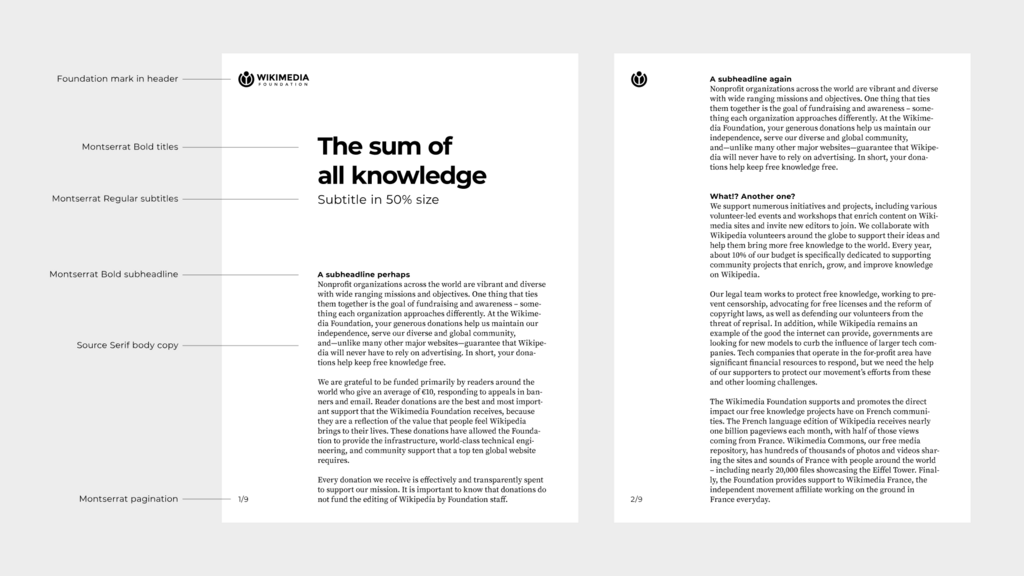
When choosing fonts to pair, look for ones that share a similar mood or have a comparable x-height (the height of a lowercase 'x'). This creates a subtle harmony, even if the fonts are different. The goal is to find two fonts that are different enough to create contrast, but not so different that they clash.
A good rule of thumb is to stick to two, or at most three, fonts in a single design. This keeps the look clean and avoids overwhelming the viewer.
Spacing and Readability
Beyond choosing fonts, the space around and between letters and lines is critical for readability. Two key adjustments are letter spacing (tracking) and line height (leading).
Tracking
noun
The adjustment of space for a group of letters. Also known as letter spacing.
Adjusting tracking can significantly change the look of your text. For large headlines, you might slightly decrease the tracking to make the letters feel more connected. For text set in all caps, or for very small text, increasing the tracking can make it much easier to read.
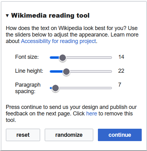
Line height, or leading, is the vertical space between lines of text. Too little leading makes text feel cramped and difficult to follow. Too much can make it feel disconnected. A good starting point is to set the line height to about 1.5 times the font size for body text. This gives the words room to breathe and helps the reader's eye move smoothly from one line to the next.
Using Custom Fonts
While standard fonts are reliable, custom fonts can give your design a unique personality and reinforce a specific brand identity. Thousands of high-quality fonts are available from sources like Google Fonts, Adobe Fonts, and independent type foundries.
Importing a custom font into a design tool allows you to go beyond the default options. This process typically involves downloading the font file (often in a .ttf, .otf, or .woff format) and uploading it through the tool's interface. Once uploaded, the custom font can be used just like any other, allowing you to apply it to your text and save it as part of your brand's style guide.
One of the best ways to make your text stand out is by using or creating custom typography.
Using a distinctive font can make your work instantly recognizable. Just be sure that the font is legible for your intended audience and that you have the proper license for its use, especially for commercial projects.
Ready to check your understanding?
What is a common and effective strategy for pairing fonts?
According to typography best practices, when is it a good idea to increase the tracking (letter spacing)?
Mastering these techniques will elevate your designs, making them not only more beautiful but also more effective at communicating your message.