Mastering Canva Intermediate Design
Advanced Design Principles
Finding Your Balance
Every element in a design has a visual weight. Balance is how you distribute that weight to create a stable, pleasing composition. It doesn't mean everything has to be perfectly centered, but it does mean the design shouldn't feel lopsided or chaotic.
There are three main types of balance:
- Symmetrical: This is the most straightforward type. Imagine a line down the middle of your design. In symmetrical balance, the elements on one side are a mirror image of the other. It feels formal, stable, and orderly.
- Asymmetrical: Here, the two sides are not identical, but the visual weight is still balanced. You might balance a single large element on one side with several smaller elements on the other. This creates a more dynamic and modern feel.
- Radial: Elements are arranged around a central point, like spokes on a wheel or ripples in a pond. This naturally draws the eye to the center and can create a strong focal point.
Canva's alignment tools can help you achieve perfect symmetry, but asymmetrical balance often requires a bit more intuition. Try moving elements around until the composition feels right to your eye.
Making Things Pop
Contrast is about making elements different so they stand out. When you make something the focal point of your design, you're creating emphasis. Contrast is the tool you use to do it.
You can create contrast in several ways:
- Color: Place light colors against dark colors. Use complementary colors (opposites on the color wheel) to make elements vibrant.
- Size: Make the most important element significantly larger than the others.
- Typography: Pair a bold, heavy font with a light, simple one. Use different font sizes to guide the reader's eye.
- Shape: Contrast geometric shapes with organic ones, or sharp corners with soft curves.
Good contrast is especially important for readability. If your text color is too similar to your background color, your message will be lost.
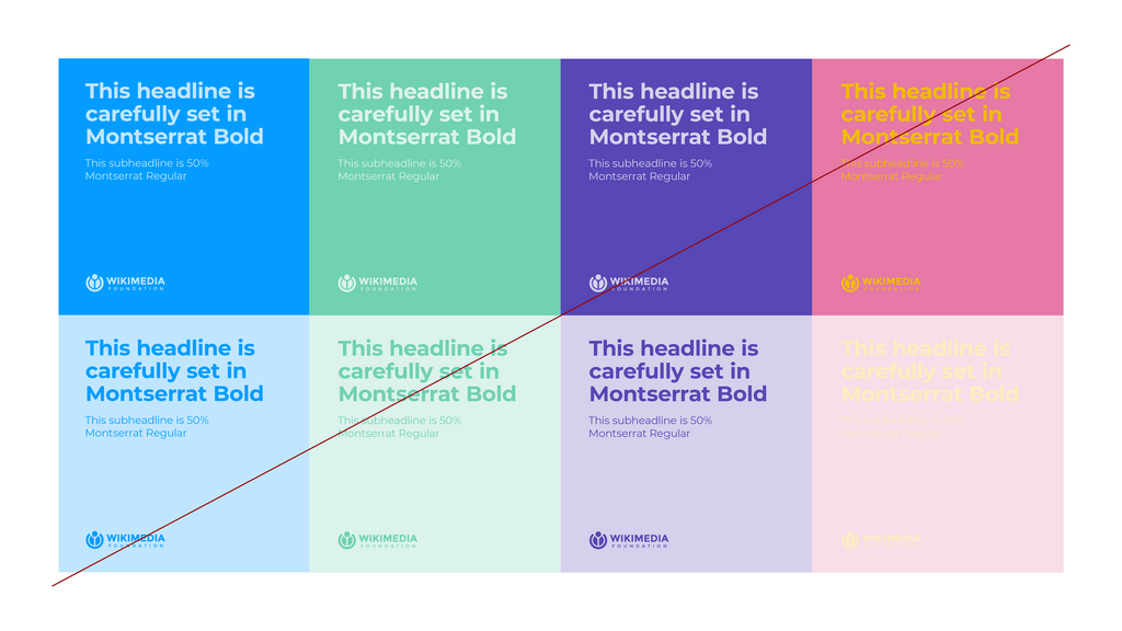
Without contrast, a design can feel flat and uninteresting. Don't be afraid to make bold choices to guide your audience's attention exactly where you want it.
Creating Order
Alignment and proximity are two principles that bring order and organization to your design. They work together to clean up messy layouts and make information easier to digest.
Alignment is the placement of elements so their edges line up along a common row or column. Even when elements are far apart, aligning them creates an invisible connection that makes the layout feel structured and intentional. In Canva, the smart guides that appear as you move objects are your best friend for achieving perfect alignment.
Proximity is about grouping related items together. When elements are close to each other, our brains perceive them as a single unit. This helps you organize information, reduce clutter, and communicate relationships between different parts of your design.
Group related items. Align everything. This simple mantra can transform a cluttered design into a clean, professional one.
Think of a business card. The person's name, title, and company are grouped together. The contact details—phone, email, website—form another group. This use of proximity makes the information scannable and easy to understand.
Building a Rhythm
Repetition is the reuse of the same or similar elements throughout a design. It creates a sense of unity, consistency, and rhythm. When you see a brand use the same color palette, fonts, and logo style across their website, social media, and products, that's repetition in action.
In a single design, you can repeat:
- Colors: Stick to a limited color palette to create a cohesive look.
- Fonts: Use one font for headings and another for body text consistently.
- Shapes: Repeating a specific shape or graphic element can tie the composition together.
Consistency, which is built through repetition, is what makes a design feel professional and trustworthy. It shows that every choice was deliberate.
The Power of Nothing
Sometimes, the most important part of a design is what isn't there. White space, also called negative space, is the empty area around and between the elements in your composition. It's not just blank background; it's an active design element.
Properly used, white space does several things:
- Improves Readability: It gives text room to breathe, making it easier to read.
- Reduces Clutter: A design with plenty of white space feels clean, modern, and uncluttered.
- Creates Emphasis: Surrounding an element with white space makes it stand out and signals its importance.
Don't be tempted to fill every inch of your canvas. Giving your elements space is one of the easiest ways to elevate your design from amateur to professional.
Mastering these principles will help you make intentional choices in your designs, moving beyond simply placing elements on a page to crafting truly effective visual communication.
Ready to test your knowledge?
A designer places a large photograph on the left side of a poster and balances it with a block of text and a small logo on the right side. What type of balance is this?
Which of the following is NOT a primary benefit of using white space in a design?