Statistical Tests for Data Analysis
Introduction to Descriptive Statistics
Describing Your Data
Imagine you have a huge pile of numbers, like the test scores for every student in a school. Looking at the raw list is overwhelming. Descriptive statistics are tools that help you summarize that pile into a few useful numbers. Instead of showing someone the entire list, you can just say, “The average score was an 85.”
It’s the first step in any data analysis, turning a confusing mess of information into something clear and understandable. The goal isn't to draw big conclusions about the world, but simply to describe the data you have in front of you.
Descriptive statistics provide a comprehensive overview of the data and are often the first step in any statistical analysis.
Finding the Center
One of the first things we want to know about a dataset is its “typical” value. This is called the measure of central tendency. There are three common ways to measure it: the mean, median, and mode.
Mean
noun
The sum of all values divided by the number of values. It's what most people call the 'average'.
The mean is the most common measure of the center. To calculate it, you add up all your data points and divide by how many there are.
Let’s say five students get the following scores on a quiz: 8, 9, 7, 10, and 6. The sum is 40. Divide by 5, and the mean is 8.
The mean is great, but it has a weakness. It's easily influenced by outliers, which are extremely high or low values. Imagine one student scored a 0 instead of a 6. The new scores are 8, 9, 7, 10, and 0. The sum is 34, and the mean drops to 6.8. That one low score pulled the average down quite a bit.
Median
noun
The middle value in a dataset that has been arranged in order from smallest to largest.
The median is the true middle ground. To find it, you first have to line up your data in order. Let's use our original scores: 6, 7, 8, 9, 10. The number right in the middle is 8. That's the median.
What if you have an even number of data points? Say, 6, 7, 8, 10. There's no single middle number. In that case, you take the average of the two middle numbers. Here, it would be .
The median’s superpower is that it isn’t affected by outliers. With the scores 0, 7, 8, 9, 10, the median is still 8. It ignores the extreme values at the ends.
Mode
noun
The value that appears most frequently in a dataset.
The mode is simply the most common value. If our test scores were 8, 9, 7, 9, 6, the mode would be 9. A dataset can have more than one mode (if two values are tied for most frequent) or no mode at all (if every value appears only once).
While the mean and median are for numerical data, the mode is special because it can also be used for categorical data. You can find the mode of favorite colors or types of pets, where you can't calculate a mean or median.
Measuring the Spread
Knowing the center of the data is only half the story. We also need to know how spread out, or variable, the data is. Imagine two classes both have a mean test score of 80. In one class, everyone scored between 75 and 85. In the other, scores ranged from 50 to 100. The average is the same, but the student experiences are very different. Measures of variability tell us about this spread.
The simplest measure is the range, which is just the highest value minus the lowest value. In a class with scores from 50 to 100, the range is 50. It's easy to calculate but can be misleading, as it only depends on the two most extreme points.
For a more robust measure, we turn to variance and standard deviation. They work together to describe how far, on average, each data point is from the mean.
Variance measures the average of the squared differences from the mean. We square the differences to make all the values positive and to give more weight to larger differences.
The units of variance are squared (e.g., “dollars squared”), which isn't very intuitive. So, we take its square root to get the standard deviation.
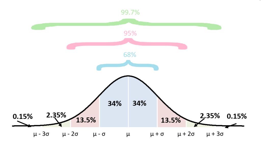
The standard deviation is one of the most important numbers in statistics. It gives us a standard way of knowing what is normal, and what is extra large or extra small. A small standard deviation means the data points are clustered tightly around the mean. A large standard deviation means they are spread far apart.
Visualizing Your Data
Numbers are great, but sometimes a picture is more effective. Visualizations help us see the shape and distribution of our data at a glance. Two common tools for this are histograms and box plots.
A histogram looks like a bar chart, but it groups numbers into ranges, or "bins." The height of each bar shows how many data points fall into that range. This quickly reveals the shape of your data. Is it symmetric? Skewed to one side? Does it have more than one peak?
A box plot (or box-and-whisker plot) is another powerful tool. It summarizes a dataset using five key numbers: the minimum, the first quartile (the 25th percentile), the median, the third quartile (the 75th percentile), and the maximum.
The “box” represents the middle 50% of the data, and the line inside the box is the median. The “whiskers” extend out to the minimum and maximum values. Box plots are excellent for comparing the spread of several datasets at once.
These descriptive tools don't tell you why the data looks the way it does, but they are the essential first step in understanding it. They create a clear, concise summary from which all deeper analysis begins.
What is the primary purpose of measures of central tendency like the mean, median, and mode?
A dataset of employee salaries includes the CEO's multi-million dollar salary along with the much lower salaries of all other employees. Which measure would be most affected by the CEO's salary?