AI and Python for Software Sales
Data Analysis with Python
Python for Sales Data
You've learned how AI can reshape sales and the basics of Python. Now, let's connect the two. Raw sales data—spreadsheets full of dates, customer names, and purchase amounts—is just a collection of facts. To make smart decisions, you need to turn that data into insights. Python is the perfect tool for this job.
We'll use a few specialized Python libraries that are essential for data analysis. Think of them as powerful toolkits for your programming workshop:
- Pandas: For organizing and manipulating data, much like an advanced spreadsheet.
- NumPy: For performing fast and efficient mathematical calculations.
- Matplotlib & Seaborn: For creating charts and graphs to visualize your findings.
From data retrieval and preprocessing to sophisticated financial modeling and machine learning applications, Python empowers finance professionals to make informed decisions in an ever-changing market landscape.
Organizing Data with Pandas
Pandas is the cornerstone of data analysis in Python. Its main feature is the DataFrame, a two-dimensional table of data with rows and columns, similar to a sheet in Excel or Google Sheets. Each column in a DataFrame can have a different type of data (text, numbers, dates), making it incredibly flexible for real-world sales records.
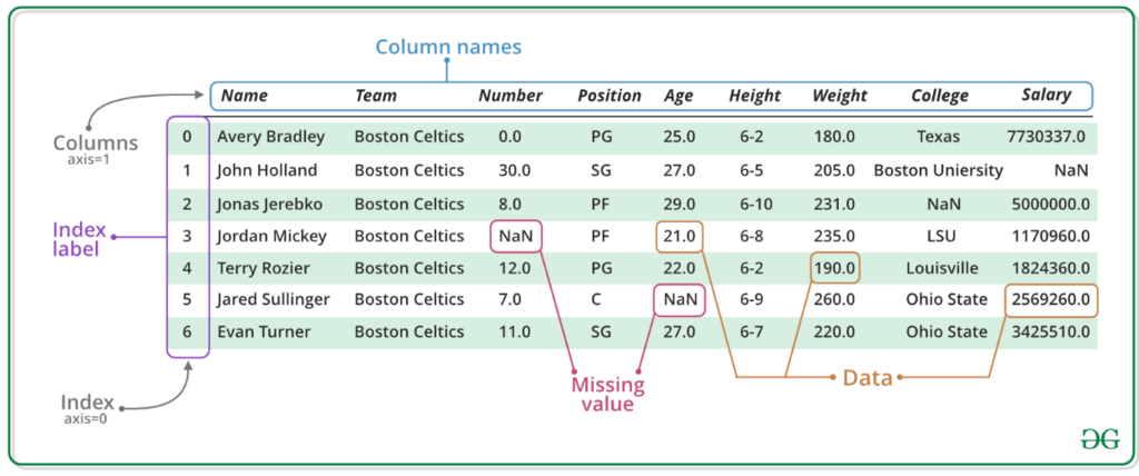
Let's say your sales data is stored in a comma-separated values (CSV) file called sales_data.csv. Loading this data into a Pandas DataFrame is straightforward.
# First, we need to import the pandas library
import pandas as pd

# Now, we can read our CSV file into a DataFrame
sales_df = pd.read_csv('sales_data.csv')

# Display the first 5 rows to see what it looks like
print(sales_df.head())
Once the data is in a DataFrame, you can easily work with it. Need to see just the sale amounts? Select the 'SaleAmount' column. Want to find all transactions made by a specific customer? Filter the data to show only rows matching their name.
# Select a single column (this returns a Series)
sale_amounts = sales_df['SaleAmount']

# Filter for all sales over 💲1000
large_sales = sales_df[sales_df['SaleAmount'] > 1000]

print(large_sales)
With Pandas, you can slice, filter, and transform huge datasets with just a few lines of code, a task that would be tedious and manual in a traditional spreadsheet.
Crunching Numbers with NumPy
Behind the scenes, Pandas relies on another library called NumPy for heavy-duty numerical calculations. NumPy is optimized for speed and efficiency, especially when working with large arrays of numbers. While you'll often interact with your data through Pandas, NumPy is the engine powering many of the calculations.
Imagine you've selected the 'SaleAmount' column from your DataFrame. You now have a list of all your sales figures. What if you need to calculate the total revenue, average sale price, or find the largest single transaction? NumPy makes these tasks trivial.
# We need to import NumPy
import numpy as np

# Assume 'sale_amounts' is a column from our Pandas DataFrame
sale_amounts = sales_df['SaleAmount']

# Perform calculations using NumPy functions
total_revenue = np.sum(sale_amounts)
average_sale = np.mean(sale_amounts)
biggest_sale = np.max(sale_amounts)

print(f"Total Revenue: 💲{total_revenue}")
print(f"Average Sale: 💲{average_sale}")
These operations are not only easy to write but also incredibly fast, even with millions of records. This speed is crucial when you're exploring data and need to test different ideas quickly.
Visualizing Sales Patterns
Numbers and tables are great, but a picture is often worth a thousand rows of data. Data visualization turns your analysis into something you can see and share. This is where Matplotlib and Seaborn come in. Matplotlib is a foundational plotting library, while Seaborn is built on top of it to make creating common statistical plots simpler and more attractive.
Let's say you want to see how sales are distributed over time. A line chart is perfect for this. We can plot the 'SaleDate' against the 'SaleAmount' to spot trends, like a dip in sales during a certain month or a surge during the holidays.
# Import the visualization libraries
import matplotlib.pyplot as plt
import seaborn as sns

# Ensure 'SaleDate' is a proper date format
sales_df['SaleDate'] = pd.to_datetime(sales_df['SaleDate'])

# Create a simple line plot of sales over time
sns.lineplot(x='SaleDate', y='SaleAmount', data=sales_df)
plt.title('Sales Performance Over Time')
plt.xlabel('Date')
plt.ylabel('Sale Amount')
plt.show() # This command displays the plot
What about identifying your top customers? A bar chart is an excellent tool for this. By grouping your data by customer and summing their total purchases, you can quickly visualize who your most valuable clients are.
Visualizations help you communicate your findings effectively. A chart showing a clear upward trend is far more impactful in a sales meeting than a spreadsheet of raw numbers.
What is the primary data structure used in the Pandas library for organizing and manipulating tabular data, similar to a spreadsheet?
While Pandas is used to structure and manipulate data, which library provides the high-performance numerical computation engine that powers many of its calculations?