Website Building Fundamentals
Understanding Web Development
The Two Sides of a Website
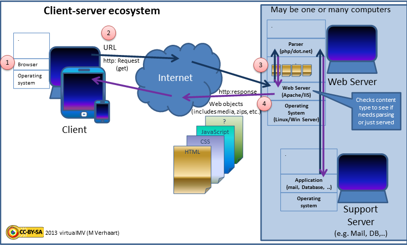
Every website or web application has two distinct sides, much like a restaurant. There's the dining room, where customers sit, read the menu, and enjoy their meal. Then there's the kitchen, a bustling place hidden from view where the chefs prepare the food and manage the inventory.
Web development is divided in a similar way: into front-end and back-end.
Front-End
noun
Everything the user sees and interacts with in their browser. This includes the layout, colors, fonts, buttons, and forms. It's the 'dining room' of the website.
The front-end is built using languages like HTML for structure, CSS for styling, and JavaScript for interactivity. It’s all about the user experience.
Back-End
noun
The 'behind-the-scenes' machinery that makes the website work. It includes the server, database, and application logic. It's the 'kitchen' of the website.
When you log into an account, save an item to your cart, or publish a post, you're interacting with the front-end, which then sends a request to the back-end. The back-end processes that request, interacts with a database if needed, and sends the information back to the front-end to be displayed. The two sides work together constantly.
Designing for Every Screen
Think about all the different ways you access the internet: on your phone during your commute, on a tablet while relaxing on the couch, and on a desktop computer at work. Each device has a different screen size.
A modern website needs to look great and be easy to use on all of them. This is the core idea behind responsive web design.
Responsive design isn't about creating separate websites for different devices. It's about building one flexible website that adapts to any screen size.
A responsive website automatically adjusts its layout. For example, a three-column layout on a wide desktop screen might reflow into a single column on a narrow smartphone screen. Images might shrink, and navigation menus might change from a horizontal bar to a compact icon.
This ensures that the user has a good experience no matter how they access the site, without having to zoom in or scroll sideways to read the content.
Following the Rules of the Road
Just as buildings must follow a construction code to be safe and functional, websites should follow a set of rules and best practices known as web standards.
These standards are guidelines for building websites, developed by organizations like the World Wide Web Consortium (W3C). They aren't strict laws, but following them is crucial for a few key reasons.
HTML is the backbone of the web, and mastering it is essential for any web developer.
First, standards ensure that websites work consistently across different web browsers like Chrome, Firefox, and Safari. When a site follows the rules, you can be reasonably sure it will look and behave as intended for most visitors.
Second, they are fundamental to accessibility. Following standards helps ensure that people with disabilities, who may use screen readers or other assistive technologies, can access and use the web. Finally, search engines like Google favor websites that are well-structured and follow best practices, which can help a site rank higher in search results.
From Idea to Launch
Creating a website is a multi-step process that goes far beyond just writing code. While the details can vary, the journey from an initial idea to a live website generally follows a clear path.
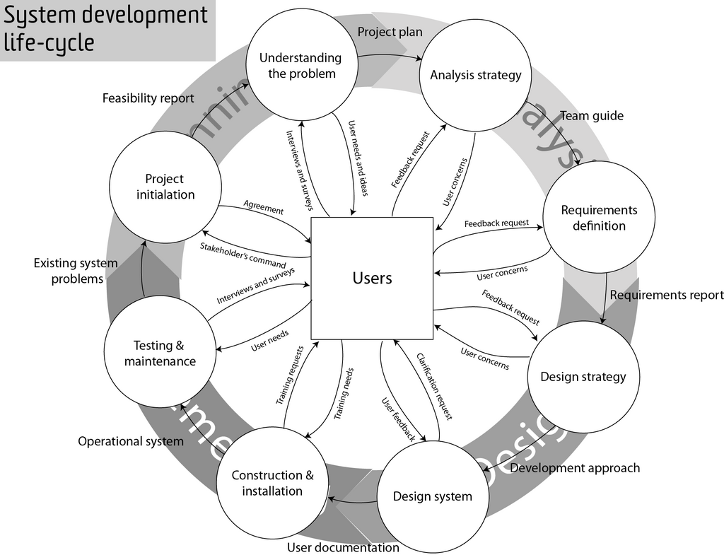
1. Planning: This is the starting point. What is the website's purpose? Who is the target audience? What features does it need? Answering these questions creates a roadmap for the entire project.
2. Design: This phase focuses on the look and feel. It involves creating wireframes (basic blueprints of the layout) and mockups (detailed visual designs). The goal is to design an interface that is both visually appealing and easy to navigate.
3. Development: This is where the design is turned into a working website. Front-end developers build the user interface, and back-end developers build the server-side logic and database connections.
4. Testing: Before the website goes live, it must be thoroughly tested. Testers check for bugs, ensure it works correctly on different devices and browsers, and confirm that all features function as expected.
5. Deployment and Maintenance: Deployment is the process of launching the website on a server so it's accessible to the public. But the work doesn't stop there. Websites need ongoing maintenance to update content, fix bugs, and apply security patches.
This cycle provides a high-level view of how professionals build robust and effective websites.
Time to test your knowledge on these foundational concepts.
If a website were a restaurant, the "back-end" would be analogous to which part?
What is the primary purpose of responsive web design?
Understanding these core principles—the roles of front-end and back-end, the need for responsive design, the importance of standards, and the overall development process—is the first step in the journey of web development.