Web Design and Hosting Essentials
Introduction to Web Design
First Principles of Web Design
Good web design is about more than just aesthetics; it's about clear communication. The goal is to create a website that's not only visually appealing but also easy to navigate and understand. Think of a webpage as a conversation with a visitor. You want to guide them smoothly, making sure they find what they're looking for without confusion. A well-designed site feels intuitive and effortless to use.
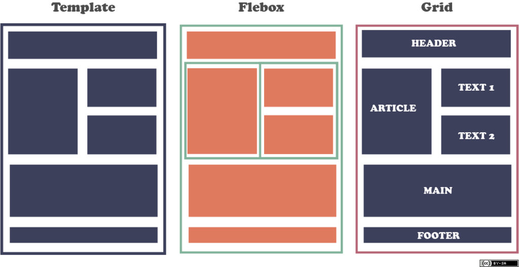
To achieve this, designers rely on a set of core principles. These aren't strict rules but rather guidelines that help organize content in a way that makes sense to the human eye. By mastering these basics, you can build websites that are both beautiful and functional.
Guiding the Eye
When you land on a webpage, your eyes don't look at everything at once. They scan for the most important information first. This is where visual hierarchy comes in. It's the art of arranging elements to show their order of importance.
The most important element on a page, like the main headline, should be the most prominent. You can make it stand out by making it larger, bolder, or a different color than the rest of the text. Subheadings should be less prominent than the main heading but more so than the body text. This creates a clear path for the user to follow, making the content easier to digest.
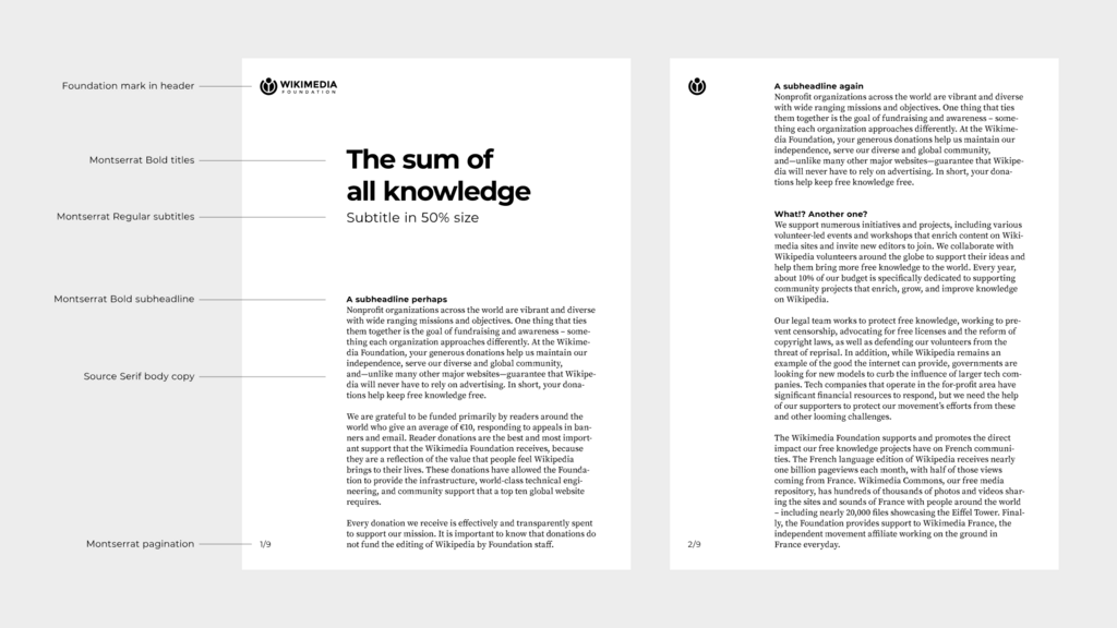
Layout structures also play a crucial role in guiding the user. Studies show that people often scan websites in predictable patterns. Two common ones are the F-pattern and the Z-pattern. In the F-pattern, users read horizontally across the top, then scan down the left side, occasionally reading across again for interesting headings. The Z-pattern involves a scan across the top, diagonally down to the bottom left, and then across the bottom. Designers use these patterns to place key information and calls-to-action where they're most likely to be seen.
To create these organized layouts, designers often use grids. A grid is an invisible framework of columns and rows that helps align elements on the page. This creates a sense of order and balance, preventing the design from feeling cluttered or chaotic.
The Psychology of Color
Color is a powerful tool in web design. It’s not just for decoration; it evokes emotions, draws attention, and can even influence behavior. Different colors carry different associations. For instance, blue is often associated with trust and stability, which is why many banks and tech companies use it. Green can suggest nature, growth, or finance, while red is a high-energy color that signifies excitement, passion, or urgency.
A good color palette sets the tone for your website and strengthens your brand identity. Most designs stick to a simple palette of two to three main colors to avoid overwhelming the user.
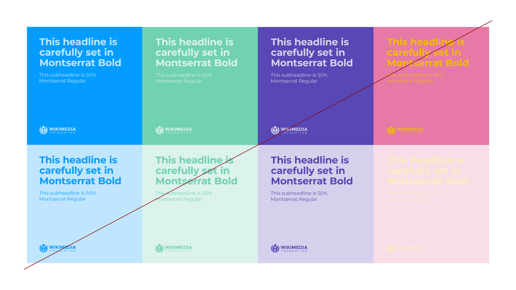
When choosing colors, it's crucial to consider contrast. Good contrast between the text and its background is essential for readability. Black text on a white background is the classic example of high contrast. Poor contrast, like light gray text on a white background, can make your content difficult to read, especially for people with visual impairments. Always test your color choices to ensure your website is accessible to everyone.
Making Text Readable
Most of the information on the web is text, so making it easy to read is a top priority. This is the job of typography. It involves choosing fonts, setting their size, and arranging them in a way that's both legible and aesthetically pleasing.
There are two main categories of fonts: serif and sans-serif. Serif fonts (like Times New Roman) have small decorative strokes at the ends of letters, which can make them easier to read in long blocks of printed text. Sans-serif fonts (like Arial or Helvetica) lack these strokes, giving them a clean, modern look that works very well on digital screens.
A common practice is to use a sans-serif font for body text for its clarity on screens and a more decorative or serif font for headings to add character.
Beyond font choice, pay attention to line length, line spacing (also called leading), and text size. Lines that are too long or too short can be hard to read. Text that is too small strains the eyes, while text that is too large can be overwhelming. Finding the right balance is key to creating a comfortable reading experience.
Consistency is Key
Finally, consistency ties everything together. A consistent design makes a website feel predictable and easy to use. This means using the same colors, fonts, and layout structures across all pages. Headings should look the same on every page. Buttons should have the same style and behave in the same way.
When a design is consistent, users don't have to relearn how to navigate each new page. They can focus on the content instead of trying to figure out the interface. This creates a seamless and professional user experience, building trust and encouraging visitors to explore your site further.
These principles of hierarchy, color, typography, and consistency are the building blocks of effective web design. By understanding and applying them, you can create websites that not only look great but are also a pleasure to use.
What is the primary purpose of visual hierarchy in web design?
A user scans a webpage horizontally across the top, then down the left side, with occasional horizontal scans to the right for interesting headings. Which scanning pattern are they most likely following?