Visualizing Sustainability Data
Introduction to Data Visualization
Telling Stories with Data
Data on its own is just a collection of facts and figures. It can be hard to see the forest for the trees. Data visualization is the art of turning those numbers into a picture. It's about creating charts and graphs that reveal the stories hidden within the data.
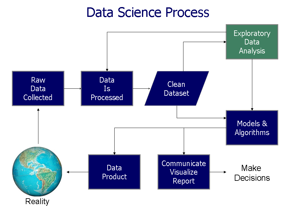
Think of it like this: a spreadsheet full of sales numbers is just a list. But a graph showing those sales numbers over time tells a story. You can instantly see if sales are growing, shrinking, or staying flat. This visual context helps our brains process complex information much faster than reading through rows of data.
The main goal of data visualization is to communicate information clearly and efficiently. A good visual makes complex data understandable at a glance.
Choosing the Right Chart
Just as a carpenter has different tools for different jobs, there are many types of charts for visualizing data. Choosing the right one depends on what you want to show. Let's look at three of the most common types.
Bar Charts: Making Comparisons
Bar charts are perfect for comparing amounts between different groups. Each bar represents a category, and its length corresponds to a value. They make it easy to see which category is biggest, smallest, or how they rank against each other.
You might use a bar chart to compare website traffic from different social media platforms or to show the number of students enrolled in different courses.
Line Graphs: Tracking Changes Over Time
A line graph is the best way to show how a value changes over a continuous period. It connects a series of data points with a line, making it simple to spot trends, cycles, or fluctuations.
This is the go-to chart for tracking stock prices, monthly rainfall, or your own running speed over the course of a year.
Pie Charts: Showing Parts of a Whole
Pie charts are used to show proportions. The entire circle, or "pie," represents 100%, and the slices show the relative size of each category. They are helpful for understanding the composition of something.
While useful, pie charts work best with just a few categories. When you have too many slices, the chart becomes cluttered and difficult to read. In those cases, a bar chart is often a better choice.
Principles of Good Visualization
Creating an effective data visualization is more than just plugging numbers into a chart. There are a few key principles to keep in mind.
Clarity is Key: The visualization should be easy to understand. Avoid unnecessary clutter, confusing colors, or distracting fonts. If something isn't adding to the story, it's likely taking away from it.
Provide Context: A chart without labels is meaningless. Always label your axes, provide a title, and include units of measurement. The viewer should know exactly what they are looking at without having to guess.
Tell a Story: A good visualization guides the viewer's eye to the most important insight. Use color or size to highlight key data points and arrange information in a logical way that tells a coherent story.
Data visualization should be more than just cold, hard numbers, it should have a clear story that keeps the audience engaged and gradually reaches a conclusion.
By transforming data into visual stories, we make information more accessible and impactful. It allows us to see patterns and connections we might have otherwise missed, leading to better understanding and smarter decisions.