Visualising Concepts Through Graphical Representation
Mapping Functional Relationships
The Signature of a Function
Every family of functions has a distinct visual signature. When plotted on a Cartesian plane, the relationship between variables takes on a specific geometric shape. Recognising these shapes is like learning to read a new language, one that instantly tells you the story of the data.
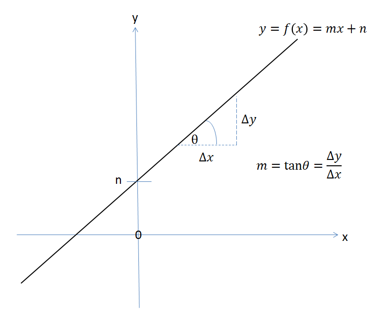
Linear functions are the simplest. They always produce a straight line. The relationship is one of direct, constant proportion. For every step you take along the x-axis, the y-value changes by a fixed amount. This constant rate of change is the function's gradient, or slope.
Power functions, like or , create curves. A quadratic function () forms a symmetrical U-shape called a parabola. Cubic functions () create a distinct S-shaped curve that passes through the origin. These shapes show a rate of change that isn't constant; it accelerates or decelerates. For example, in a parabola, the line gets steeper the further you move from the centre.
Polynomials of a higher degree introduce more complexity. A function like will have more twists and turns, creating multiple peaks and troughs. The number of these turning points is related to the highest power in the polynomial. Each bend in the graph signals a shift where the rate of change switches from increasing to decreasing, or vice versa.
Setting the Stage
The same function can look dramatically different depending on the scale of your axes. Choosing the right scale is crucial for clarity. If you're plotting a company's revenue over ten years, a scale that shows daily fluctuations would be a meaningless scribble. A yearly scale would reveal the meaningful trend.
The goal of scaling is to make the important features of the graph visible. If the key interactions happen in a small region, zoom in on that area. If you need to show a long-term trend, zoom out.
Consider plotting the trajectory of a launched projectile. If your x-axis (horizontal distance) runs into thousands of metres but your y-axis (height) only goes up to 100, the resulting parabola will look flat and squashed. To get a representative shape, the scales of the axes need to be proportional to the range of the data they represent. Sometimes, a non-linear scale, like a logarithmic scale, is needed to wrangle data that spans several orders of magnitude.
Interpreting the Gradient
The gradient, or slope, of a graph is more than just a number; it represents a rate of change. In real-world applications, this is often the most important piece of information the graph provides. In economics, the gradient of a cost function tells you the – the cost of producing one additional unit. A steep gradient means high marginal cost, while a shallow gradient means it's cheap to ramp up production.
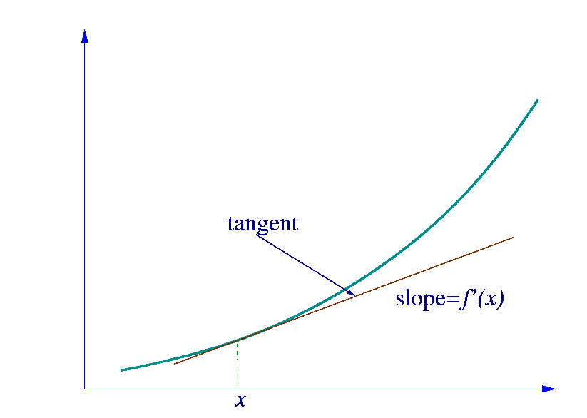
For a curved graph, the gradient isn't constant. It changes at every point. We can find the instantaneous rate of change by drawing a tangent line to the curve at a specific point. The gradient of this tangent reveals the rate of change at that exact moment. For an engineer analysing a velocity-time graph, the gradient at any point represents the object's acceleration at that instant.
From Constraints to Boundaries
Many real-world problems operate within certain limits or constraints. A factory can only produce so many units per day, a budget can't be exceeded, and there are only 24 hours in a day. We can translate these constraints into geometric boundaries on a graph. These boundaries define a 'feasible region' where all possible solutions to the problem must lie.
For example, imagine a baker who makes cakes and pies. Let be the number of cakes and be the number of pies. The baker has enough flour for at most 10 items in total. This gives us a constraint:
The baker also knows it takes 2 hours to make a cake and 1 hour to make a pie, with only 16 hours of work time available. This gives a second constraint:
When we plot these inequalities on a graph, they form lines. The area on the graph that satisfies both conditions is the feasible region. Any combination of cakes and pies within this shaded area is a possible production plan for the baker. This graphical method is the foundation of , a powerful tool for optimisation problems.
Visualising relationships this way transforms abstract algebraic problems into tangible geometric ones. It allows us to see the interplay of different factors and identify the boundaries of what is possible.
What is the characteristic shape of a quadratic function, such as , when plotted on a Cartesian plane?
The scale chosen for the axes of a graph can dramatically alter the apparent shape of the plotted function.