Visual Graphic Design Fundamentals
Introduction to Visual Communication
Speaking Without Words
From the red of a stop sign to the logo on your favorite coffee cup, you're constantly reading a language without an alphabet. This is visual communication: the art of using images, colors, and shapes to send a message. It’s not just about making things look good. It's about communicating an idea clearly and effectively.
Think about assembling a piece of furniture. The instruction manual uses diagrams, not just words, to guide you. Why? Because a simple drawing can show you exactly how two pieces fit together much faster than a paragraph of text. That's the power of visual communication. It cuts through the noise and delivers information in a way our brains can quickly process.
Design isn’t just about making things look good; it’s about creating visual harmony and effectively communicating your message.
In graphic design, this is the core mission. Whether creating a website, a poster, or a business card, the goal is to guide the viewer’s eye and mind to a specific conclusion or action. To do this, designers use a shared set of fundamental tools.
The Building Blocks
Just like written language has an alphabet, visual language has its own basic elements. These are the simplest forms you can work with, but they combine to create everything you see in a design.
Line
noun
A mark that connects two points. Lines can be thick or thin, straight or curved, smooth or jagged. They're used to create outlines, direct the eye, and separate sections of a design.
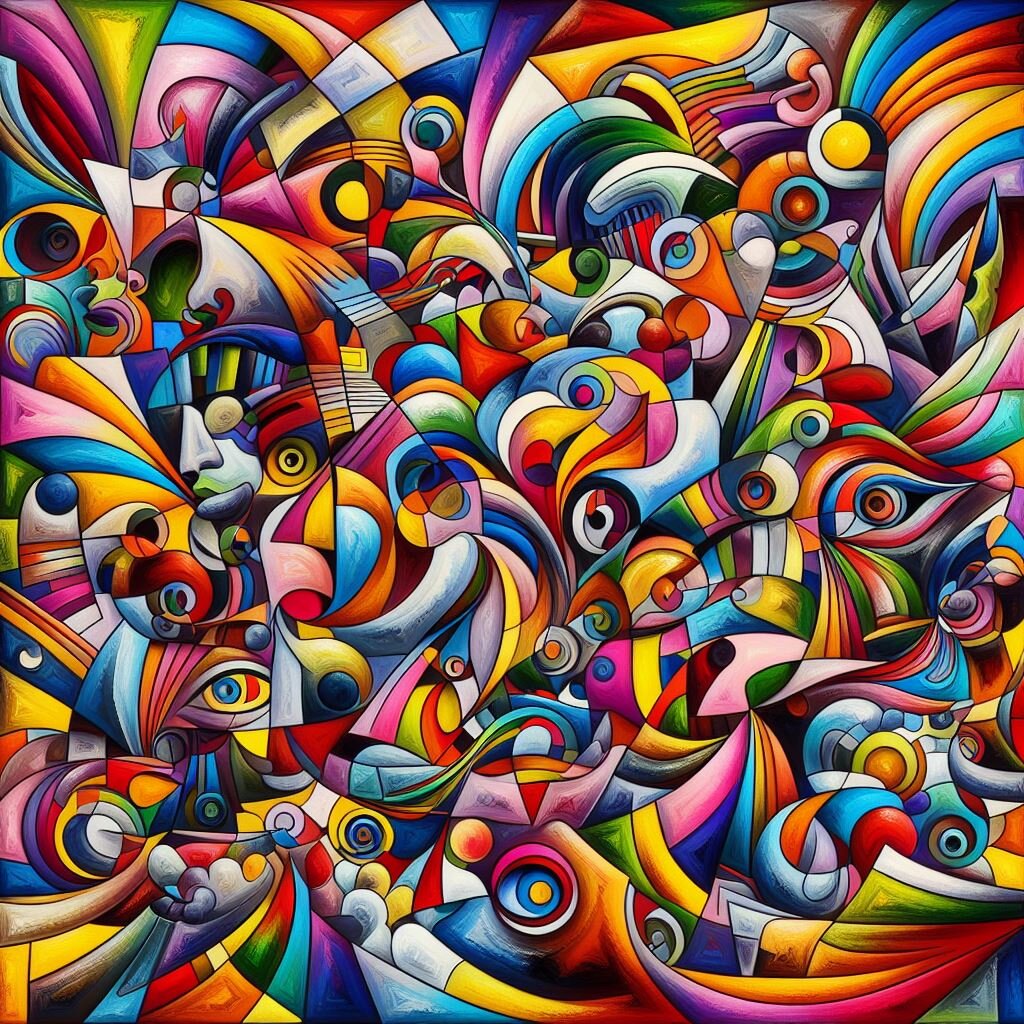
Shape refers to any enclosed, two-dimensional area. Shapes can be geometric, like circles and squares, which feel orderly and stable. They can also be organic, with irregular, natural-feeling curves, like a puddle or a leaf. Shapes form the foundation of logos, icons, and illustrations.
Color is perhaps the most emotionally resonant element. Different colors carry different meanings and can drastically change the mood of a design. Red can signal danger or passion, while blue often feels calm and trustworthy. Getting color right is key to setting the right tone.
Texture is the physical or visual surface quality of an object. A design can have a rough, smooth, glossy, or matte texture. Even on a flat screen, texture can be implied using patterns and shading, adding depth and a tactile feel that makes the design more interesting.
Arranging the Elements
Once you have the basic elements, you need principles to arrange them effectively. These principles are like the rules of grammar for visual language. They help you organize the elements to create a clear and compelling message.
The key principles of design are balance, contrast, and hierarchy. Mastering them is the first step toward creating professional-looking work.
Balance is about distributing the visual weight of objects in a design. A balanced design feels stable and pleasing. Symmetrical balance is like a mirror image, where elements are evenly weighted on both sides of a central axis. It feels formal and calm.
Asymmetrical balance, on the other hand, uses elements of different sizes and weights to create balance. For example, one large object on one side can be balanced by several smaller objects on the other. This often feels more dynamic and modern.
Contrast is used to make elements stand out. It happens when two design elements are opposites, like a thick line next to a thin one, or a dark color against a light one. Contrast is essential for readability and for drawing the viewer's attention to the most important parts of the design.
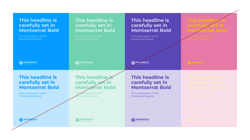
Finally, hierarchy is the principle of arranging elements to show their order of importance. In a well-designed piece, you instantly know what to look at first, second, and third. Designers create hierarchy by making the most important element the largest, brightest, or most centrally located. This guides the viewer through the information in a logical way.
These building blocks and rules are the foundation of all visual communication. By understanding them, you can start to see why some designs work so well and others fall flat. They are the tools designers use to turn ideas into clear, effective, and engaging messages.
Ready to test your knowledge?
What is the primary purpose of visual communication in graphic design?
A logo designer uses the irregular, flowing shape of a leaf. What type of shape is this an example of?