Unmasking Dark UX Patterns
Introduction to Dark Patterns
What Are Dark Patterns?
Have you ever tried to unsubscribe from an email newsletter, only to find yourself clicking through a maze of confusing links and guilt-tripping messages? Or maybe you've signed up for a free trial, and when it came time to cancel, the 'cancel subscription' button was mysteriously hard to find. These aren't accidents. They are carefully crafted design choices.
If you’ve ever found it easier to sign up for an account than it is to cancel it, you’ve stumbled onto a dark pattern.
These frustrating experiences are examples of dark patterns. They are tricks used in websites and apps that make you do things you didn't mean to, like buying or signing up for something. The key difference between a dark pattern and just a bad design is intent. A poorly designed website might be confusing by accident. A dark pattern is confusing on purpose.
Dark patterns are design choices that deliberately manipulate users into making decisions that benefit the business, often at the user’s expense.
The goal is usually to boost a company's metrics, such as sign-ups, sales, or data collection, by steering users away from choices that are in their own best interest.
A Quick History
The term "dark patterns" was coined in 2010 by user experience (UX) designer Harry Brignull. As the internet grew, he noticed a rise in deceptive design practices, but there was no common language to describe them. Giving them a name was the first step toward calling them out.
Brignull created a website to categorize and expose these tricks, making it easier for designers and consumers to identify and discuss them. The rise of dark patterns coincided with the intense focus on e-commerce and growth metrics. Companies began using A/B testing not just to improve user experience, but to find the most effective ways to nudge users toward profitable actions, even if those methods were deceptive.
The Ethical Line
Good design is persuasive. It might highlight the benefits of a premium subscription or make it easy to see the most popular products. This is like a helpful salesperson pointing you to a great deal. It helps both the user and the business.
Dark patterns cross an ethical line from persuasion into manipulation. They exploit cognitive biases, like our tendency to skim text or follow default options, to trick us. This is more like a salesperson who hides fees in the fine print or signs you up for a warranty without asking.
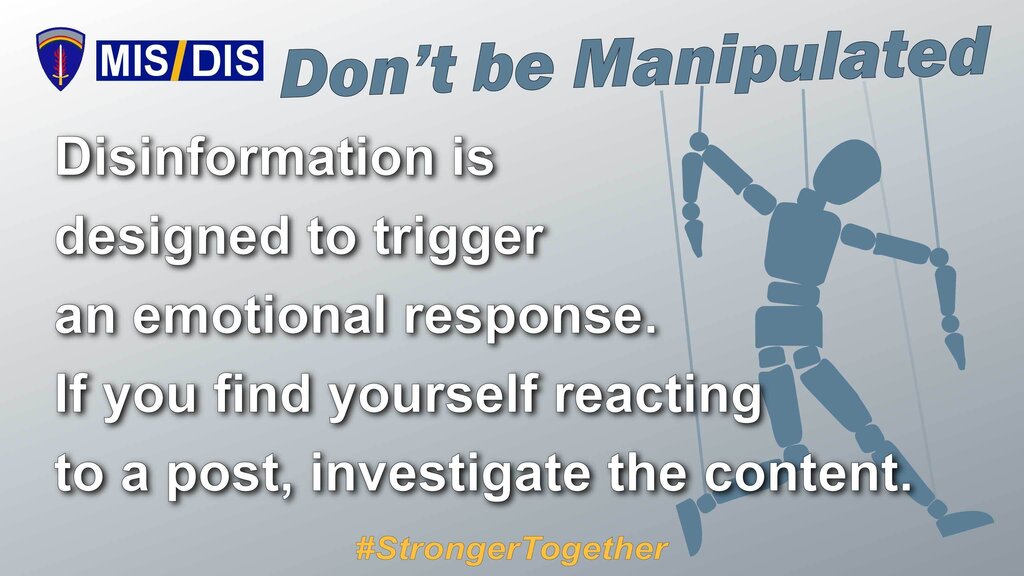
This deception has a cost. While it might lead to a short-term gain for the company, it erodes the most valuable asset a business has: its users' trust. When people feel tricked, they are less likely to become loyal customers. In the long run, transparent and ethical design is simply better business.
Dark patterns are inherently unethical, eroding trust between users and companies.
Now that you understand what dark patterns are and the ethical problems they create, you're ready to learn how to spot the specific types you'll encounter online.