Understanding Slide Content
Slide Analysis
Start with the Title
Every slide has a job to do, and its title is the job description. The title isn't just a label; it's the main signpost that tells you what the slide is all about. Before you dive into the details, read the title carefully. It frames the entire message and gives you the context you need to understand everything else that follows.
Think of the slide's title as a headline. It should summarize the core idea or the main question the slide intends to answer.
For example, a title like "Quarterly Sales Growth" immediately tells you to look for data showing changes in sales over the last three months. A different title, such as "Key Obstacles in Q3," primes you to look for problems or challenges. The title sets your expectations and helps you focus on what's most important.
Find the Main Points
Once you've understood the title, your next step is to find the main points. These are the key takeaways the presenter wants you to remember. Most often, they are presented as bullet points or short, declarative sentences. Scan for the most prominent text—it’s usually what matters most.
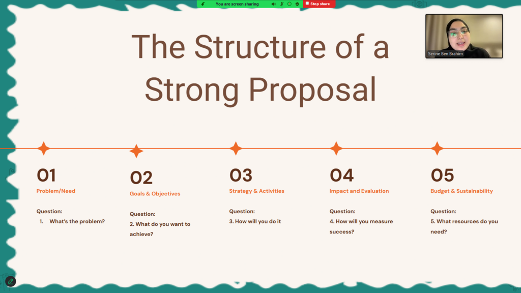
After identifying the main points, look for the supporting data. This is the evidence that backs up the main claims. Supporting data can be anything from statistics and figures to quotes and brief examples. The main point makes a claim, and the supporting data proves it.
Separating these two helps you evaluate the argument. Is the evidence strong enough? Does it directly relate to the main point? This critical distinction is key to truly understanding the slide's message.
Focus on one key message or data point per slide.
Decode the Visuals
Often, the most important information on a slide isn't in the text but in a visual, like a chart or a graph. Visuals are designed to make complex data easier to understand at a glance. But they still require careful interpretation.

When you encounter a chart or graph, don't just look at the shapes. Follow these steps to understand what you're seeing:
-
Read the labels. Start with the chart's title and the labels on the axes (the horizontal x-axis and vertical y-axis). What is being measured? What are the units?
-
Identify the type. Is it a line graph showing a trend over time, a bar chart comparing quantities, or a pie chart showing parts of a whole? Knowing the chart type gives you clues about its purpose.
-
Look for the story. Scan for trends, patterns, and outliers. Is a line going up or down? Is one bar significantly taller than the others? What is the biggest slice of the pie? The visual is telling a story, and your job is to read it.
| Chart Type | Primary Use |
|---|---|
| Line Chart | Shows trends or changes over time. |
| Bar Chart | Compares amounts between different groups. |
| Pie Chart | Shows how a whole is divided into parts (percentages). |
According to the provided text, what is the primary function of a slide's title?
When analyzing a slide, what is the relationship between a main point and its supporting data?
By breaking down a slide into its title, main points, and visuals, you can move from passively viewing information to actively understanding it.