Understanding HR Physics Diagrams
Introduction to HR Diagrams
A Map of the Stars
For centuries, astronomers cataloged stars, gathering data on their brightness, color, and distance. It was like having a giant collection of puzzle pieces with no picture on the box. Was there a hidden order to the cosmos? Two astronomers, working independently in the early 1900s, found one.
Ejnar Hertzsprung, a Danish astronomer, started plotting the color of stars against their brightness. A few years later, American astronomer Henry Norris Russell did the same. They both discovered something remarkable. When you chart stars this way, they don't appear randomly. Instead, they fall into distinct groups and patterns. This powerful tool became known as the Hertzsprung–Russell diagram, or HR diagram for short.
The HR diagram is essentially a celestial census. It takes individual data points about stars and organizes them into a meaningful picture, revealing the underlying physics that governs their lives.
Reading the Diagram
At its core, the HR diagram plots two fundamental properties of a star. Think of it like a standard graph with a vertical (y-axis) and a horizontal (x-axis).
The vertical axis measures a star's luminosity. This isn't just how bright a star looks from Earth, which depends on its distance. Luminosity is the total amount of energy a star radiates per second—its true, intrinsic brightness. Brighter, more powerful stars are plotted higher up on the diagram.
Luminosity
noun
The total amount of energy emitted by a star, galaxy, or other astronomical object per unit time.
The horizontal axis measures a star's surface temperature. Here’s the tricky part: the temperature scale runs backward. The hottest stars are on the left, and the coolest stars are on the right. A star's temperature is closely related to its color. Hot stars are blue or white, while cooler stars are red or orange. So, the diagram goes from blue-hot on the left to reddish-cool on the right.
What the Diagram Reveals
When thousands of stars are plotted, a clear pattern emerges. Most stars, including our Sun, fall along a diagonal band running from the hot, bright upper-left to the cool, dim lower-right. This band is called the Main Sequence.
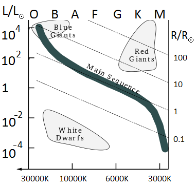
Other groups of stars appear in different regions. In the upper right, you'll find cool but very luminous stars known as Red Giants. They are bright because they are enormous. In the lower left are White Dwarfs, which are very hot but have low luminosity because they are tiny, about the size of Earth.
By finding a star's position on the HR diagram, astronomers can instantly know its classification, temperature, color, and intrinsic brightness.
The HR diagram provided the first clear evidence that stars weren't all the same. It gave astronomers a framework for classifying them into families—main sequence stars, giants, dwarfs—and laid the groundwork for understanding how stars are born, live, and die.
Let's check your understanding of these foundational concepts.
What two fundamental properties of a star are plotted on the Hertzsprung-Russell diagram?
On an HR diagram, where would you find a star that is very hot but has low luminosity?
This simple chart transformed astronomy from a descriptive science into a physical one, allowing us to decode the lives of the stars.