UI/UX Design Career Roadmap
Visual Design Mastery
Guiding the Eye
Effective visual design isn't about making things pretty. It's about communication. In a digital interface, you're the director, telling the user's eye where to look and in what order. This control is called visual hierarchy. You already know the basics, but mastery comes from wielding its tools with intent.
Size is the most straightforward tool. Larger elements feel more important. But scale is more nuanced. It’s the relative size of elements to one another. A button doesn't need to be huge to stand out; it just needs to be noticeably larger than the descriptive text next to it.
Contrast does the same job, but with color, brightness, or font weight. A bold headline shouts for attention over light-gray body text. Proximity, the principle of grouping related items, creates clean, organized blocks of information. Users instinctively understand that elements placed close together belong together.
Use size, scale, contrast, and proximity not as individual settings, but as a combined system to create a clear path for the user's attention.
People don't read websites; they scan them. Your job is to make that scan as efficient as possible. Two common scanning patterns dominate western digital layouts: the F-pattern and the Z-pattern.
The is common on text-heavy pages like articles or search results. A user’s eye moves horizontally across the top, then down the left side, occasionally darting right to scan a subheading or interesting phrase. The Z-pattern applies to less dense, more graphic-heavy pages, like landing pages. The eye zips from the top-left (logo), across to the top-right (call-to-action), down to the bottom-left, and finally across the bottom-right.
By understanding these patterns, you can place key information and interactive elements where users are most likely to see them, creating a layout that feels intuitive and effortless.
Systematic Typography
Good typography is invisible. It creates a seamless reading experience. Bad typography is a stumbling block. In UI design, consistency is key, which is why we build typographic systems.
A system starts with font pairing. A common practice is to pair a distinct, expressive font for headlines (a serif or display font) with a clean, highly-readable font for body text (a sans-serif). The goal is to create contrast and personality without sacrificing legibility.
Next, you establish a typographic scale. This is a set of predefined font sizes for all text elements: H1, H2, H3, body, captions, etc. This scale is often based on a mathematical ratio, like the classic major third (1.250). Using a scale ensures a harmonious and predictable relationship between all text on the screen, reinforcing your visual hierarchy.
Take the time to learn about the fundamentals of UI, UX, typography, composition, and color theory.
Color and Accessibility
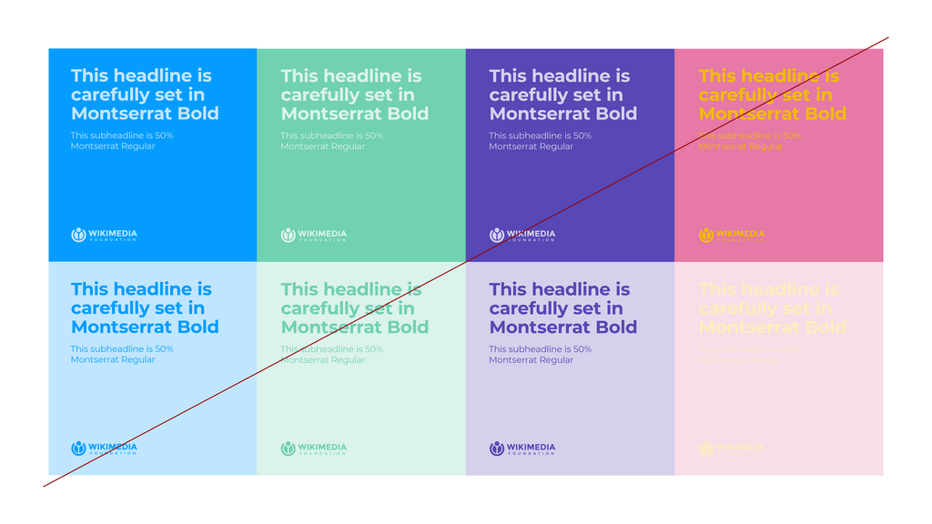
Color sets the mood of an interface, but its most critical job is functional: ensuring usability for everyone. This is where the [{
A common mistake is choosing colors based only on aesthetics. A professional workflow involves building a palette that is both appealing and compliant. Your primary brand colors might be vibrant, but you'll also need a set of neutral grays, as well as specific colors for success (green), warning (yellow/orange), and error (red) states. Every color choice must be checked for contrast.
Fortunately, you don't need to do the math yourself. Numerous online tools can check your color pairs against WCAG standards instantly. Integrating this check into your design process is a non-negotiable part of modern UI design.
Building with Grids
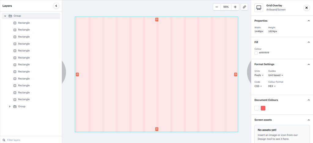
A is the invisible skeleton that holds your design together. It provides structure and order, making it easier to create clean, consistent layouts. For web and mobile design, a 12-column grid is a common standard. This number is highly divisible (by 2, 3, 4, and 6), offering tremendous flexibility for arranging content.
This structure is the foundation of responsive design. On a wide desktop screen, a main content area might take up 8 columns, with a sidebar taking up the remaining 4. On a tablet, that sidebar might stack below the main content. On a mobile phone, all elements might stack vertically, each taking up all 12 columns of the narrower screen. The grid allows you to define these rules logically, ensuring your interface looks great on any device.
Now, let's test what you've learned about putting these visual principles into practice.
What is the primary goal of visual hierarchy in UI design?
You are designing a text-heavy blog article page. According to common scanning patterns, where should you place the most important information?
Mastering these principles moves you from simply decorating a screen to architecting a user's experience. It’s a foundational skill for any serious UI/UX designer.