Typography Fundamentals for Design
Typography Basics
What is Typography?
Typography is the art of arranging text to make it legible, readable, and appealing. It involves everything from choosing a typeface to arranging letters and words on a page. Good typography guides the reader's eye and makes information easy to understand. It’s not just about making words pretty; it’s about making them work.
Effective typography establishes a visual hierarchy, provides a graphic balance to the page, and sets the product's overall tone.
When done well, typography is invisible. The reader simply absorbs the information without noticing the text's style. When done poorly, it can distract, confuse, or even prevent the reader from engaging with the content. Every choice, from the size of the letters to the space between them, impacts the user's experience.
Typeface vs. Font
People often use the terms "typeface" and "font" interchangeably, but they mean different things. Understanding the distinction is a key first step.
A typeface is the design of the lettering. Think of it as a family of related styles. For example, Helvetica is a typeface known for its clean, modern look. A font, on the other hand, is a specific style within that family. Helvetica Bold, 12-point is a font. Helvetica Italic, 10-point is another font.
An easy analogy is music. A typeface is like a song, while a font is a specific recording of that song (like an MP3 or a vinyl record).
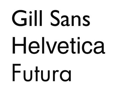
Typeface
noun
A set of design features for letters and other characters. It's the overall look of the characters.
A font is the specific file that contains the typeface in a particular size, weight, and style. In the days of metal printing presses, a font was a literal set of metal blocks for a given typeface in one size. Today, it's a digital file.
Font
noun
A specific style within a typeface family, such as a particular size, weight (e.g., bold), or style (e.g., italic).
The Anatomy of a Letter
Just like a body has a skeleton, letters have an underlying structure. Understanding the basic parts of a letterform helps you understand why different typefaces create different feelings and levels of readability. Let's look at the most fundamental elements.
Here's what those terms mean:
-
Baseline: The invisible line upon which most letters sit. It provides the anchor for all the characters.
-
x-height: The height of the main body of the lowercase letters, like 'x', 'a', and 'c'. A larger x-height can make a typeface feel more open and easier to read, especially at small sizes.
-
Ascender: The part of a lowercase letter that rises above the x-height. You can see it in letters like 'b', 'd', 'f', 'h', and 'k'.
-
Descender: The part of a lowercase letter that extends below the baseline, such as in 'g', 'j', 'p', and 'y'.
These four elements are the most basic building blocks of letter anatomy. Grasping them gives you a solid foundation for discussing and choosing typefaces.
Now, let's test your understanding of these core concepts.
What is the primary goal of good typography?
Which of the following is the best description of a "typeface"?
Understanding these fundamentals is the first step toward using typography effectively in your own work.