Typography Anatomy Explained
Introduction to Typography
What is Typography?
Every time you read a book, browse a website, or even look at a street sign, you're experiencing typography. It’s the art of arranging text to make it easy to read and visually appealing. Think of it as the 'voice' of the written word. The fonts, sizes, and spacing all work together to convey a feeling, guide your eyes, and make information clear.
Good typography doesn't just present information; it clarifies it. It can turn a confusing jumble of words into an orderly, understandable message.
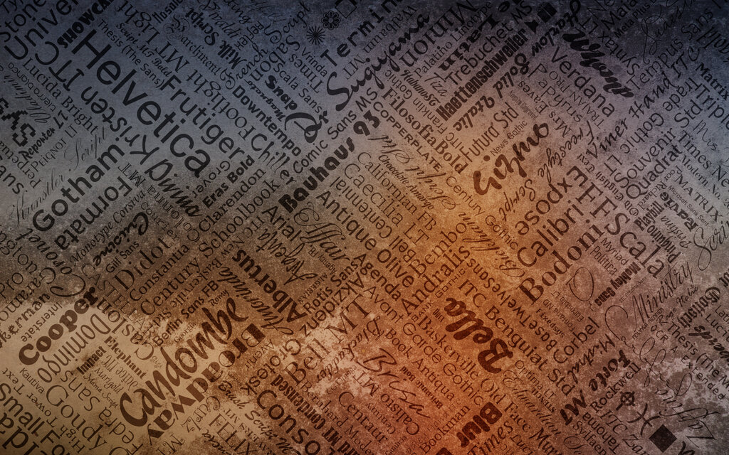
Why does it matter? Because how text looks affects how we feel about what we're reading. A wedding invitation uses elegant, flowing script. A stop sign uses bold, blocky letters. Each choice is deliberate, designed to communicate a specific message and mood quickly and effectively. Without thoughtful typography, text would be harder to understand and much less engaging.
A Quick Trip Through Time
Typography as we know it began in the 15th century with Johannes Gutenberg's invention of movable type. Before this, books were copied by hand, a slow and expensive process. Gutenberg's printing press allowed for the mass production of texts, and with it came the need to design letters that were both easy to read and efficient to produce.
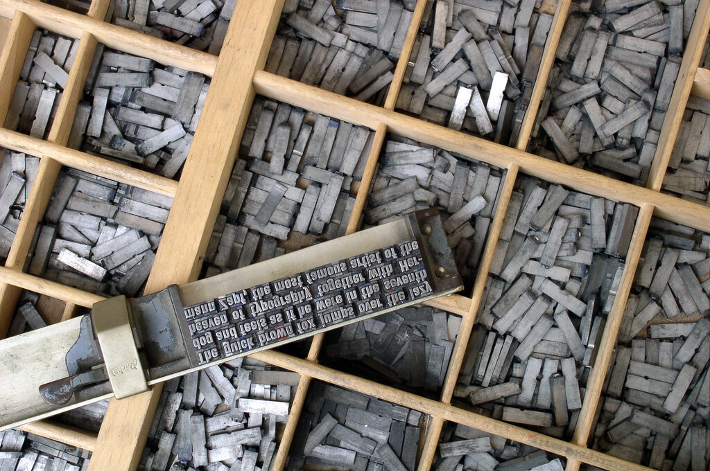
These early typefaces were modeled after the handwriting of scribes. As technology evolved, so did typography. The Industrial Revolution brought new machines and new styles of type. The 20th century saw the birth of digital fonts, which opened up endless creative possibilities. Today, designers have thousands of typefaces at their fingertips, but the core challenge remains the same: arranging them in a way that serves the reader.
The Core Principles
Effective typography boils down to a few key principles. The goal is always to create a seamless reading experience. Three of the most important concepts are legibility, readability, and aesthetics.
Legibility
noun
The quality of being clear enough to read, focusing on how easily individual letters or characters can be distinguished from one another.
Legibility is all about the design of a typeface. Can you easily tell the difference between an 'h' and a 'b', or an 'i' and an 'l'? Fonts with very thin strokes, extreme flourishes, or unconventional letter shapes can be difficult to decipher, especially at small sizes.
Which is easier to read? This is legible. vs. 𝔗𝔥𝔦𝔰 𝔦𝔰 𝔩𝔢𝔰𝔰 𝔩𝔢𝔤𝔦𝔟𝔩𝔢.
Next comes readability.
Readability
noun
The ease with which a reader can understand a written text, focusing on the arrangement of words and blocks of type.
While legibility is about individual characters, readability is about the overall reading experience. It’s how you, the designer, arrange those legible letters. Key factors include:
- Font Size: Is the text large enough to be read comfortably?
- Line Spacing (Leading): Is there enough vertical space between lines of text so they don't feel cramped?
- Line Length: Are the lines too long or too short, forcing the reader's eyes to jump around unnaturally?
- Color Contrast: Is there enough contrast between the text and the background?
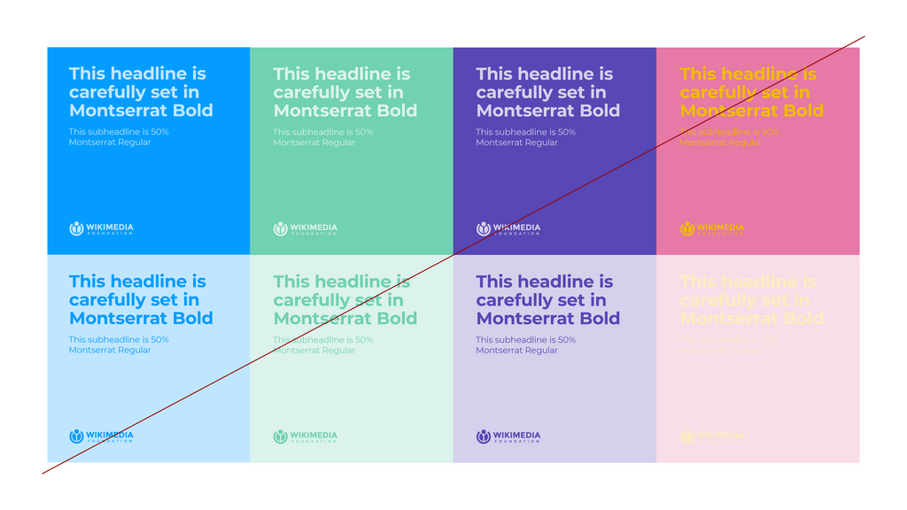
Finally, we have aesthetics. This is the visual appeal of the text. Aesthetics are subjective, but the goal is to choose typography that matches the tone and purpose of the content. A playful, rounded font might be perfect for a children's book but would feel out of place in a legal document. Good aesthetics support the message without distracting from it.
Ready to check your understanding?
What is the primary goal of typography?
The invention of movable type by Johannes Gutenberg in the 15th century was a pivotal moment in typography's history.
Understanding these basic principles is the first step in learning to see typography not just as letters on a page, but as a powerful tool for communication.