The Art and Science of Typography
Introduction to Typography
What is Typography?
Simply put, typography is the art of arranging text to make it legible, readable, and appealing when displayed. Think of it as the 'voice' of the written word. Just as the tone of your voice can change the meaning of what you say, the way text looks can change the feeling of what you read.
A friendly, rounded typeface on a birthday card feels cheerful. A sharp, bold typeface on a protest sign feels urgent. The words might be the same, but the typography gives them a different personality.
Good typography is often invisible. When it’s done well, you don't notice the font or the spacing; you just absorb the information effortlessly. When it's done poorly, reading becomes a chore. Letters might be too close together, too small, or just plain hard to read. It guides the reader's eye, creates a clear hierarchy of information, and ultimately helps the message get across without a hitch.
Typography plays a vital role in graphic design, as it involves the art of arranging typefaces to enhance readability and visual impact.
A Quick Trip Through Time
The story of typography as we know it began in the 15th century with Johannes Gutenberg and the invention of movable type. Before this, books were copied by hand, a slow and expensive process. Gutenberg created individual metal letters that could be arranged into words, sentences, and pages, then inked and pressed onto paper.
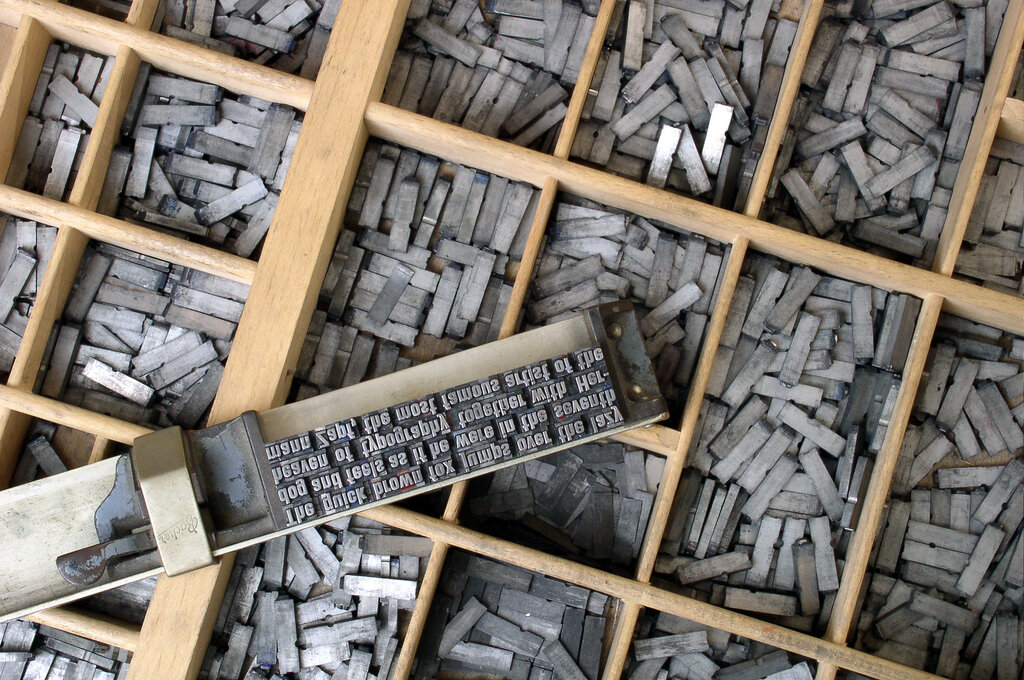
This was a revolution. For the first time, information could be mass-produced. The earliest typefaces were designed to mimic the handwriting of scribes.
For centuries, typography remained a physical craft involving metal, wood, and ink. But with the dawn of the digital age, everything changed. Today, type exists as font files on our computers. This shift has given designers an incredible amount of freedom and has made typography accessible to everyone.
The Basic Language
To talk about typography, you need to know a few key terms. People often use 'typeface' and 'font' interchangeably, but they mean slightly different things.
Typeface
noun
A design for a set of letters, numbers, and symbols. Examples include Times New Roman, Arial, and Helvetica.
Font
noun
A specific style within a typeface, such as a particular size, weight, or variant (like bold or italic).
Think of it this way: Helvetica is the typeface (like a family), while Helvetica Bold in 10-point is a specific font (a member of that family). Most typefaces can be grouped into two main categories: serif and sans-serif.
A serif is a small decorative line added to the end of a stroke in a letter. Typefaces with these lines are called serif typefaces. They often feel traditional and are common in books and newspapers.
Sans-serif, which literally means 'without serif,' refers to typefaces that lack these small lines. They look clean, modern, and are very popular for on-screen text.
Understanding these basic building blocks is the first step. They help you see how text is constructed and why certain styles are chosen for different purposes. Now, let's test your knowledge.
What is the primary goal of good typography?
What revolutionary invention from the 15th century is central to the history of typography?
Mastering these core concepts provides a foundation for exploring the wider world of visual communication.