Tableau Fundamentals
Introduction to Tableau
Why Bother Visualizing Data?
Raw data is just a collection of numbers and text. A massive spreadsheet might hold incredible insights, but in its raw form, it's often overwhelming and difficult to interpret. Trying to find trends by just staring at rows and columns is like trying to understand a city by reading a list of every street name. You have the information, but no context.
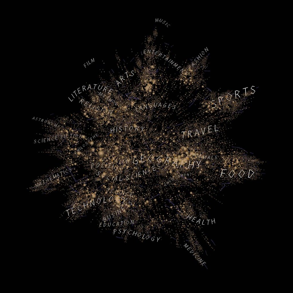
Data visualization turns that list into a map. It transforms numbers into charts, graphs, and other visual formats that our brains can process quickly. Suddenly, patterns, outliers, and connections jump out. You can see the story your data is trying to tell.
This is where tools like Tableau come in. They are designed to help you explore, understand, and communicate data visually, without needing to be a programming expert.
Tableau Software is a fast-growing data visualization tool that's making a splash in the Business Intelligence (BI) industry.
The Tableau Workspace
When you first open Tableau and connect to data, you'll see the main workspace. It might look complex, but it's organized into a few key areas that work together. Think of it as an artist's studio.
Here’s a breakdown of the key areas:
| Area | Analogy | Purpose |
|---|---|---|
| Data Pane | Your Palette | This is where all your data fields (ingredients) are listed. They are split into Dimensions (categories, like 'Product Type' or 'Date') and Measures (numbers, like 'Sales' or 'Profit'). |
| Shelves | Your Easel | These are the 'Columns' and 'Rows' areas. You drag fields from the Data Pane onto these shelves to build the structure of your chart. |
| Canvas | Your Canvas | This large central area is where your visualization appears. As you add fields to the shelves, the chart builds itself here. |
| Marks Card | Your Brushes | This controls the visual details of your chart. You can drag fields here to change colors, sizes, shapes, and labels to make your visualization more informative. |
Getting comfortable with these areas is the first step. You'll learn how they interact by simply dragging and dropping different data fields and seeing what happens on the canvas.
Connecting to Your Data
Before you can visualize anything, you need to give Tableau some data to work with. Tableau can connect to a huge variety of data sources, from simple spreadsheets to massive corporate databases.
When you open Tableau, the first thing you see is the start page. The left side of this page is the Connect pane. This is your gateway to your data.
The options are grouped by type:
- To a File: This is for common file types like Microsoft Excel, text files (like CSVs), and PDFs. For many users, this is the most common starting point. You simply select the file from your computer.
- To a Server: This section is for connecting to databases. You'll see options like Microsoft SQL Server, MySQL, Oracle, and many others. Connecting to a server usually requires credentials like a server name, username, and password.
- Saved Data Sources: If you've connected to a data source before and saved it, you can quickly access it here.
Once you successfully connect, Tableau takes you to the Data Source page. Here, you can preview your data and prepare it for analysis, for example by joining different tables together.
That's the foundation. Understanding why visualization matters, knowing your way around the workspace, and connecting to your data are the essential first steps. Now you're ready to start exploring what your data has to say.