Tableau for Consultants
Introduction to Tableau
From Numbers to Narratives
Data on its own is just a collection of facts and figures. To make decisions, you need to understand the story that data is telling. This is where Tableau comes in. It's a tool that transforms raw data into interactive, visual stories called dashboards. Instead of staring at endless spreadsheets, you can see trends, spot outliers, and explore relationships with just a few clicks.
Think of Tableau as a powerful translator. It takes the complex language of data and converts it into charts and graphs that anyone can understand.
In business consulting, speed and clarity are critical. Tableau helps consultants quickly analyze a client's data, find key insights, and present those findings in a compelling, easy-to-digest format. It bridges the gap between raw information and actionable strategy. The best part is its user-friendly, drag-and-drop interface, which means you don't need to be a programmer to start uncovering insights.
With Tableau's no-code approach, users can analyze data and create interactive dashboards without writing complex code.
Your Data's Canvas
When you first open Tableau, you're looking at its main workspace. It might seem like a lot at first, but it's organized logically into a few key areas. Understanding this layout is the first step to building your own visualizations.
Let’s break down the key components:
- Data Pane: On the left, this is where your connected data appears. Tableau automatically sorts your data fields into Dimensions (categorical data like names or dates) and Measures (numerical data like sales or quantity).
- Shelves: At the top and on the side, you'll find the Columns and Rows shelves. You drag fields from the Data Pane onto these shelves to build the structure of your chart.
- Marks Card: This is where you control the visual details of your chart. You can drag fields here to change colors, sizes, or labels.
- The View: The large central area is your canvas. This is where your visualization comes to life as you add data fields to the shelves and marks card.
Plugging In Your Data
A visualization is only as good as the data behind it. Tableau is powerful because it can connect to a huge variety of data sources. You can start with something as simple as a Microsoft Excel spreadsheet or a CSV file on your computer. For more complex projects, Tableau can connect directly to enterprise-level databases like SQL Server, Oracle, and cloud-based sources like Google BigQuery or Amazon Redshift.
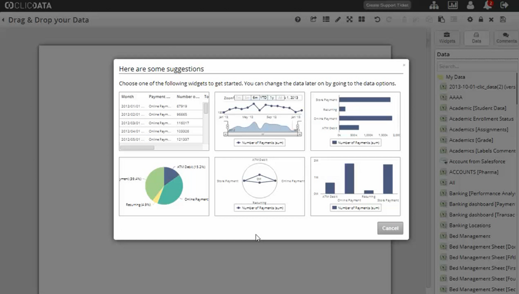
Once you select a data source, Tableau displays its contents in the Data Source page. Here, you can see all the tables and sheets from your file. You can join different tables together by dragging them onto the canvas, creating a unified data source for your analysis. This step is crucial for combining related information, like sales data from one table and customer details from another.
Simple Data Prep
Often, your raw data isn't quite ready for analysis. You might need to clean it up or create new calculations. Tableau has built-in tools for basic data preparation. As mentioned, the first thing Tableau does is separate your data into dimensions and measures.
| Type | Description | Examples |
|---|---|---|
| Dimension | Qualitative, descriptive data. Often used to categorize or 'slice' the data. | Customer Name, Product Category, Order Date, Region |
| Measure | Quantitative, numerical data. These are the numbers you want to analyze. | Sales, Profit, Quantity, Shipping Cost |
Understanding this distinction is key. You'll typically drag dimensions to rows or columns to create labels and categories, and then drag measures into the view to see the values for those categories.
Sometimes you need a field that doesn't exist in your original data. For example, you might have Sales and Profit and want to calculate the Profit Ratio. You can easily do this in Tableau by creating a calculated field. This involves writing a simple formula, like SUM([Profit]) / SUM([Sales]), to create a new, reusable measure in your Data Pane. This allows you to customize your analysis without ever changing the original data source.
What is the primary function of Tableau in a business context?
When you connect a new data source, Tableau automatically sorts the fields into what two categories?
Now that you've got the basics down, you're ready to start building your first visualizations and exploring what your data has to say.