Strategic Trading and Market Execution
Strategy Timing and Indicators
Timing Your Trades with Indicators
Identifying a chart pattern is one thing; knowing when to act is another. Technical indicators help bridge that gap by measuring the market's pulse. They analyze price action to give us clues about momentum, trend strength, and potential turning points. Think of them not as crystal balls, but as specialized tools that, when used together, can bring clarity to your trading decisions.
Gauging Momentum with RSI
The Relative Strength Index, or RSI, is a momentum oscillator. It measures the speed and magnitude of recent price changes to evaluate overbought or oversold conditions in the price of an asset. RSI is displayed as an oscillator, a line graph that moves between two extremes, and can have a reading from 0 to 100.
Traditionally, RSI is considered overbought when above 70 and oversold when below 30. An overbought signal suggests that gains are getting overextended and a pullback might be coming. An oversold signal suggests the asset has been sold off heavily and could be due for a bounce.
Be careful, though. An asset can remain overbought or oversold for long periods in a strong trend. RSI is not a standalone signal to buy or sell. It's a warning that the current move might be running out of steam.
Trend and Momentum with MACD
The Moving Average Convergence Divergence (MACD) indicator helps identify trend direction and momentum. It's built from the relationship between two exponential moving averages (EMAs), making it a trend-following momentum indicator.
It has three main components:
- The MACD Line: The difference between the 12-period EMA and the 26-period EMA.
- The Signal Line: A 9-period EMA of the MACD line itself. It's a smoothed version of the MACD line and is slower to react to price changes.
- The Histogram: The difference between the MACD line and the Signal line. The histogram gives a visual representation of the distance between the two lines.
The most common MACD signal is a crossover. A bullish crossover occurs when the MACD line crosses above the signal line, suggesting upward momentum is increasing. A bearish crossover happens when the MACD line crosses below the signal line, suggesting downward momentum is building. The histogram is above zero during a bullish crossover and below zero during a bearish one.
Measuring Trend Strength with ADX
Not all markets are trending. Some move sideways in a range. The Average Directional Index (ADX) is an indicator used to determine when the price is trending strongly. It doesn't tell you the direction of the trend, only its strength.
The ADX is plotted as a single line with values ranging from 0 to 100. A low ADX value (typically below 25) suggests a weak or non-existent trend. A high ADX value (above 25) indicates a strong trend.
| ADX Value | Trend Strength |
|---|---|
| 0-25 | Weak or Ranging Market |
| 25-50 | Strong Trend |
| 50-75 | Very Strong Trend |
| 75-100 | Extremely Strong Trend |
Using ADX helps you decide which strategy to use. In a low-ADX environment, trend-following strategies are unlikely to work well. In a high-ADX environment, you can trade with more confidence in the direction of the trend.
Spotting Divergence and Engulfing Patterns
Now let's combine our indicator knowledge with price action. Two powerful concepts are divergence and engulfing candlestick patterns. They can signal that a trend is losing steam and might be about to reverse.
Divergence
noun
A situation where the price of an asset is moving in the opposite direction of a technical indicator, such as an oscillator. It can signal a potential change in the current trend.
There are two main types of divergence:
- Bullish Divergence: Price makes a new low, but your indicator (like RSI or MACD) makes a higher low. This suggests that downward momentum is fading, and the price might reverse upwards.
- Bearish Divergence: Price makes a new high, but your indicator makes a lower high. This hints that the upward momentum is weakening, and a downward reversal could be on the horizon.
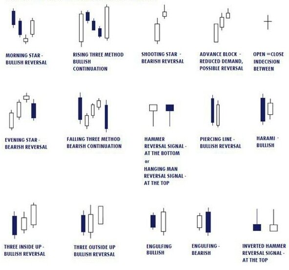
Engulfing patterns are two-candlestick reversal patterns. A Bullish Engulfing pattern forms after a downtrend when a large green candle completely engulfs the prior small red candle, signaling a potential move up. A Bearish Engulfing pattern appears after an uptrend, where a large red candle engulfs the prior small green candle, hinting at a move down.
The Power of Confluence
The key to effective indicator use is not to rely on any single tool. Instead, look for confluence, where multiple, complementary indicators give you the same signal. This increases the probability that you're making a sound decision.
For example, imagine you spot a bullish engulfing pattern at a key support level. That's one signal. If you then look at your RSI and see that it's in oversold territory and showing bullish divergence, you have a second and third signal. Finally, a bullish MACD crossover would be a fourth confirmation. This confluence of signals creates a much higher-probability trade setup than any single indicator could alone.
Combine Multiple Technical Analysis Tools: Utilize a combination of chart patterns, trendlines, support, and resistance levels, moving averages, and oscillators to enhance the accuracy of your market analysis and trading decisions.
By combining indicators that measure different things—momentum (RSI), trend (MACD), and trend strength (ADX)—along with price action patterns, you can filter out a lot of market noise and focus on the most promising opportunities.
Time to test your knowledge on these concepts.
What is the primary purpose of technical indicators according to the text?
A trader observes that a stock's price has just made a new low, but the RSI indicator has formed a higher low. What is this phenomenon called?
Mastering these tools is a process of practice and observation. They provide a framework for analyzing the market, but ultimately, they are guides, not guarantees.