Strategic Market Trading
Advanced Chart Analysis
Reading the Market's Rhythm
Price charts tell a story, but it's not always a straightforward one. The market moves in a series of pushes and pulls, a rhythm of expansion and contraction. Understanding this rhythm is the key to moving beyond basic chart reading. The two fundamental movements are impulse and corrective waves.
Impulse Wave
noun
A strong, decisive price move in the primary direction of the trend. These waves cover more price distance than the waves that move against them.
Think of an impulse wave as the market taking a determined stride forward. It's where the real momentum is. A corrective wave, or pullback, is the market catching its breath. It’s a smaller counter-move before the next push in the trend's direction. In a healthy uptrend, the upward impulse waves will be significantly larger than the downward corrective waves. The opposite is true in a downtrend. This simple observation is your first clue to the strength and direction of the prevailing trend.
Mapping the Swings
To validate the trend's direction, we need to map out its structure using swing highs and swing lows. These are the peaks and valleys the price action creates as it moves. A is a candlestick with a higher high than the candles immediately to its left and right. A swing low is the inverse: a candle with a lower low than its neighbors.
These points aren't just random noise; they are the building blocks of market structure.
- Uptrend: A series of higher highs (each peak is higher than the last) and higher lows (each valley is higher than the last).
- Downtrend: A series of lower highs (each peak is lower than the last) and lower lows (each valley is lower than the last).
When a market fails to make a new higher high in an uptrend, it’s a warning sign. When it breaks below the previous swing low, the uptrend is officially in question. This sequence is the absolute foundation of trend analysis.
By connecting these dots, you move from just seeing prices to understanding the narrative of the market.
Patterns of Pause and Reversal
Within these trends, specific formations, or patterns, often appear. These aren't magic signals, but rather visual representations of the ongoing battle between buyers and sellers. They fall into two main categories: continuation and reversal.
Continuation patterns suggest the market is just pausing before continuing its trend. Reversal patterns signal the trend might be ending and changing direction.
Common continuation patterns include flags and triangles. A flag looks like a small, sloping rectangle that forms after a sharp price move, signaling a brief consolidation. Triangles (symmetrical, ascending, or descending) show price coiling into a tighter and tighter range before breaking out, usually in the direction of the prior trend.
On the other hand, the most classic reversal pattern is the Head and Shoulders formation. This pattern appears at the end of an uptrend and consists of three peaks: a central, higher peak (the 'head') flanked by two lower peaks (the 'shoulders'). A break below the 'neckline'—a support level connecting the lows between the peaks—signals a potential trend reversal.
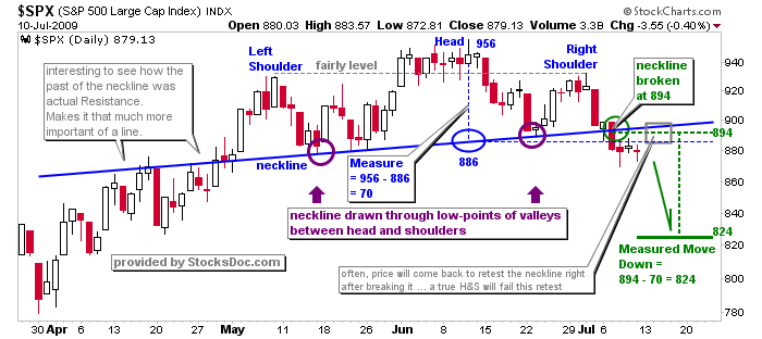
The key is context. A perfect-looking pattern forming in the middle of a choppy, directionless market is far less reliable than one appearing at a well-established support or resistance zone. Always zoom out and see where the pattern fits into the bigger picture.
Institutional Footprints
While classic patterns are useful, some of the most powerful signals come from single or two-candle patterns that reveal the activity of large institutions. These provide high-probability clues without relying on lagging indicators. Two of the most important are and inside bars.
A pin bar has a long tail (or wick) and a small body, showing that the price moved far in one direction but was forcefully rejected by opposing pressure. A bearish pin bar at a resistance level, for instance, shows that buyers tried to push the price higher but were overwhelmed by sellers. It’s a strong signal of rejection.
An inside bar is a candle whose entire range (high to low) is contained within the range of the preceding candle. It represents a pause or consolidation—a moment of indecision. A breakout from the inside bar's range, especially in the direction of the trend, can trigger an explosive move. These institutional candles are triggers. They provide precise points to plan an entry or exit, with a clear level of invalidation if the price moves against the signal.
Candlestick patterns forming at significant support or resistance levels carry enhanced reliability compared to patterns appearing in neutral market zones.
Let's review the core concepts we've covered.
Now, test your understanding of these advanced patterns and structures.
In a healthy, established downtrend, which type of price movement is expected to be larger and more powerful?
What is the most basic definition of a swing high in price action analysis?
By combining the analysis of market structure, classic patterns, and institutional triggers, you can build a robust framework for interpreting price action. This multi-layered approach allows you to read the market's story with more clarity and confidence.