Statistical Analysis for Thesis with R or Python
Introduction to R and Python
R and Python for Data
When it comes to analyzing data, two programming languages stand out: R and Python. Both are powerful, free, and widely used in academic research and industry. Think of them as two different toolkits for the same job. Each has its own strengths and way of doing things.
R and Python dominate the world of statistical analysis – these two programming languages are powerful tools that offer a range of functionalities, but they come with specific advantages for different kinds of statistical modeling tasks.
We'll start with R, a language created by statisticians specifically for statistical computing and graphics.
Getting Started with R
R's syntax can feel a bit different if you're used to other languages. For example, the most common way to assign a value to a variable is with an arrow <-.
# This is a comment in R
my_variable <- "Hello, R!" # Assigns a string to my_variable
print(my_variable)         # Prints the variable's content
R organizes data in a few key structures. The most fundamental is the vector, which is a sequence of elements of the same type.
# A numeric vector
ages <- c(25, 30, 22, 45)

# A character (string) vector
names <- c("Alice", "Bob", "Charlie", "David")
For more complex data, R uses data frames. A data frame is a table, much like a spreadsheet. Each column is a vector, and all columns must have the same length.
# Create a data frame from our vectors
people_df <- data.frame(Name = names, Age = ages)

# Display the data frame
print(people_df)
The real power of R comes from its packages. For data manipulation, dplyr is essential. It provides simple verbs to solve common data problems.
# Load the dplyr library (must be installed first)
library(dplyr)

# Use dplyr to filter for people older than 25
older_people <- filter(people_df, Age > 25)
print(older_people)
For visualization, ggplot2 is the standard. It lets you build elegant and complex graphs layer by layer.
# Load the ggplot2 library
library(ggplot2)

# Create a bar chart of people's ages
ggplot(people_df, aes(x = Name, y = Age)) + geom_col()
Exploring Python
Now let's turn to Python. It's a general-purpose language known for its clear and readable syntax. While not created just for stats, its powerful libraries have made it a favorite for data analysis.
Python has gained immense popularity in data science and statistics due to its simplicity, readability, and extensive library support.
Assigning variables in Python is straightforward, using the equals sign =.
# This is a comment in Python
my_variable = "Hello, Python!" # Assigns a string
print(my_variable)               # Prints the content
Python has several built-in data structures. A list is a collection of items that can be of different types and can be changed.
# A Python list
ages = [25, 30, 22, 45]

# A list with mixed data types
mixed_list = ["Alice", 25, True]
A dictionary stores data in key-value pairs, which is useful for labeling information.
# A dictionary representing a person
person = {
    "name": "Alice",
    "age": 25,
    "is_student": True
}

print(person["name"]) # Access the value by its key
Like R, Python's strength in data analysis comes from its libraries. NumPy is fundamental for numerical computing, providing powerful array objects.
import numpy as np

# Create a NumPy array
ages_array = np.array([25, 30, 22, 45])

# Calculate the average age
mean_age = np.mean(ages_array)
print(mean_age)
For working with tabular data, Pandas is the go-to library. It introduces the DataFrame, which is conceptually the same as R's data frame.
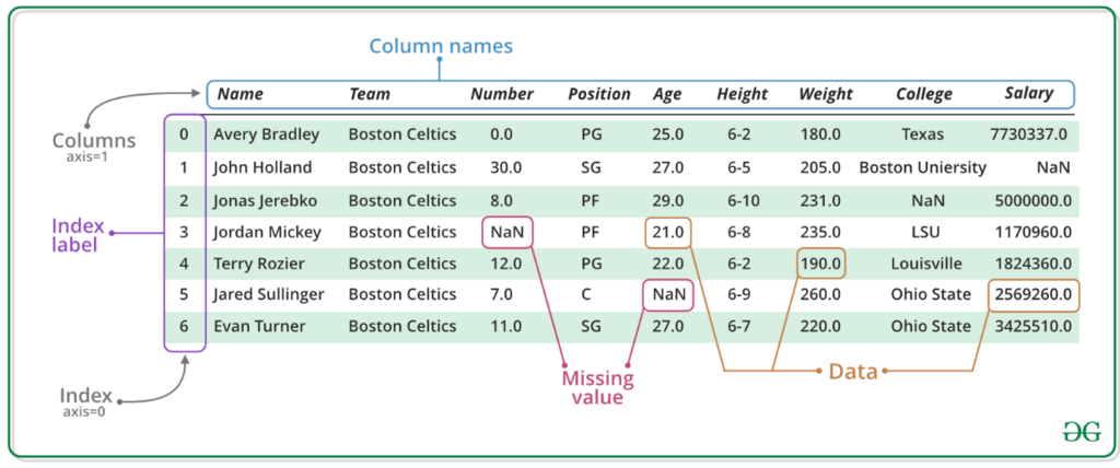
Let's create a DataFrame in Pandas.
import pandas as pd

# Create a dictionary of data
data = {'Name': ['Alice', 'Bob', 'Charlie', 'David'],
        'Age': [25, 30, 22, 45]}

# Create a DataFrame
people_df = pd.DataFrame(data)

# Filter for people older than 25
older_people = people_df[people_df['Age'] > 25]
print(older_people)
For plotting, Matplotlib is a widely used library that offers a great deal of control over your visualizations.
import matplotlib.pyplot as plt

# Create a bar chart
plt.bar(people_df['Name'], people_df['Age'])
plt.xlabel('Name')
plt.ylabel('Age')
plt.title('Ages of Individuals')
plt.show()
To recap, both R and Python are excellent choices for statistical analysis. R is highly specialized for statistics, while Python is a versatile language with powerful data science tools. Knowing the basics of both opens up a world of possibilities for your research.
Time to check your understanding.
What was the primary original purpose for which the R language was designed?
In R, the most common operator used to assign a value to a variable is <-.
With these fundamentals, you're ready to start exploring your own data.