Spotting UX Dark Patterns
Introduction to Dark Patterns
When Design Deceives
Have you ever found it surprisingly difficult to cancel a free trial? Or maybe you've ended up with an extra item in your online shopping cart that you don't remember adding. These aren't accidents. They are often the result of carefully crafted design choices intended to guide you toward an action you might not have taken otherwise.
If you’ve ever found it easier to sign up for an account than it is to cancel it, you’ve stumbled onto a dark pattern.
This practice has a name: dark patterns. It’s a term for user interfaces designed to trick people. Unlike a poorly designed site, a dark pattern is intentional. It leverages an understanding of human psychology to benefit the business, often at the user's expense.
dark pattern
noun
A user interface that has been carefully crafted to trick users into doing things, such as buying insurance with their purchase or signing up for recurring bills.
The term was coined in 2010 by UX designer Harry Brignull. He started cataloging these deceptive practices as he saw them cropping up across the web. While manipulative tactics in sales are as old as commerce itself, the digital world created a fertile new ground. With the ability to test and measure user behavior at a massive scale, companies could fine-tune their interfaces to maximize conversions, sometimes by crossing an ethical line.
The Ethical Line
Good design is persuasive. It helps users achieve their goals efficiently and enjoyably. But there’s a critical difference between persuasion and manipulation. Persuasion helps users, while manipulation exploits them. Dark patterns deliberately obscure information, create confusion, and prey on cognitive biases to push users into making choices they don't fully understand or agree with.
Dark patterns are design choices that deliberately manipulate users into making decisions that benefit the business, often at the user’s expense.
Think of it like this: A well-lit path with clear signs persuades you where to go. A poorly lit path with misleading signs and hidden obstacles manipulates you into stumbling where someone else wants you to end up. The former respects your autonomy; the latter does not.
The Cost of a Bad Experience
Using dark patterns can lead to short-term gains, like a temporary boost in subscriptions or sales. But this approach is shortsighted. When users feel tricked or disrespected, they lose trust in the brand. This erosion of trust is incredibly damaging and hard to repair.
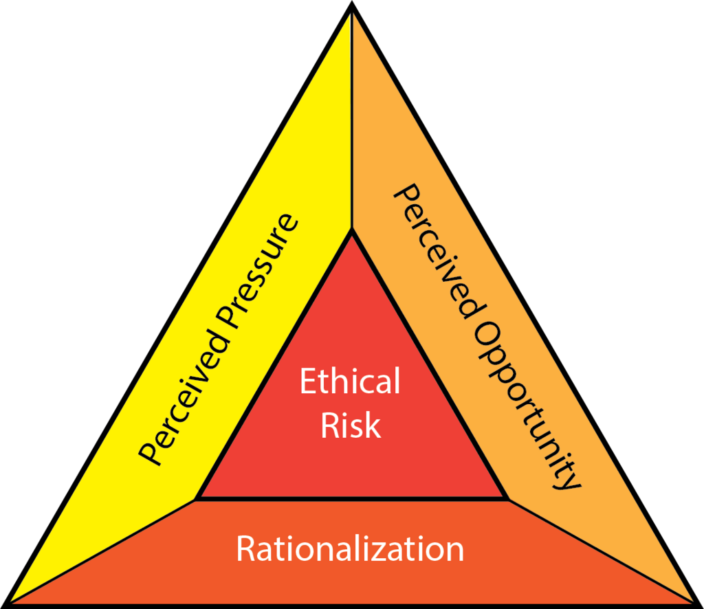
In the long run, a reputation for shady practices can drive customers away and harm a company’s bottom line far more than any temporary win. A negative experience spreads quickly, and a brand known for being manipulative will struggle to build a loyal customer base. Ethical design, which prioritizes user well-being and transparency, is the only sustainable path to success.
A good user experience is built on trust and respect. Dark patterns break that foundation.
Now, let's review the key idea from this section.
Ready to check your understanding?
What is the primary characteristic that distinguishes a dark pattern from a poorly designed user interface?
According to the text, the key difference between persuasion and manipulation in design is that persuasion helps users, while manipulation exploits them.
Recognizing these patterns is the first step toward advocating for more honest and user-friendly digital spaces.