Spotting UX Dark Patterns
Introduction to Dark Patterns
Designs That Deceive
Have you ever tried to unsubscribe from an email list, only to find yourself clicking through a maze of confusing options? Or maybe you've tried to cancel a free trial and couldn't find the 'cancel' button, but the 'upgrade to paid plan' button was everywhere. These frustrating experiences are often not accidents. They're by design.
Dark Pattern
noun
A user interface that has been carefully crafted to trick users into doing things they might not otherwise do, such as buying insurance with their purchase or signing up for recurring bills.
Dark patterns are the opposite of good user experience (UX) design. While good UX aims to help people accomplish their goals smoothly and efficiently, dark patterns create friction and confusion to benefit the business, often at the user's expense.
if you’ve ever found it easier to sign up for an account than it is to cancel it, you’ve stumbled onto a dark pattern.
A Brief History
The term "dark pattern" was coined in 2010 by UX designer Harry Brignull, who started a website to catalog these deceptive practices. But the idea of manipulative design isn't new. It grew alongside the internet itself.
As businesses moved online, their focus shifted to measurable actions: clicks, sign-ups, views, and sales. This created immense pressure to optimize websites and apps to boost those numbers. Techniques like A/B testing, which compare two versions of a page to see which one performs better, became standard. While powerful for improving user experience, these tools could also be used to find the most effective ways to trick users.
The goal shifted for some from 'How can we help the user?' to 'How can we make the user click this button?'
The Ethical Line
Good design is honest. It presents choices clearly and respects the user's autonomy. Dark patterns cross an ethical line by exploiting psychological principles to manipulate behavior. They might create a false sense of urgency, hide important information, or use confusing language to guide someone toward an unintended action.
This creates a fundamental conflict. The business wants one thing (e.g., to keep a subscriber), while the user wants another (e.g., to cancel their subscription). Instead of making the process straightforward, a dark pattern intentionally makes the user's goal difficult to achieve.
Dark patterns are inherently unethical, eroding trust between users and companies.
Imagine a grocery store where the exit signs are tiny and hidden, but bright, flashing signs point you toward aisles of candy and expensive gadgets. You'd feel trapped and manipulated. That's the effect dark patterns have in the digital world.
The Impact of Mistrust
Using dark patterns is a shortsighted strategy. A company might win a few extra clicks or prevent a handful of cancellations, but the long-term cost is severe. When users feel tricked, they lose trust in the brand. That trust is incredibly difficult to win back.
A single negative experience can sour a customer's entire perception of a company. They're less likely to return, and more likely to share their frustration with others. In the end, prioritizing a short-term metric over user trust is a losing game. Happy, satisfied users are the ones who stick around, recommend the service, and drive sustainable growth.
Thankfully, awareness of these manipulative techniques is growing among both consumers and designers. People are becoming more critical of the digital services they use, and designers are increasingly advocating for ethical practices that put the user first.
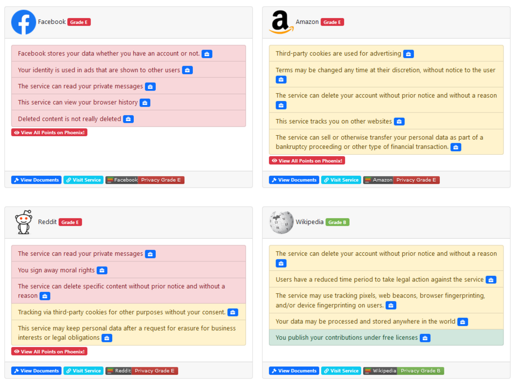
Recognizing these patterns is the first and most important step toward building a more transparent and user-friendly web.