Spotting Dark UX Patterns
Introduction to Dark Patterns
Designs That Deceive
Have you ever tried to unsubscribe from an email list, only to find the “unsubscribe” link hidden in tiny, light-gray text at the bottom of the page? Or maybe you've signed up for a free trial that seamlessly converts to a paid subscription, making it surprisingly difficult to cancel. These aren't accidents or poor design choices. They're intentional.
Dark Pattern
noun
A user interface that has been carefully crafted to trick users into doing things, such as buying insurance with their purchase or signing up for recurring bills.
These deceptive designs are called dark patterns. The term was coined in 2010 by UX designer Harry Brignull to describe interfaces created to benefit a business at the user's expense. Instead of helping users achieve their goals, dark patterns exploit common psychological biases to nudge, trick, or coerce them into making choices they otherwise wouldn't.
Dark patterns are design choices that deliberately manipulate users into making decisions that benefit the business, often at the user’s expense.
Think of it like a grocery store aisle. A well-designed aisle is wide, clearly labeled, and helps you find what you need quickly. An aisle built with dark patterns might have confusing signs, place impulse buys right at eye level, and hide the exit, all to make you spend more time and money than you planned.
Why They Matter
Dark patterns have a significant impact. For users, they can lead to frustration, wasted time, and unwanted charges. They can also trick people into sharing more personal data than they're comfortable with. Over time, these experiences teach us to be wary of digital services.
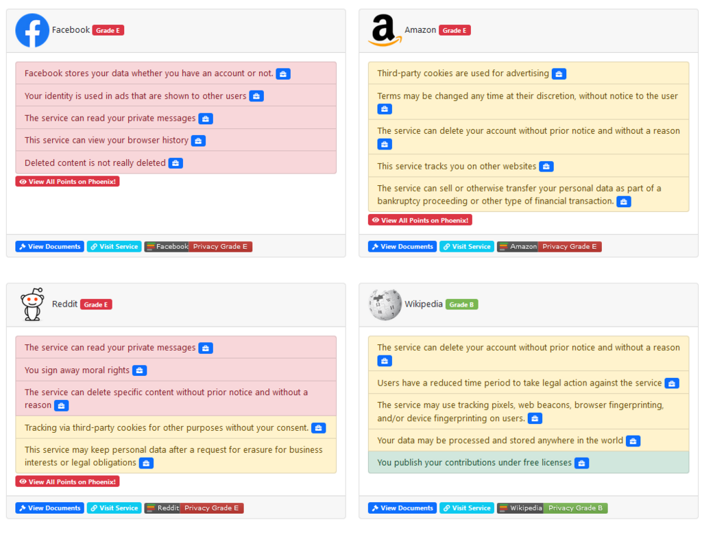
The most significant consequence of using dark patterns is the erosion of trust. When a user feels tricked, they lose confidence in the company. A business might gain a few extra clicks or subscriptions in the short term, but it risks losing a customer's loyalty for good.
This raises important ethical questions for designers and businesses. Good user experience design is about empathy and empowerment. It should make technology easier and more pleasant to use. Dark patterns do the opposite; they are fundamentally disrespectful to the user. Recognizing them is the first step toward advocating for more transparent and ethical design practices across the web.
Ethical design prioritizes the user's well-being and autonomy over business metrics.
Now, let's test your understanding of these core concepts.
What is the primary purpose of a "dark pattern" in user interface design?
According to the provided text, what is the most significant long-term consequence for a business that uses dark patterns?
By learning to spot these deceptive designs, you can make more informed choices and better protect your interests online.