Scatterplots Explained
Introduction to Scatterplots
Seeing the Connection
How do you show the relationship between two different things? For example, does the temperature outside affect how much ice cream a shop sells? To find out, you could track both values every day. You'd end up with a long list of paired numbers: one for the temperature, one for the sales.
A scatterplot takes these pairs of numbers and turns them into a picture. It’s a graph that uses dots to represent the values for two different variables. Each dot on the graph is a single observation or data point. Think of it like a map of stars. Each star's position is defined by two coordinates, and together they form a picture.
Scatter Plots are graphical representation of points plotted that show the relationship between two variables.
The Basic Components
Every scatterplot has two main parts: the axes and the data points.
The horizontal line at the bottom is the x-axis, and the vertical line on the side is the y-axis. Each axis represents one of the two variables you're comparing. For our ice cream example, the x-axis could be temperature and the y-axis could be daily sales.
Each dot, or data point, on the plot represents a single measurement of both variables. If on a day that was 85 degrees, the shop made $500, you would place a dot where the 85 on the x-axis lines up with the $500 on the y-axis.
Spotting Patterns
When you plot all your data points, you can step back and look at the overall picture they create. The main purpose of a scatterplot is to see if there's a pattern in the data. Do the points cluster together? Do they seem to form a line or a curve? Or are they just scattered all over with no clear arrangement?
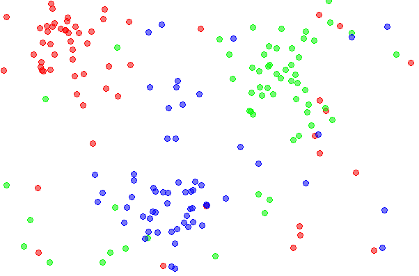
This visual pattern gives you a clue about the relationship between your two variables. For instance, if you see that the dots tend to rise from left to right, it might suggest that as one variable increases, the other one does too. We don't need to get into the details of interpreting these patterns yet. For now, the key is to recognize that the arrangement of the dots tells a story.
A scatterplot turns pairs of numbers into a picture, making it easy to spot relationships that are hard to see in a table of data.
Scatterplots are used everywhere. A doctor might use one to see the relationship between a patient's dosage of a medicine and their blood pressure. An ecologist could plot the connection between the population of a predator and its prey. A business might look at the link between advertising spending and monthly revenue. In each case, the goal is the same: to visualize the relationship between two sets of numbers.
What is the primary purpose of a scatterplot?
In a scatterplot showing daily temperature and ice cream sales, what does a single dot represent?
By understanding these basics, you're ready to start exploring how data can reveal connections in the world around you.