Rodeo Logo Design Essentials
Logo Design Basics
The Anatomy of a Great Logo
A logo is more than just a pretty picture. It's your brand's handshake, its first impression, and a symbol of its promise. Creating a powerful logo doesn't require complex software or artistic genius. It requires understanding a few core principles. Master these, and you'll be able to create or identify a logo that truly works.
Simplicity Is Strength
The most effective logos are often the simplest. Think about the world's most recognizable brands. Nike has a swoosh. Apple has an apple. McDonald's has golden arches. You can picture them in your mind instantly. That's the power of simplicity.
A simple design is easy to recognize, easy to remember, and cuts through the noise of a crowded marketplace. A complicated logo with too many colors, fonts, and shapes is like trying to shout ten different things at once. No one will understand the message. A simple logo, on the other hand, delivers a single, clear idea.
Your goal should be to distill your brand's core message into its simplest visual form. What is the one thing you want people to feel or remember?
When you start designing, ask yourself: what can I remove? Keep stripping away elements until you're left with only what's essential. This isn't about being boring; it's about being direct and confident.
Originality and Readability
Your logo needs to be unique. It's your brand's signature, and it must stand apart from your competitors. Using generic clipart or a slightly altered version of another company's logo will only cause confusion and make your brand look unprofessional. Originality builds credibility.
Take time to research your industry. See what other logos look like, not to copy them, but to ensure you create something different. The initial brainstorming phase is crucial for exploring unique ideas that genuinely represent your brand's personality.

Just as important as originality is readability. If your logo includes a name, people must be able to read it effortlessly. This applies to the font choice and the overall symbol. Avoid overly ornate scripts or abstract shapes that are hard to decipher.
A key test for readability is scalability. A great logo looks just as good on a giant billboard as it does as a tiny icon on a smartphone screen. Intricate details disappear at small sizes, leaving an unreadable smudge. Always test your design in various sizes to ensure its message is never lost.
Timelessness and Versatility
Design trends come and go, but a great logo should last. Chasing the latest fad—whether it's swooshes in the 90s or gradients in the 2010s—can make your logo look dated in just a few years. Aim for a timeless quality that will feel relevant a decade from now. This often ties back to simplicity; classic, simple forms endure.
Think of the Coca-Cola script or the Ford signature. They have been updated over the years, but their core identity remains unchanged because their original designs were timeless.
One way to create a versatile logo is to begin designing in black and white.
Versatility is also key. Your logo will be used in many different contexts: on a website, a business card, a t-shirt, or a social media profile. It needs to work everywhere. This means it must be effective in a single color (black and white) as well as in full color. A logo that relies on intricate color gradients to be understood will fail when printed on a single-color document. It should also work on both light and dark backgrounds. A versatile logo gives your brand flexibility without losing its identity.
The Psychology of Color
Color isn't just decoration; it's a powerful communication tool. The colors you choose for your logo evoke specific emotions and associations in your audience. Understanding basic color psychology can help you make an appropriate choice for your brand.
While cultural interpretations can vary, some general associations in Western cultures include:
- Red: Passion, excitement, energy, urgency. Often used for entertainment, food, or to create a call to action.
- Blue: Trust, calm, stability, professionalism. A favorite for corporate, financial, and tech brands.
- Green: Nature, health, growth, wealth. Used for organic products, environmental causes, and financial institutions.
- Yellow: Optimism, happiness, warmth. Grabs attention and projects a friendly, cheerful energy.
- Orange: Friendliness, enthusiasm, creativity. Combines the energy of red with the happiness of yellow.
- Purple: Royalty, luxury, wisdom, creativity. Often associated with high-end or imaginative brands.
- Black: Power, elegance, sophistication. A popular choice for luxury brands and modern tech companies.
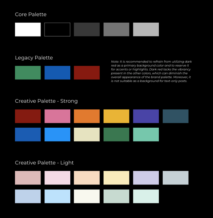
The key is to select a color palette that aligns with your brand's personality and values. Don't just pick your favorite color. Think about the message you want to send and what will resonate most with your target audience.
Now, let's test your knowledge on these foundational principles.
According to the principles of effective logo design, why is simplicity considered a primary goal?
What is the most critical test for a logo's readability and scalability?
By keeping these principles in mind—simplicity, originality, readability, timelessness, versatility, and color—you can create a logo that is not only beautiful but also a powerful asset for your brand.