Responsive Web Design Fundamentals
Introduction to Responsive Web Design
One Website, Many Screens
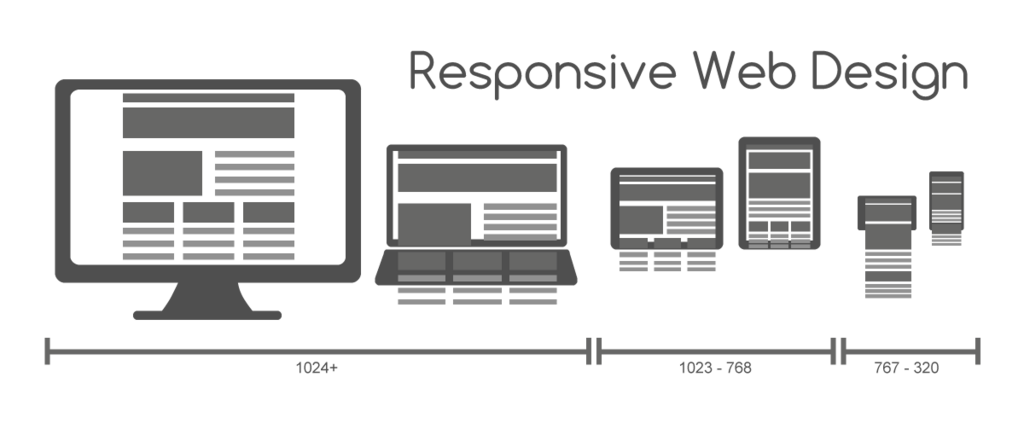
Not long ago, websites were designed for one thing: a desktop computer monitor. The screen sizes were fairly predictable, and designers could create layouts with fixed dimensions. Then came the explosion of devices. Suddenly, people were browsing on laptops, tablets, phones, and even smart TVs. A design that looked perfect on a desktop was a disaster on a tiny phone screen, forcing users to pinch, zoom, and scroll endlessly.
This created a new challenge: how do you build a single website that works beautifully on every possible screen? The answer is responsive web design.
Responsive web design is an approach that makes web pages render well on a variety of devices and window or screen sizes.
The Building Blocks
Instead of creating separate websites for different devices, responsive design uses a few core principles to make a single site flexible. Think of it like water; it doesn't have a fixed shape but instead adapts to fill whatever container it's in.
The first principle is the fluid grid. Old websites were built like brick houses, using fixed units like pixels to define the width of columns and elements. A 960-pixel-wide layout looked great on a 1024-pixel monitor, but it would be cut off on a 320-pixel phone screen.
A fluid grid, on the other hand, is built like a house of rubber bands. It uses relative units, like percentages, for widths. A sidebar might not be 200 pixels wide; instead, it's 25% of the screen width. As the screen gets smaller, the sidebar naturally slims down to match.
The second principle is flexible images. Just like the layout, images also need to adapt. If an image has a fixed width of 500 pixels, it will break the layout on a narrow phone screen. With responsive design, we tell the image to have a maximum width of 100%. This means it will never be wider than the container it's in. On a wide screen, it might show at its full size. On a narrow screen, it will shrink down to fit, preserving the layout and the user's experience.
Making It Happen
Fluid grids and flexible images provide the foundation, but how does the website know when to make bigger changes, like stacking columns vertically instead of horizontally? This is where media queries come in.
A media query is a CSS feature that allows you to apply styles based on a device's characteristics, most commonly the screen width. It's like a set of conditional rules for your website's design.
/* This is a conceptual example */

/* On screens 600px or wider, use two columns */
@media (min-width: 600px) {
  .sidebar {
    width: 30%;
  }
  .main-content {
    width: 70%;
  }
}

/* On screens narrower than 600px, stack them */
@media (max-width: 599px) {
  .sidebar,
  .main-content {
    width: 100%; /* Each takes full width */
  }
}
Using media queries, a designer can define specific breakpoints where the layout should change significantly. This ensures the site is not just a shrunken-down version of the desktop view but is truly optimized for every screen size.
This approach is now the industry standard. It ensures that no matter how a user accesses a site, they get a seamless, readable, and easy-to-navigate experience.
What is the primary problem that responsive web design aims to solve?
A designer sets a website's sidebar width to 25% instead of 300px. This is an example of which core responsive design principle?