Recipe Infographic Design
Understanding Infographics
What's an Infographic?
An infographic is a visual way to present information, data, or knowledge quickly and clearly. It combines images, charts, and minimal text to get a message across. Think of it as a story told with pictures and numbers, designed to make complex topics easy to digest.
The goal is simple: turn complicated ideas into a visual format that’s both beautiful and easy to understand.
infographic
noun
A visual representation of information or data, such as a chart or diagram.
Instead of reading a long page of text, you can glance at an infographic and immediately grasp the main points. They are powerful tools for communication because our brains are wired to process visual information much faster than text.
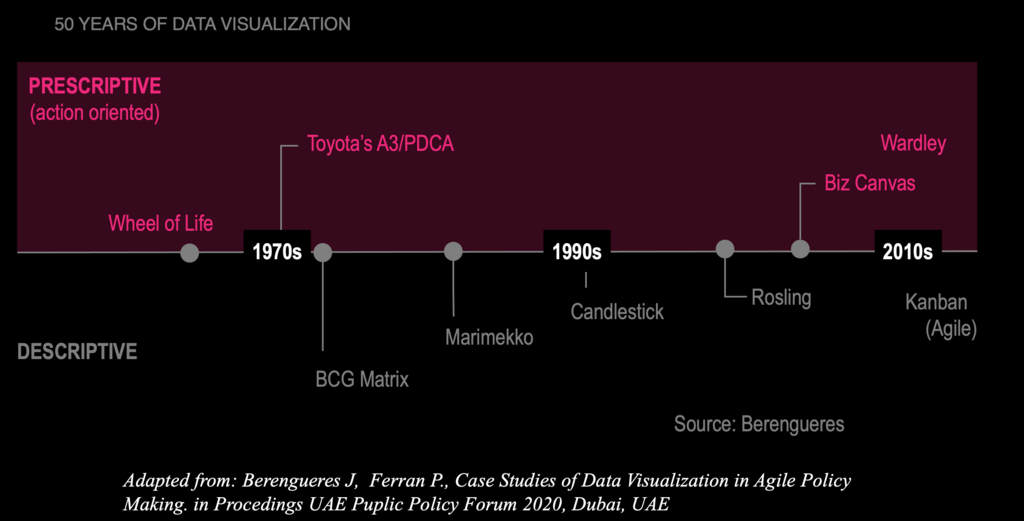
A Quick Trip Through Time
While the term "infographic" feels modern, the concept is ancient. Early humans used cave paintings to tell stories and share information. Centuries ago, maps were created to visualize land and sea. These were some of the first infographics.
However, the infographics we know today really took off with the rise of computers and the internet. Suddenly, it became much easier to create and share high-quality visuals. Data that was once stuck in spreadsheets could now be transformed into engaging, colorful charts and diagrams that anyone could understand.
Not All Infographics Are the Same
Infographics come in many flavors, each suited for a different purpose. While there are many styles, most fall into a few main categories.
Statistical infographics are all about numbers. They use charts, graphs, and other data visualizations to tell a story with data. If you want to show survey results or compare market trends, this is the type you'd use.
Informational infographics are designed to explain a concept or provide an overview of a topic. They often use icons and illustrations alongside text to break down a subject into easy-to-understand pieces.
Process infographics show a series of steps or a workflow. Flowcharts and timelines are common examples. They are perfect for explaining how something works, from a morning routine to a complex manufacturing cycle.
Why They Work So Well
The power of infographics lies in their ability to blend substance with style. They take dense, potentially boring information and make it visually appealing and easy to scan.
Using charts, graphs, and infographics to visualize data can make it easier for your audience to understand and remember your key points.
This visual approach has several key benefits:
- Better Comprehension: Visuals help clarify complex information and show relationships between different points.
- Increased Retention: People are more likely to remember information presented in a visual format.
- Higher Engagement: A well-designed infographic is more eye-catching and shareable than a block of text, especially on social media.

Ready to test what you've learned about the basics of infographics?
What is the primary purpose of an infographic?
Which type of infographic would be best for showing the results of a national population survey?
By turning data and processes into a visual story, infographics help us communicate more effectively. Understanding their purpose and types is the first step toward creating your own.