Professional Web Development with Webflow
Advanced Layout Structure
The Style Panel as Mission Control
Webflow's Style Panel is your visual command center for CSS. Instead of writing code, you're manipulating the same properties—color, font-size, margin—through a graphical interface. Since you already know CSS, think of this as a direct translator. What you click is what a developer would type.
One of its most powerful features is how it clarifies CSS inheritance. When you select an element, you'll notice styles appear in different colors. Orange text indicates a style inherited from a parent element. Blue text signifies a style applied directly to the element's class. This system instantly demystifies the nature of stylesheets, showing you exactly where a property originates without needing to inspect the code.
Mastering Space with the Box Model
The CSS Box Model is the fundamental principle of web layout, and Webflow gives you a hands-on way to control it. Every element is a rectangular box, and the Style Panel provides a diagram to directly adjust its padding, border, and margin.
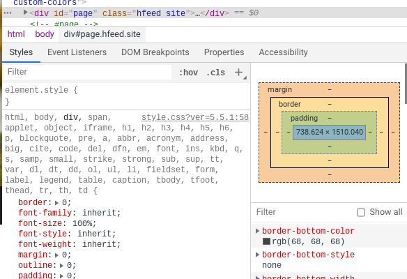
This visual approach simplifies classic CSS techniques. For example, centering a block-level element is as simple as setting its left and right margins to auto. There's no need to write margin: 0 auto;—you just select 'auto' for the sides in the panel, and Webflow handles the rest.
For more complex layouts, you can use negative margins to pull elements into the space of others, creating overlapping effects. Combined with position: absolute, you can break an element out of the normal document flow entirely. This is useful for things like custom captions on images or decorative UI elements that sit on top of other content. In Webflow, you'd set the parent element to position: relative and then adjust the child element's position from static to absolute, using the positioning controls to place it precisely.
One-Dimensional Layouts with Flexbox
Modern layouts thrive on CSS Grid and Flexbox.
is your go-to for arranging items in a single row or column. In Webflow, applying it is instant: select a parent element and set its display property to Flex. Immediately, a new set of controls appears for alignment and distribution, translating properties like justify-content and align-items into simple buttons.
These controls allow you to perfect spacing with a single click. You can nest flex containers to build complex components. For instance, a navigation bar might be a horizontal flex container, while the logo and nav links within it could be their own nested flex container to manage their internal alignment.
Two-Dimensional Power with CSS Grid
While Flexbox excels at one-dimensional layouts, CSS Grid is designed for two dimensions: rows and columns. It's the ideal tool for structuring an entire page or a complex component like a feature gallery. In Webflow, setting an element's display to Grid opens up a powerful editor that lets you visually define your grid structure.
You can add, remove, and resize grid tracks (your columns and rows) with your mouse. A key concept here is the fractional unit (fr), which represents a fraction of the available space in the grid container. This makes it incredibly powerful for responsive design.
| Unit | Behavior | Best Used For |
|---|---|---|
| fr | Takes a fraction of the remaining space. | Flexible columns that adapt to content and screen size. |
| % | Takes a percentage of the total container space. | Fixed-width columns, like a sidebar that should always be 30% of the page. |
| px | A fixed pixel value. | Gutters or columns that must never change size. |
| auto | Sizes based on the content inside it. | Columns that need to shrink-wrap their content perfectly. |
With your grid defined, you can place child elements precisely by dragging them into specific grid areas or making them span multiple cells. This combination of visual grid definition and direct element placement allows you to build sophisticated, responsive layouts much faster than writing the code by hand.
In Webflow's Style Panel, what does it signify when a style property's label is orange?
To center a block-level element horizontally within its parent container using the classic margin: 0 auto; method, what would you do in the Style Panel?