Professional UI Design Systems
Advanced Typography Hierarchy
Crafting a Typographic System
Moving beyond simply picking large, medium, and small font sizes is the key to professional design. A systematic approach ensures harmony, readability, and scalability across any device. Instead of arbitrary values, we can build a cohesive system using mathematical relationships.
A typographic scale is a pre-defined set of font sizes that relate to each other through a mathematical ratio. This creates a natural, pleasing rhythm in your text. Common ratios include the Major Third (1.250) and the Perfect Fourth (1.333). You start with a base font size, say 16px, and multiply it by the ratio to get the next size up, and so on.
| Ratio | Scale (Base 16px) |
|---|---|
| Major Third | ... 12.8px, 16px (base), 20px, 25px, 31.25px ... |
| Perfect Fourth | ... 12px, 16px (base), 21.33px, 28.44px, 37.91px ... |
| Golden Ratio | ... 9.89px, 16px (base), 25.89px, 41.89px ... |
This method gives you a consistent set of sizes for everything from tiny captions to massive headlines, ensuring they all feel like part of the same family.
Vertical Rhythm and Relative Units
Just as a musical piece has a beat, text needs a rhythm. Vertical rhythm is the practice of keeping the vertical spaces between elements consistent. This is achieved using a baseline grid, an invisible set of lines that your text sits on. The distance between these lines is typically based on the line height of your body text. Aligning all text, regardless of its size, to this grid creates a subtle, organised look that is much easier to read.
To make these systems truly flexible, we must use relative units instead of fixed pixels. The most important unit for modern typography is the rem. A is relative to the root font size of the HTML document. If the user changes their browser's default font size for better accessibility, your entire type scale adjusts automatically. Another unit, em, is relative to the parent element's font size, which can be useful but also lead to complex nested calculations. For mobile apps, you might also see sp (scale-independent pixels), which behaves similarly to rem on Android and iOS.
Using
remfor typography isn't just a best practice; it's a fundamental step towards creating accessible and user-respecting designs.
Advanced Optimisation
Beyond sizing and spacing, we can fine-tune our type for performance and clarity. are a modern evolution of traditional font files. Instead of loading a separate file for each weight (light, regular, bold, black), you load a single, compact file. This one file contains all the data needed to generate any weight or style within a defined range. This not only reduces page load times but also gives designers granular control over the precise weight, width, or slant of the text, allowing for subtle animations and perfect adjustments.
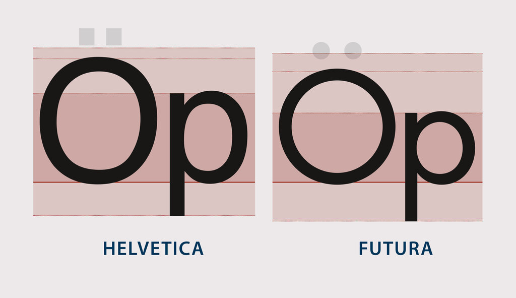
Another crucial concept is optical sizing. A letter 'H' designed for a 72pt headline is not simply a scaled-up version of an 'H' for 10pt body text. At large sizes, character strokes can be finer and spacing tighter. At small sizes, they need to be thicker and more open to remain legible. Good typefaces are designed with these optical adjustments in mind. Some variable fonts even include an 'optical size' axis that automatically adjusts the letterforms as the font size changes.
Finally, to manage this complex system in a design or development workflow, we use semantic naming for our typography styles, often called s. Instead of naming a style "16px-regular", you'd name it body-text-default. Instead of "32px-bold-blue", it might be headline-primary. This abstracts the style from its specific properties. If you decide to change the primary headline font or colour, you only change the token's value, and it updates everywhere it's used. This makes redesigns and maintenance dramatically more efficient.
Let's test your understanding of these advanced typographic systems.
What is the primary purpose of a typographic scale?
In CSS, the rem unit is relative to the font size of the _______.
By combining mathematical scales, vertical rhythm, relative units, and semantic tokens, you can create typographic systems that are not only beautiful and readable but also robust, scalable, and accessible.