Professional Graphic Design Systems
Complex Grid Systems
From Anatomy to Structure
In fine art and anatomy, you've mastered the organic flow of the human form. You know how to create balance and guide the eye through a composition intuitively. Digital design requires that same intuition, but channels it through a more rigid, mathematical framework: the grid. This isn't about replacing your artistic eye; it's about giving it a new language to speak in, a way to translate natural rhythm into a structured, scalable system.
Think of a grid not as a cage, but as a skeleton. It provides the underlying structure that supports the entire composition, ensuring every element has its place and relates to the whole.
We'll start with one of the most versatile systems: the modular grid. This approach divides the page into a series of consistent, repeating modules—uniform rectangular units that combine to form columns and rows. By designing within these modules, you can create a clean, organized layout where everything from text blocks to images feels like it belongs. It's the key to handling complex information without creating chaos.
While modular grids organize space horizontally and vertically, baseline grids focus exclusively on vertical rhythm. A baseline grid is a series of evenly spaced horizontal lines that run across the page. The idea is simple: the baseline of every line of text, from headings to captions, should snap to one of these grid lines. This creates a subtle but powerful sense of order and harmony, much like the consistent rhythm in a piece of music. It stops text from feeling like it's floating randomly and ensures a smooth reading experience, especially in multi-page documents or long-form web articles.
Establishing Hierarchy
Not all content is created equal. A headline needs to shout, while body copy should speak clearly and image captions should whisper. Hierarchical grids are designed to manage this variety. Instead of uniform modules, they create distinct zones for different types of content. You might have a wide area for a hero image, a narrower multi-column section for articles, and a small, fixed area for navigation.
This approach gives you control over the visual flow. You can use the grid to establish a clear path for the user's eye, drawing attention to the most important elements first. It's a systematic way to apply the compositional principles you already know from art. The Swiss graphic designer was a pioneer of these flexible systems, creating what he called "programmes"—grids that could adapt to any content while maintaining a coherent structure.
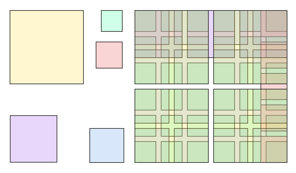
Think of a website's layout. A common hierarchical grid would be a 12-column structure. The main article might occupy the central 8 columns, while a sidebar with related links takes up the remaining 4. The header and footer would span all 12 columns. This division creates a clear hierarchy and ensures a balanced, readable page. The same logic applies to print, from magazines to brochures.
Mathematical Rhythm
The spaces between your content are just as important as the content itself. (the space between columns), margins (the space around the edge of the page), and columns work together to create a visual rhythm. Consistent spacing is the key to a professional and uncluttered design.
This is where the mathematical side of grids comes in. A common practice is to establish a base unit of measurement, say 8 pixels, and make all spacing a multiple of that unit. A gutter might be 16px (8 x 2), a margin 24px (8 x 3), and so on. This creates a consistent, mathematical relationship between all the elements on the page, resulting in a design that feels cohesive and intentional.
Grids have a long and varied history in design, from the earliest books, through movements like constructivism and the International Typographic Style, right up to the present-day popularity of grids in frameworks like Bootstrap and material design.
Your background in anatomy gives you an advantage. You understand proportion and the relationship between parts of a whole. A grid simply provides a new vocabulary for those same principles. It's not about forcing organic shapes into rigid boxes, but about using a logical structure to present complex information clearly and beautifully. The grid is your tool to bring order and rhythm to the digital canvas.
What is the primary function of a modular grid?
The practice of aligning the bottom of every line of text to a series of evenly spaced horizontal lines is the principle behind which type of grid?