Professional Graphic Design Practice
Advanced Grid Systems
Beyond Simple Columns
You already know how to use basic column grids to bring order to a layout. But when you're dealing with complex information hierarchies, like in a magazine, a dense website, or a data-heavy report, a simple set of columns isn't always enough. To manage this complexity, designers turn to more sophisticated grid systems.
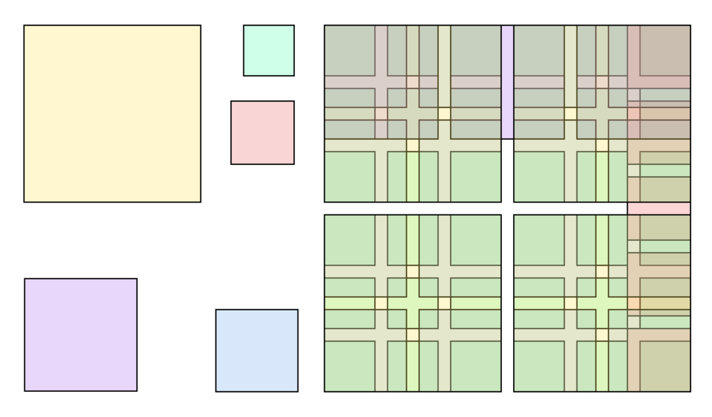
The first step up is the modular grid. Instead of just vertical columns, a modular grid adds horizontal rows to the mix. The intersection of rows and columns creates small rectangular units called modules. These modules act as building blocks for your layout. You can group them together to form larger content blocks, or use them individually for smaller elements. This system provides more granular control and flexibility than a simple column grid.
Modular and Compound Grids
Working with a modular grid allows you to create spatial zones for different types of content. A block of four modules might be perfect for a primary image, while a single column of modules could house a caption or a pull quote. The consistency of the module size ensures that even with varied content, the overall page feels unified and intentional.
This approach was a hallmark of the (or Swiss Style), which championed clean, objective, and highly structured design. Designers like Josef Müller-Brockmann and Karl Gerstner used modular grids to create layouts that were not only beautiful but also incredibly clear and functional.
For even more complex layouts, you can use a compound grid. This is simply the practice of using more than one grid on a single page. For example, the main body of an article might follow a 12-column modular grid, while a sidebar uses a simpler 3-column grid. The key is to ensure the different grids still relate to each other, perhaps by sharing the same overall margins or vertical divisions.
Finding Your Rhythm
Grids don't just organize horizontal space. A brings order to the vertical dimension, creating what designers call vertical rhythm. It's an invisible set of equally spaced horizontal lines that run down the page. The idea is to align the baseline of every line of text to this grid.
When text is aligned to a baseline grid, the result is a clean, calm, and professional-looking page. It eliminates visual jarring that occurs when text in adjacent columns doesn't line up, making the content easier and more pleasant to read.
The spacing of your grid can be arbitrary, but many designers use mathematical ratios to create harmonious proportions. Ratios like the Golden Ratio (approximately 1:1.618) or simpler ones like 2:3 or 3:5 have been used for centuries in art, architecture, and design to create compositions that feel naturally balanced and aesthetically pleasing. You can use these ratios to determine column widths, margin sizes, or the relationship between a header and body text.
Bending the Rules
Once you've mastered the structure of the grid, you can learn how to break it intentionally. Breaking the grid means allowing an element, like an image or a headline, to cross over column lines or ignore the baseline grid. This isn't a mistake; it's a deliberate choice to create a focal point, add dynamism, or draw attention to a specific piece of content. The effect is most powerful when the rest of the layout strictly adheres to the grid, making the break a clear and impactful gesture.
While some designers actively eschew grids in favour of a more intuitive, freeform layout, the most successful do so having worked with grids for years – they understand the rules before they break them.
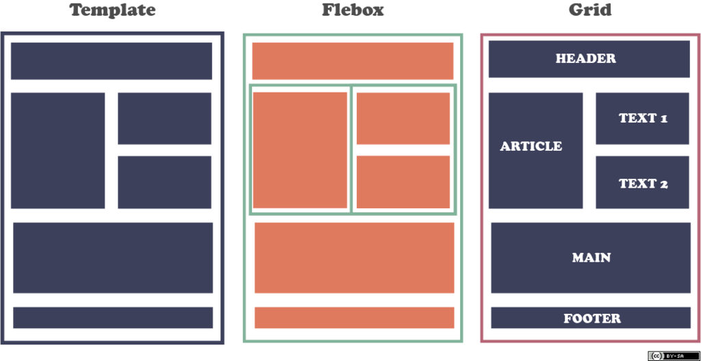
Finally, in the digital world, grids must be responsive. A layout that looks perfect on a large desktop monitor will be unusable on a mobile phone. This is where modular grids truly shine. On a desktop, you might have a 12-column grid with multiple content zones side-by-side. On a tablet, those zones might reflow to a simpler layout. On a mobile device, they might stack vertically into a single column. The underlying grid system provides the logic for how content should adapt across different screen sizes, ensuring a consistent and usable experience for everyone.
Let's review the key concepts we've covered.
Ready to test your knowledge?
What is the primary purpose of a baseline grid?
In a modular grid, the small rectangular units created by the intersection of columns and rows are known as ______.
By mastering these advanced grid systems, you move from simply organizing content to truly orchestrating it, creating dynamic, professional, and responsive designs.