Professional Graphic Design Mastery
Advanced Visual Hierarchy
Beyond the Grid
You've already mastered grids and alignment. You know how to bring order to a composition. But professional design isn't just about tidiness; it's about control. It’s about creating a narrative path that guides a viewer's eye from one point to the next, exactly as you intend. This is where we move from simply arranging elements to truly composing them.
This involves a more intuitive understanding of how people perceive visual information. We'll explore how to use psychological principles to group elements, create balance that feels right rather than just looking mathematically correct, and strategically break the rules to make a powerful statement.
Your Brain on Design
Your brain is a natural pattern-matching machine. It automatically groups similar objects, closes gaps to form complete shapes, and connects elements that follow a clear path. Designers leverage these shortcuts, known as , to build clear hierarchies without cluttering a layout with lines and boxes.
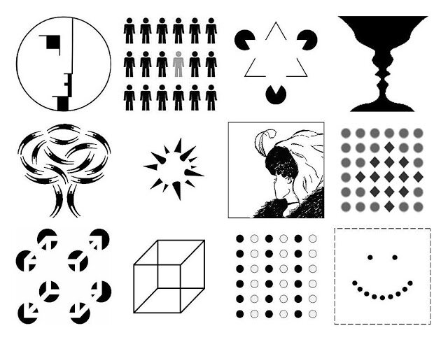
Think about a complex dashboard. Proximity groups related metrics together. Similarity, maybe through color or shape, links all interactive buttons. The principle of continuation uses invisible lines to guide your eye from a headline to its related text, then to an image. These aren't just aesthetic choices; they are functional tools for reducing cognitive load.
Good design uses Gestalt principles to make complex information feel simple and intuitive. The user shouldn't notice the structure, only the clarity.
The Feeling of Balance
Mathematical balance is easy. You can center an object in a frame with perfect precision. But does it always look centered? Often, it doesn't. This is the difference between mathematical and optical balance.
Our eyes perceive visual weight in complex ways. A dark, dense object feels heavier than a light, airy one of the same size. A triangle, for instance, has its visual center of gravity closer to its wide base. If you mathematically center it based on its geometric midpoint, it will appear to be falling. To achieve , you have to nudge it slightly higher to account for its perceived weight.
This principle applies to entire layouts. A page with a large, dark image at the top and light text at the bottom will feel top-heavy and unbalanced. Strategic use of white space can counteract this, providing a visual cushion that restores the feeling of equilibrium.
Weaponizing White Space
White space isn't empty space; it's active space. It's a tool for directing attention, creating relationships, and establishing rhythm. By surrounding an element with generous negative space, you elevate its importance. You're telling the viewer, "Look here. This matters."
In a dense layout, like a magazine spread or a complex webpage, white space can also be used to create pathways. Think of it as creating rivers and channels that guide the eye through the content. A wider channel of space can separate major sections, while smaller streams can separate paragraphs or related items within a group.
Sometimes, the most impactful move is to break the grid. After establishing a strong, consistent structure, intentionally placing one element outside of it creates immediate tension and focus. A photo that bleeds off the edge or a quote that breaks the column alignment can't be ignored. This technique should be used sparingly to maintain its power. If everything is emphasized, nothing is.
A successful designer will think carefully about these rhetorical purposes and use basic design principles to engage the audience’s attention, to draw their eyes to certain parts of the page, and to create a sense of order and direction that helps the reader process the information and follow the steps you’ve outlined for them.
Let's test your understanding of these advanced concepts.
A designer places a heading and its corresponding paragraph very close together, and then adds significant extra space before the next heading/paragraph pair. Which Gestalt principle is primarily being used to group the related content?
Why might a dark-colored square placed at the exact geometric center of a light-colored canvas appear to be slightly off-balance?
Mastering these techniques transforms you from someone who arranges content into someone who directs attention. It's the core of effective visual communication.