Professional Framer Web Design
Mastering Advanced Layouts
Beyond the Basics: Fluid Layouts
You've mastered the Framer canvas. Now it's time to build layouts like a professional. This means moving beyond fixed-pixel designs and embracing a more dynamic approach. Think of your content not as static blocks, but as water flowing into different containers. The layout's job is to define the shape of those containers, ensuring the content adapts perfectly to any screen size.
Stacks, Grids & Absolute Positioning are the three main layout tools in Framer.
Mastering Stacks and Grids is the key to this fluidity. By nesting these elements and using responsive sizing rules, you can create complex, resilient designs that look precise on an iPhone or an ultrawide monitor without manually adjusting every breakpoint.
Nesting Stacks for Structure
Stacks are your workhorse for linear layouts, either horizontal or vertical. The real power comes from nesting them. Imagine a typical webpage layout: a main vertical stack for the page itself, containing a horizontal navigation stack at the top, a content section, and a footer stack at the bottom. The content section might itself be a horizontal stack containing a sidebar and a main content area.
This hierarchical structure is the foundation of responsive design. Instead of thinking about individual elements, you think about the containers they live in. Changes made to a parent stack, like adjusting its alignment or distribution, will cascade down to all the child elements within it. This creates predictable and maintainable layouts.
This modular approach makes updates simple. Need to add another navigation link? Just drop it into the 'Nav' stack. Need to reorder the sidebar and content? Just change the direction of the 'Main' stack. You are manipulating containers, not pushing pixels.
Sizing: Relative, Fill, and Hug
How elements size themselves within these containers is crucial. Framer provides three primary methods that replace manual pixel-pushing.
-
Hug Contents: The element sizes itself to be just big enough to contain its children. This is perfect for components like buttons or tags, where the container should grow or shrink based on the text label inside it. The size is determined from the inside out.
-
Fill: The element expands to fill all available space within its parent container. If you have three elements in a horizontal stack and set all of them to 'Fill', they will each take up one-third of the parent's width. This is the workhorse of fluid design. The size is determined from the outside in.
-
Relative: This sets the size as a percentage of the parent container's dimension. Setting a width of 50% means the element will always occupy half of its parent's width, regardless of the screen size.
| Sizing Type | Behavior | Best Used For |
|---|---|---|
| Hug Contents | Sizes to fit its internal content. | Buttons, text labels, dynamic components. |
| Fill | Expands to occupy available space in the parent. | Main layout sections, columns, background panels. |
| Relative (%) | Sizes as a percentage of its parent container. | Creating proportional relationships, like a 50/50 split. |
Effective layouts mix these types. A common pattern is a full-width parent stack containing a child 'content' frame. The parent might be set to 100% width, but the child frame inside uses a max-width of 1200px and is centered. This prevents your content from stretching uncomfortably on very wide screens, a key strategy for professional web design.
Unlocking Grids
When you need to arrange content in two dimensions, CSS-style Grids are the answer. They are perfect for things like photo galleries, dashboards, or the increasingly popular bento grid layouts. Unlike stacks, grids allow you to define explicit columns and rows.
A powerful feature of Framer's grids is the use of fractional units (fr). An fr unit represents a fraction of the available space in the grid container. If you define a two-column grid with widths of 1fr and 2fr, the second column will always be twice as wide as the first, no matter the total width of the container. This makes creating complex, proportional layouts incredibly intuitive.
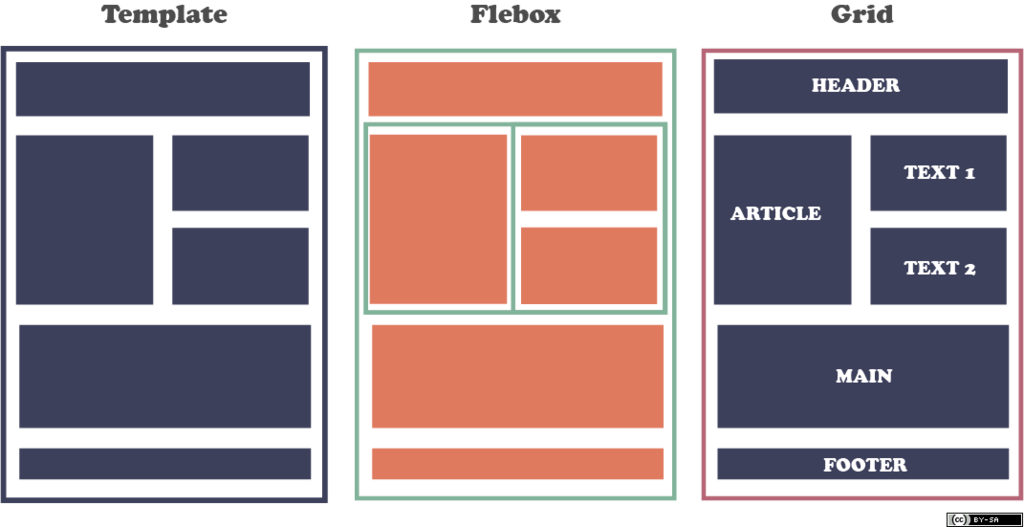
You can also control exactly where an item is placed within the grid by defining its start and end rows and columns. This allows for items to span multiple cells, creating sophisticated and asymmetrical designs that remain perfectly responsive.
Breakpoints work as you'd expect, but with a philosophy of inheritance. Styles on the desktop breakpoint cascade down to tablet and phone unless you create an override. A good practice is to perfect your layout on the desktop, then adjust for smaller screens. For a grid, this often means reducing the number of columns, causing items to stack vertically.
By combining these advanced layout tools—nested stacks, powerful sizing options, and flexible grids—you can build any modern web layout you can imagine. The goal is to create a robust system that handles responsiveness automatically, freeing you to focus on the design itself.
Now let's review what you've learned about these layout techniques.
Ready to test your knowledge?
What is the primary advantage of using nested stacks for building a webpage layout in Framer?
You are creating a button component where the text label will vary in length. Which sizing property should you apply to the button's main frame to ensure it always fits its text snugly?
With these concepts, you're well-equipped to build responsive, professional-grade layouts in Framer.