Product Design Whiteboarding Mastery
Introduction to Visual Communication
Communicating with Pictures
Before you can read, you can understand pictures. A drawing of a smiling face means happiness. A red stop sign means stop, no matter what language you speak. This is visual communication: conveying ideas and information using images, colors, and text. It's a universal language that our brains process incredibly fast, much faster than written words.
For product designers, this isn't just a nice skill to have; it's fundamental. When someone uses an app or a website, they aren't reading a manual. They're following visual cues. A well-placed button, a clear icon, or a readable font can make the difference between a frustrating experience and an intuitive one. Good visual communication guides the user, builds trust, and makes technology feel more human.
Design is more than aesthetics; it’s about communication.
The Basic Ingredients
Every visual design, from a simple logo to a complex app interface, is built from a few core elements. Understanding these ingredients—color, typography, and imagery—is the first step to communicating effectively.
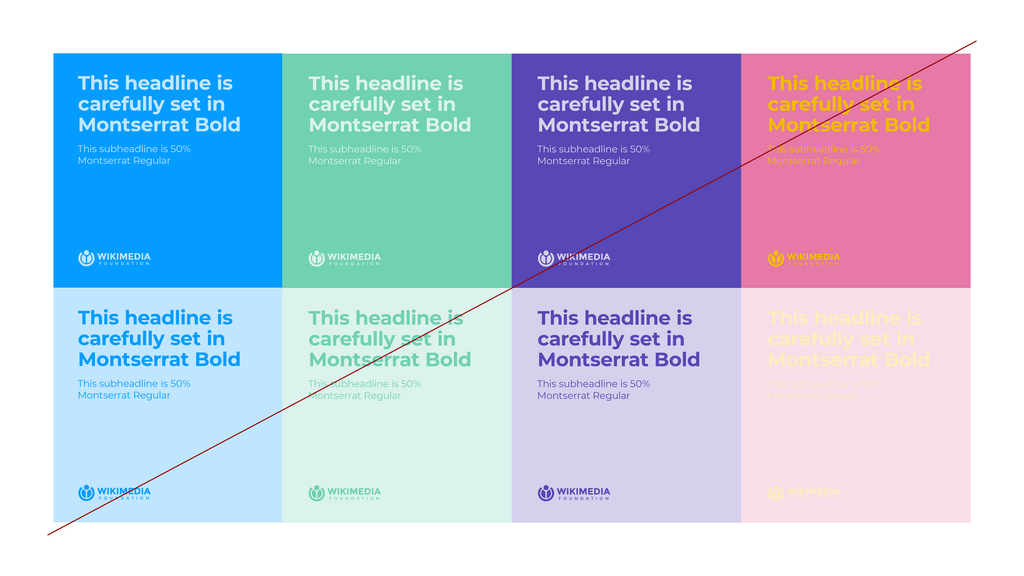
Color is never just decoration. It carries emotional and psychological weight. Think about traffic lights: red means stop, green means go. We're conditioned to associate colors with specific meanings. In design, blue often suggests trust and security (think of banking apps), while red can create a sense of urgency or alert you to an error. The colors you choose will profoundly affect how users feel about your product.
Beyond emotion, color contrast is critical for usability. If text doesn't stand out clearly from its background, it's difficult to read, making your product inaccessible for many users.
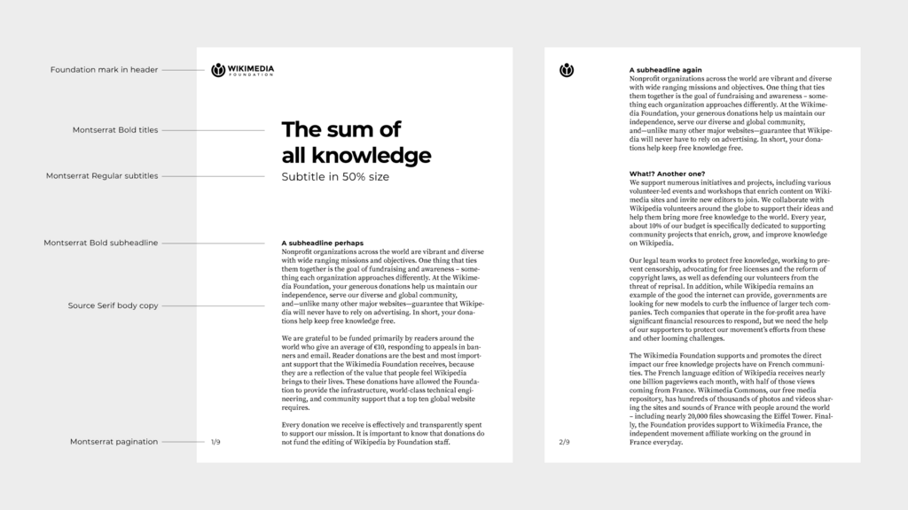
Next is typography, which is the style and appearance of text. The fonts you choose have personalities. A serif font (with small lines attached to the letters, like Times New Roman) can feel traditional and trustworthy. A sans-serif font (without those lines, like Arial) often feels more modern and clean.
But typography is more than just picking a font. It's about creating a clear visual hierarchy. By using different sizes, weights (like bold), and styles, you can guide a reader's eye. The most important thing on a page, like a headline, should be the biggest and boldest. Subheadings should be smaller, and body text smaller still. This structure helps users scan information quickly and understand what's most important.
Finally, we have imagery. This includes photographs, illustrations, and icons. An image can tell a story, set a mood, or explain a complex concept in an instant. A friendly illustration can make an empty screen feel more welcoming, while a sharp, professional photograph can build credibility. Icons are a powerful tool for navigation. A magnifying glass icon universally means "search," and a shopping cart means, well, a shopping cart. Good imagery makes an interface clearer and more engaging.
Creating a Clear Message
These elements don't work in isolation. Great visual communication happens when color, typography, and imagery all work together to support the same message. A playful, rounded font might not fit with a serious, corporate color scheme. A minimalist icon style would clash with ornate, classical illustrations.
The goal is to create a cohesive experience where every visual element feels like it belongs. This consistency not only looks professional but also makes your product easier to learn and use. When users know what to expect from your design, they can navigate with confidence. By mastering these basic principles, you can create designs that don't just look good, but also communicate with clarity and purpose.
Why is visual communication considered a fundamental skill for product designers?
In user interface design, what emotion or concept is the color blue often used to suggest?