Product Animation Design
Introduction to Animation Principles
The Language of Movement
Animation in digital products isn't just decoration. It’s a form of communication that can guide, inform, and delight. When done well, it makes an interface feel intuitive and alive. When done poorly, it can be distracting and frustrating.
The foundation for great digital animation comes from a surprising place: classic cartoons. In the 1930s, animators at Disney developed a set of guidelines to create more realistic and expressive characters. These became known as the 12 principles of animation.
The 12 principles of animation are essential guidelines for creating lifelike and engaging animations.
While originally for hand-drawn films, these principles are perfectly suited for designing user interfaces. They help us create motion that feels natural and purposeful, turning a static screen into a responsive experience.
Key Principles in Action
You don't need to master all 12 principles at once. A few key ones provide the biggest impact in UX design. Let's look at how they work.
Squash and Stretch This principle gives objects a sense of weight, mass, and flexibility. Think of a bouncing rubber ball. It squashes when it hits the ground and stretches just before and after impact. This slight distortion makes the motion feel more dynamic and real.
In a user interface, this can be subtle. When you tap a button, it might compress slightly, like a physical button being pushed. This provides immediate, satisfying feedback that the tap was registered.
Anticipation This is the preparation for a major action. Before a character jumps, they bend their knees. Before they throw a punch, they wind up their arm. Anticipation signals to the viewer what is about to happen, making the action clearer and more powerful.
In UX, anticipation can prepare the user for a change on the screen. For example, an icon might shrink slightly before it expands into a new menu. This small preparatory motion draws the eye and communicates that a transition is about to occur, so the user isn't surprised by a sudden change.
Timing and Spacing Timing refers to the speed of an action, determined by the number of frames between poses. Spacing refers to how the object's position changes between those frames. Together, they define how an object moves and communicates its weight and personality.
A menu that slides into view quickly feels snappy and efficient. If it slides in slowly, it might feel more elegant or even sluggish. The right timing makes an interface feel responsive and aligned with the user's expectations.
Ease In and Ease Out Most objects in the real world don't start or stop moving abruptly. A car accelerates from a stop and decelerates before halting. This principle, also known as "slowing," mimics that natural acceleration and deceleration. Movement starts slowly, picks up speed, and then slows down before stopping.
Animations without easing feel robotic and unnatural. When a notification slides onto the screen and gently slows to a stop, it feels smooth and polished. This is one of the most important principles for making UI motion feel organic and less jarring.
Animation with a Purpose
In product design, every animation should have a clear purpose. Motion isn't just for show; it's a powerful tool for improving the user experience.
Every animation you implement in your user interface design should have a purpose.
Here are some of the key roles animation plays:
-
Providing Feedback: Motion can instantly confirm that the system has received a user's input. When you tap a button and it glows or changes shape, you know your action was successful. A loading spinner tells you the app is working on your request.
-
Guiding Focus: Animation can direct the user's attention to what's important. When a new screen slides in from the right, it subtly tells the user that the previous screen is to the left, showing the spatial relationship between different parts of the app.
-
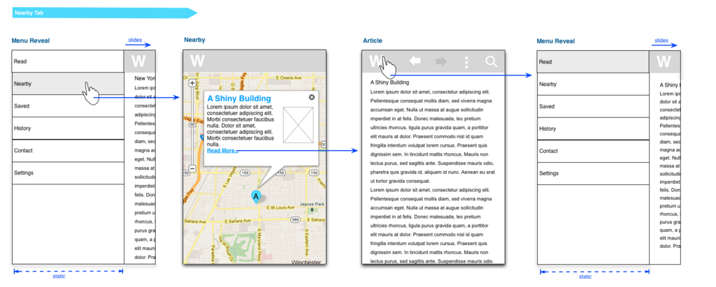
Revealing Information: Instead of showing everything at once, you can use animation to reveal options as they become relevant. Tapping a hamburger menu icon might cause navigation links to slide out, keeping the interface clean until those options are needed.
-
Adding Character: Beyond pure function, animation gives a product personality. The fun, bouncy animations in a language-learning app can make the experience feel more playful and encouraging. The sleek, fast transitions in a productivity app can make it feel more professional and efficient.
By applying the basic principles of animation, you can create interfaces that not only look good but also feel responsive, intuitive, and human.
Time to check your understanding of these core concepts.
The foundational principles for modern UI animation originally came from which field?
A button that slightly compresses when tapped provides immediate feedback to the user. This is an application of which animation principle?
Understanding these foundational ideas is the first step toward using motion to build better, more engaging products.