Persuasive Data Visualization
Introduction to Data Visualization
What is Data Visualization?
Data visualization is the art of turning numbers and text into pictures. Think of it as a translator for data. It takes complex, raw information and transforms it into charts, graphs, and maps that our brains can understand in a glance.
Why bother? Imagine trying to find a single friend's name in a phone book with ten million entries. It would take ages. Now, imagine if your friend's name was the only one written in bright red ink. You'd spot it instantly. That's what data visualization does. It makes the important parts of the data pop out, revealing patterns, trends, and outliers that would otherwise stay hidden in spreadsheets.
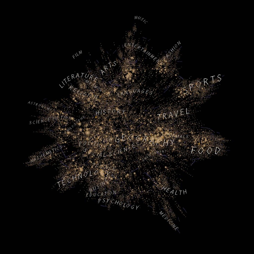
The main goal is to communicate information clearly and efficiently. A good visual tells a story. It can show how sales have grown over a year, which parts of a city have the most traffic, or how different variables relate to one another. By representing data visually, we can make faster, more informed decisions.
The purpose of data visualization is to present complex data in a way that is clear to understand and engages audiences.
Guiding Principles
Creating effective visualizations isn't just about making pretty pictures. It's about communication. To do it well, we need to follow a few key principles.
Clarity is King Your audience should be able to understand the main point of the visualization within seconds. If they have to spend five minutes deciphering your chart, it has failed. Use clear labels, logical layouts, and titles that explain what the viewer is looking at. The message should be unmistakable.
Simplicity is Power Less is almost always more. Every element in your visualization—every color, line, and label—should serve a purpose. Get rid of anything that doesn't add to the understanding of the data. This is often called removing 'chart junk'. A simple, clean design is easier to interpret and looks more professional.
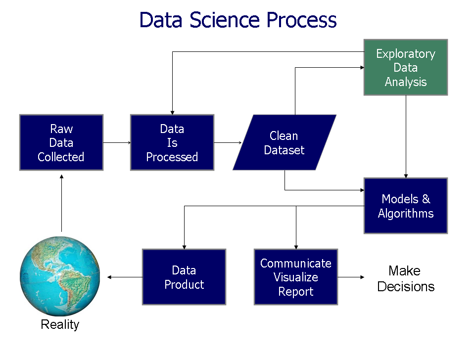
Honesty is Essential Visualizations must represent the data accurately. It's easy to mislead, intentionally or not. For example, starting the vertical axis of a bar chart at a number other than zero can exaggerate differences. Manipulating scales or cherry-picking data to support a certain narrative is dishonest and undermines trust. An effective visualization is an honest one.
Ready to check your understanding?
What is the primary purpose of data visualization?
According to the text, what does data visualization help people do more effectively?
By keeping these principles in mind, you can turn data from a confusing mess into a clear and powerful story.