Persuasive Data Visualization
Introduction to Data Visualization
Making Sense of Numbers
Data visualization is the art of turning raw data, like spreadsheets full of numbers, into pictures. Think of it as translating a dense paragraph into a single, clear image. The goal is to make complex information easy to understand at a glance. Instead of digging through rows of numbers to find a trend, a simple chart can reveal it instantly.
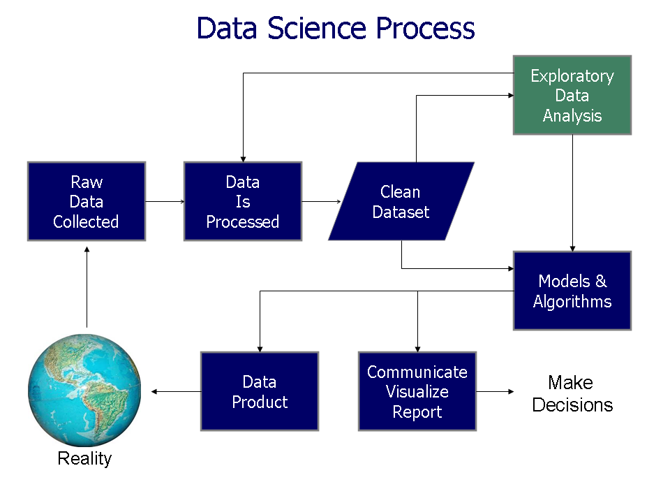
Why do we do this? Because our brains are wired to process visual information far more quickly than text or numbers. When you see a chart, you can spot patterns, identify outliers, and understand relationships in a way that isn't possible by just looking at the raw data. This ability to see the story within the data helps us make smarter, faster decisions.
The purpose of data visualization is to present complex data in a way that is clear to understand and engages audiences.
Common Chart Types
There are many ways to visualize data, but a few basic types handle most everyday needs. Let's look at three of the most common ones.
Bar Charts: For Comparison Bar charts use rectangular bars to compare values across different categories. The length of each bar is proportional to the value it represents. They're perfect for answering questions like, "Which product sold the most?" or "Which country has the highest population?"
This chart makes it immediately clear that oranges are the top-selling fruit, without needing to sort through any numbers.
Line Graphs: For Changes Over Time A line graph connects a series of data points with a continuous line. This makes it the best choice for tracking changes or trends over a period of time. Use a line graph to see how your website traffic has grown over the last year or to monitor daily temperature fluctuations.
The upward trend from Monday to Friday is obvious, though there was a small dip on Thursday.
Pie Charts: For Parts of a Whole A pie chart is a circle divided into slices to illustrate numerical proportion. Each slice represents a category, and the size of the slice is proportional to the percentage of the whole it represents. Pie charts are useful for showing how a single total is broken down into parts, like the composition of a company's budget or the market share of different competitors.
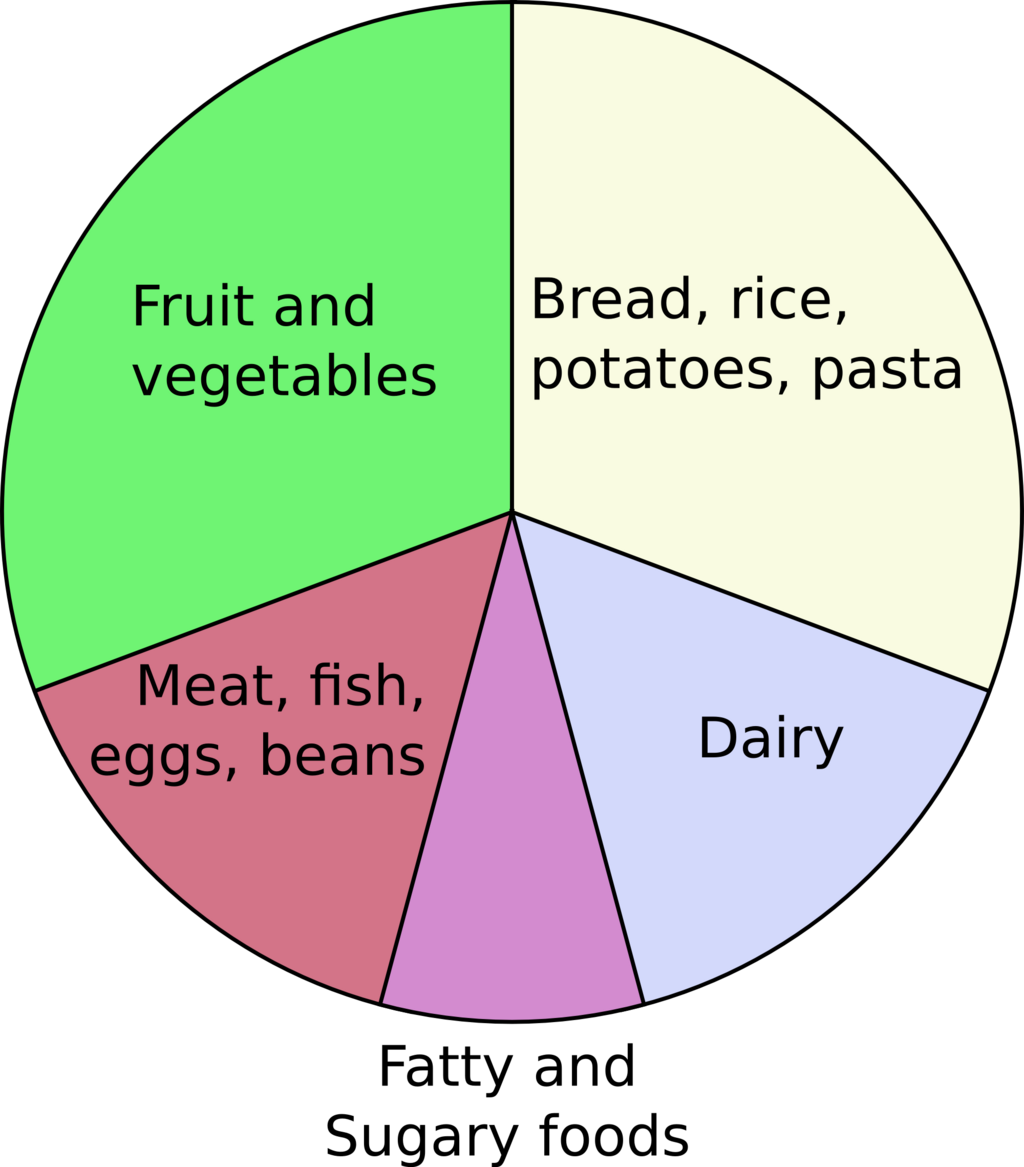
A good rule of thumb for pie charts is to keep them simple. If you have more than five or six categories, the chart can become cluttered and difficult to read. In those cases, a bar chart is often a better choice.
What is the primary goal of data visualization?
You want to track the daily temperature in your city over a month to see the warming trend. Which chart type would be most effective?
These basic charts are the building blocks of data visualization. By choosing the right one for your data, you can turn a confusing set of numbers into a clear and compelling story.