Persuasive Data Visualization
Understanding Data Visualization
Telling Stories with Data
Raw data is often just a long list of numbers and words. It’s hard to see what’s important or how things are connected. Data visualization changes that. It’s the art of turning raw information into pictures, like charts and graphs. This makes it much easier to spot trends, understand relationships, and tell a clear story.
Think of it like this: a spreadsheet of a company's monthly sales is just a grid of numbers. But a graph showing those sales climbing over a year tells a powerful story of growth at a glance.
When you put visualizations in a report, you’re not just showing data; you’re guiding your reader to an insight. A well-chosen chart can make a complex point instantly understandable, saving time and preventing confusion.

Choosing the Right Chart
Different stories require different ways of telling. The same is true for data. Choosing the right type of chart is crucial for communicating your message clearly. Let's look at three of the most common types: bar charts, line graphs, and pie charts.
Bar Chart
noun
A chart that presents categorical data with rectangular bars with heights or lengths proportional to the values that they represent.
Bar charts are perfect for comparing amounts between different groups. If you want to show which category is the biggest or smallest, a bar chart is a great choice. You can use vertical or horizontal bars.
Next up are line graphs.
Line Graph
noun
A type of chart which displays information as a series of data points connected by straight line segments.
Line graphs are the best way to show how something changes over a continuous period of time. By connecting the dots, they make it easy to see trends, like growth, decline, or fluctuations. This is useful for tracking stock prices, monthly temperatures, or website visitors.
Finally, we have pie charts.
Pie Chart
noun
A circular statistical graphic, which is divided into slices to illustrate numerical proportion.
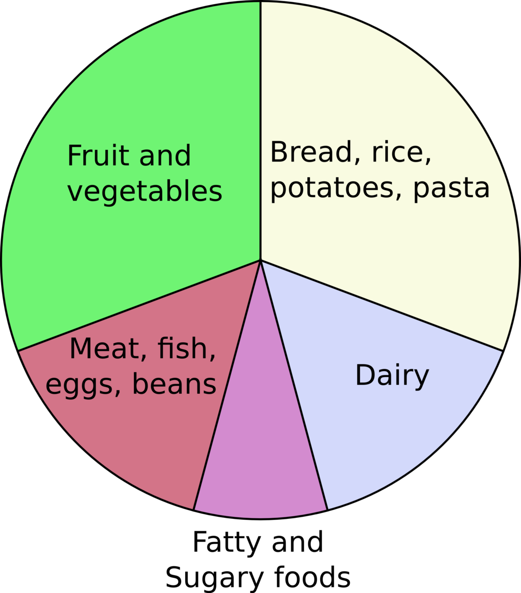
Pie charts are used to show the parts of a whole. They're effective when you want to show how different categories make up a total, like the percentage of a budget spent on different departments. However, they work best with just a few categories. If you have too many slices, the chart becomes cluttered and hard to read.
A good rule of thumb: if you have more than five or six categories, a bar chart is usually a better choice than a pie chart.
Making Data Clear
The ultimate goal of visualizing data is clarity. A good visualization doesn't just look nice; it helps people understand complex information quickly and accurately. By turning numbers into a simple picture, you can highlight key insights that might have been lost in a table.
A simple, well-designed visualization ensures that the story behind the data is clear.
When you choose the right chart for your data, you empower your audience to see the bigger picture. This leads to better understanding, more informed conversations, and smarter decisions.
Time to review what you've learned.
What is the primary goal of data visualization?
You want to show your company's monthly sales figures for the past year to highlight the growth trend. Which chart type is the most appropriate for this task?