Packaging Design Fundamentals
Introduction to Packaging Design
More Than Just a Box
Think about the last time you bought something new. Before you even used the product, you interacted with its packaging. Was it a sleek, minimalist box? A colorful, busy bag? That first encounter is no accident. Packaging is a product's first handshake, its opening line, and its most important advertisement all rolled into one.
At its most basic level, packaging protects a product from damage during shipping and on the shelf. It keeps food fresh, electronics safe, and fragile items intact. But its job goes far beyond simple protection. It's a silent salesperson, working to grab your attention in a crowded store and convince you to make a purchase.
Packaging and labeling is the first level of engagement a customer has with your product, so visual appeal is key.
Effective packaging design is a bridge between the product and the consumer. It communicates what the product is, who it's for, and what the brand stands for, all in a matter of seconds.
The Language of Packaging
Designers use a specific set of tools to communicate through packaging. These key elements work together to create a feeling, tell a story, and build a connection with you, the customer.
Color is often the first thing a consumer notices. It can instantly trigger feelings and associations. Brands use color to stand out from competitors and create a specific mood. For example, blue often conveys trust and reliability, while green is associated with nature and health. Red can create excitement or a sense of urgency.
Typography, or the style of the text, gives the brand a voice. A fancy, scrolling script on a perfume box suggests elegance and luxury. A bold, clean, sans-serif font on a tech gadget feels modern and efficient. The choice of font says a lot about the brand's personality before you read a single word.
Imagery—the photos or illustrations on the package—tells a story. A picture of a juicy strawberry on a yogurt container tells you about the flavor inside. An illustration of a happy family might be used to sell a board game, connecting the product with feelings of fun and togetherness.
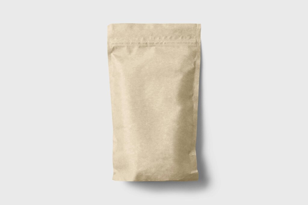
Finally, the materials used in packaging have a major impact. The physical feel of a package can communicate quality. A heavy, textured paper might make a product feel more premium, while a thin, glossy plastic might feel more economical. The material is a tactile cue that reinforces the brand's message.
Speaking to Your Customer
Great packaging design isn't just about looking good; it's about connecting with the right people. Every design choice is made with a specific brand identity and target audience in mind.
A brand's identity is its personality and values. Is the brand playful and fun, or serious and professional? Is it a luxury brand or a budget-friendly one? The packaging must reflect this identity consistently. A children's toy company will use bright colors and whimsical fonts, while a high-end skincare line will opt for a more subdued and elegant design.
Effective packaging understands its target audience. The design for a protein bar aimed at athletes will look very different from one for a chocolate bar meant as an indulgent treat.
Designers consider the lifestyle, values, and preferences of the people they want to reach. By aligning the visual message with what the target customer cares about, the packaging becomes much more effective at building trust and encouraging a sale. It makes the customer feel like the product was made just for them.
Now, let's test what you've learned about the fundamentals of packaging design.
Besides protecting a product from damage, what is a primary role of its packaging?
A company launching a new, high-tech gadget would most likely use which type of typography on its packaging to convey a modern and efficient feel?