Orange Data Mining Fundamentals
Introduction to Orange
What is Orange?
Orange is an open-source tool that makes data science accessible to everyone. Instead of writing lines of code, you connect visual blocks to analyze data, create visualizations, and build machine learning models. It’s like building with LEGOs, but for data.
Think of it as a visual laboratory. You can load a dataset, clean it up, find patterns, and see your results in charts and graphs, all by dragging and dropping components. This makes it a great starting point if you're new to data mining, but it's powerful enough for experienced analysts too.
Getting Started
First, you'll need to install Orange. It’s available for Windows, macOS, and Linux. The easiest way is to download Anaconda, a popular platform for data science that includes Python and other useful tools. Once Anaconda is installed, you can install Orange with a single command or through its graphical interface.
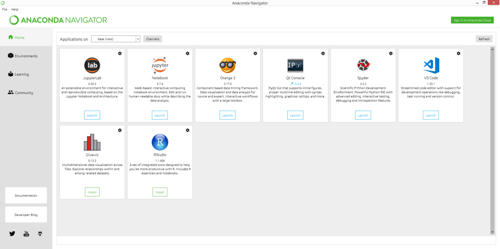
Open Anaconda Navigator, find Orange 3 in the list of applications, and click "Install." Or, open the Anaconda Prompt (or terminal) and type:
conda install -c conda-forge orange3
After installation, launch Orange. You’ll be greeted by a welcome screen and a blank canvas. This canvas is where you'll build your data analysis pipelines.
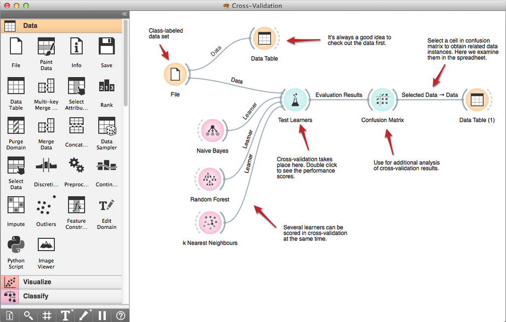
The interface is split into a few key areas. On the left, you'll see a categorized list of components. This is your toolbox. The large empty space in the middle is your canvas, where the magic happens. Any visualizations or data tables you open will appear in separate windows.
Widgets and Workflows
The building blocks in Orange are called "widgets." Each widget performs a specific task, like loading a file, selecting data, training a model, or creating a plot. You can find them in the toolbox on the left, organized into categories like Data, Visualize, and Model.
Widget
noun
A self-contained component in Orange that performs a specific data-related task.
You combine these widgets to create a workflow. A workflow is the sequence of steps your data will go through. You create one by dragging widgets onto the canvas and connecting their inputs and outputs. The connection, represented by a line, shows the flow of data from one widget to the next.
Let’s build a very simple workflow. Find the 'File' widget in the Data tab, and drag it onto the canvas. This widget lets you load data. By default, it comes with several sample datasets. Now, drag a 'Data Table' widget onto the canvas. To see the data from the File widget, click the output channel of the File widget and drag a line to the input channel of the Data Table widget. A connection appears. Double-click the Data Table widget, and a new window will pop up showing your data in a spreadsheet format.
This is the fundamental concept behind Orange. You chain widgets together to form a logical flow, transforming and analyzing data at each step. By connecting different visualization or modeling widgets, you can quickly explore your data without writing a single line of code.
Now, let's test your understanding of these initial concepts.
What is the primary method for building a data analysis pipeline in Orange?
The building blocks in Orange, which perform specific tasks like loading data or creating a plot, are called ______.
You've now taken your first steps with Orange. You know what it is, how to get it running, and how to build a basic workflow with widgets. In the next sections, we'll dive deeper into specific widgets to perform more complex analysis.