Newsletter Typography and Layout
Establish Visual Hierarchy
Guiding the Reader's Eye
Most people don't read newsletters; they scan them. Your job is to create a visual path that guides their eyes from the most important message to the supporting details. This is called visual hierarchy. Without it, your newsletter is just a wall of text. With it, a reader can grasp your core message in seconds.
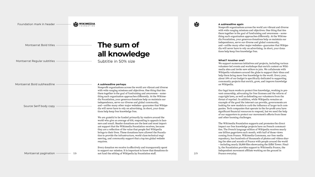
The simplest and most effective structure is a three-level hierarchy: the main headline (H1), sub-headers (H2), and the body text. Think of it as a conversation. The H1 shouts the main topic across the room. The H2 offers a compelling detail to draw you closer. The body text provides the full story once you've arrived.
The most direct way to establish this hierarchy is through scale. A common rule of thumb is to make your main headline (H1) twice the size of your body text. If your body text is 16px, your H1 would be 32px. For sub-headers (H2), a ratio of 1.5x often works well, putting them at 24px in this example. These aren't rigid laws, but they provide a solid, balanced starting point.
H1 Size ≈ 2 × Body Size H2 Size ≈ 1.5 × Body Size
Next, consider weight. Simply making a headline bigger isn't always enough. Making the H1 and H2 bold while keeping the body text at a regular weight creates a strong contrast that our eyes pick up instantly during a scan. It signals importance without shouting. This simple difference in weight helps a reader's brain categorize information before they've even read a full sentence. It’s a powerful tool for effortless navigation.
Density and Emphasis
Beyond size and weight, you can control hierarchy through what designers call . This doesn't refer to the actual color of the font, but rather the overall density or grayness of a block of text. A paragraph with tight line spacing and letter spacing will appear as a darker, denser block than one with more generous spacing. You can use this to your advantage.
Want a call-to-action (CTA) to stand out without making it huge and loud? Place it in its own paragraph with extra space above and below it. This creates a pocket of white space, reducing the 'density' around the CTA and naturally drawing the eye. This creates emphasis through contrast. The surrounding text is dense, the CTA is an island. This is often more sophisticated than just putting a bright red button everywhere.
Ultimately, hierarchy is about creating clear contrast between elements. This can be achieved through scale, weight, spacing, or even color. By mastering these simple principles, you transform your newsletter from a static document into a guided experience, ensuring your most important messages are always seen.
What is the primary purpose of applying visual hierarchy to a newsletter?
According to a common rule of thumb, if your newsletter's body text is 16px, what would be a good size for your sub-headers (H2)?