Modern Web Development and Architecture
Modern Layout Systems
Grid for Structure, Flex for Components
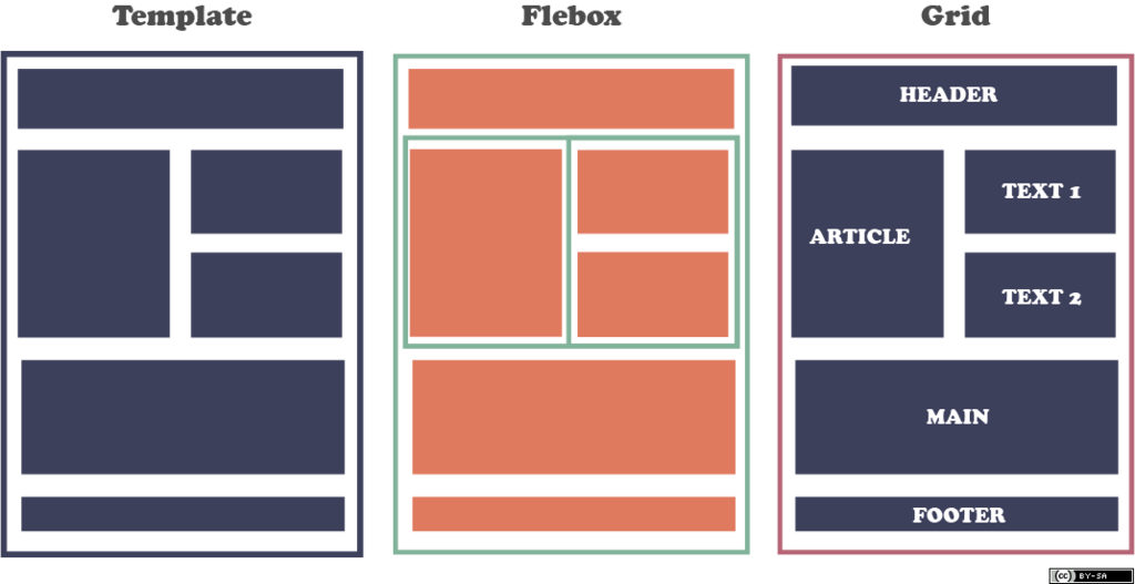
Forget floats and complex positioning hacks. Modern web layout revolves around a powerful duo: CSS Grid and Flexbox. The industry-standard approach is simple: use Grid to define the large-scale, two-dimensional structure of your page, and use Flexbox to arrange the items within those structural regions.
Think of Grid as the architect designing the rooms of a house (header, sidebar, main content, footer). Flexbox is the interior designer arranging furniture within each room (aligning buttons in a header, spacing items in a card).
This separation of concerns makes layouts more logical, readable, and easier to maintain. You get the power of a two-dimensional system for the overall page skeleton and a precise one-dimensional system for the components that live inside it.
Building Skeletons with CSS Grid
CSS Grid is built for creating two-dimensional layouts. It manages both rows and columns at the same time, making it perfect for the foundational structure of a webpage. One of the most intuitive ways to do this is with property.
It allows you to name your grid areas and then arrange them in a visual pattern that mirrors the final layout. You can literally see the shape of your page in your CSS.
.container {
  display: grid;
  grid-template-columns: 1fr 3fr;
  grid-template-rows: auto 1fr auto;
  grid-template-areas:
    "header header"
    "sidebar main"
    "footer footer";
  height: 100vh;
  gap: 10px;
}

/* Assign elements to the named areas */
header { grid-area: header; }
main { grid-area: main; }
aside { grid-area: sidebar; }
footer { grid-area: footer; }
Grid also enables powerful intrinsic responsiveness without a single media query. By using repeat(auto-fit, minmax(250px, 1fr)), you can create a grid of items that automatically wrap and resize based on the available space. The browser does the math for you.
auto-fitwill collapse empty tracks to allow content to grow, whileauto-fillwill keep the space for empty tracks. For a flexible grid of items,auto-fitis usually what you want.
Arranging Components with Flexbox
Inside a grid area, you'll often have a group of items that need to be aligned along a single axis, either horizontally or vertically. This is Flexbox's specialty. It's the perfect tool for navigation bars, button groups, or the contents of a product card.
The core of Flexbox's power lies in the relationship between three properties: flex-grow, flex-shrink, and flex-basis. Together, they control how items handle extra space or a lack of it.
| Property | Description |
|---|---|
flex-basis | The ideal starting size of an item before any growing or shrinking occurs. |
flex-grow | A proportion that dictates how much an item will grow to fill available space. |
flex-shrink | A proportion that dictates how much an item will shrink if there isn't enough space. |
For example, in a navigation bar, you might give the logo a flex-grow of 0 so it never gets bigger, but give the navigation links a flex-grow of 1 so they expand to fill the remaining space. You can also now use the gap property to create space between flex items, which was previously only available in Grid.
Vanilla CSS vs. Frameworks
With Grid and Flexbox being so capable, the role of CSS frameworks has changed. Utility-first frameworks like offer a different approach. Instead of writing CSS rules, you apply pre-written utility classes directly in your HTML.
<!-- Tailwind CSS Example -->
<div class="flex justify-between items-center p-4 bg-gray-100">
  <div class="font-bold">Logo</div>
  <nav class="flex gap-4">
    <a href="#" class="hover:underline">Home</a>
    <a href="#" class="hover:underline">About</a>
  </nav>
</div>
Which approach is better? It's a trade-off.
Vanilla CSS (Grid/Flexbox):
- Pros: No dependencies, zero extra bundle size, clean separation of HTML and CSS.
- Cons: Can require more code for complex designs, you have to create and name your own classes.
Tailwind CSS:
- Pros: Extremely fast for prototyping, enforces a consistent design system, can result in smaller final CSS files through its purging process.
- Cons: Can make HTML less readable, adds a build step and dependency to your project.
Modern layouts thrive on CSS Grid and Flexbox.
Many teams find a hybrid approach works best, using Grid and Flexbox as the foundational layout tools and leveraging a few utility classes for common spacing and typography. Using CSS custom properties (variables) to store layout values like gaps or container widths makes either approach more maintainable.
According to modern web layout best practices, what are the distinct, primary roles of CSS Grid and CSS Flexbox?
Which CSS property allows you to create a responsive grid that automatically adjusts the number of columns based on available space, often eliminating the need for media queries?
Mastering the interplay between Grid and Flexbox is the key to creating virtually any layout the modern web demands. By using Grid for the big picture and Flexbox for the details, you can build websites that are robust, responsive, and easy to understand.