Modern Full Stack Web Architecture
Modern Layout Architecture
One Dimension vs. Two
Modern web layout isn't about hacking things into place with floats and positioning tricks. It’s about intention. The two pillars of modern CSS layout, Flexbox and Grid, both arrange elements, but they think about space in fundamentally different ways.
Flexbox is for one-dimensional layouts. Think of it as arranging items in a single line, either a row or a column. You can wrap lines, but the core logic is always about distributing space along one primary axis.
Grid, on the other hand, is for two-dimensional layouts. It manages both rows and columns simultaneously. This is your tool for the big picture, the overall structure of a page where elements need to align in a grid.
Use Flexbox for components and content within a layout. Use Grid for the overall page layout itself.
Imagine you're designing a navigation bar. The items (Home, About, Contact) just need to sit next to each other in a row. You might want to space them out evenly or push some to the right. This is a perfect job for Flexbox. It excels at aligning items along a single axis.
Now, think about the layout of a whole news website: a header across the top, a main content area, a sidebar for related articles, and a footer. This is a two-dimensional problem. You need to control the placement of items in relation to both rows and columns. This is where CSS Grid shines.
Building the Skeleton with Grid
Grid lets you define a layout and then place items onto it. One of the most readable ways to do this is with grid-template-areas. You essentially draw your layout with names in your CSS. It's a visual way to structure your page, which helps avoid the confusing mess of nested containers often called .
/* CSS for the page container */
.container {
  display: grid;
  grid-template-columns: 1fr 3fr;
  grid-template-rows: auto 1fr auto;
  grid-template-areas:
    "header header"
    "sidebar main"
    "footer footer";
  height: 100vh;
}

/* Assigning elements to the named areas */
.header { grid-area: header; }
.sidebar { grid-area: sidebar; }
.main { grid-area: main; }
.footer { grid-area: footer; }
In that example, we created a grid with two columns and three rows. The grid-template-areas property makes it clear that the header and footer span both columns, while the sidebar and main content share the middle row.
Notice the unit. This is a 'fractional unit'. 1fr 3fr tells the browser to give one fraction of the available space to the first column (the sidebar) and three fractions to the second column (the main content). It’s a beautifully simple way to handle proportional sizing.
Aligning Components with Flexbox
Once your Grid skeleton is in place, you can use Flexbox to handle the details inside each grid area. Let's return to that navigation bar, which we would place inside our header grid area.
/* Inside the .header element */
nav {
  display: flex;
  justify-content: space-between; /* Pushes items to ends */
  align-items: center; /* Vertically centers them */
}

.logo {
  /* No special flex properties needed */
}

.nav-links {
  display: flex;
  gap: 20px; /* Adds space between links */
}
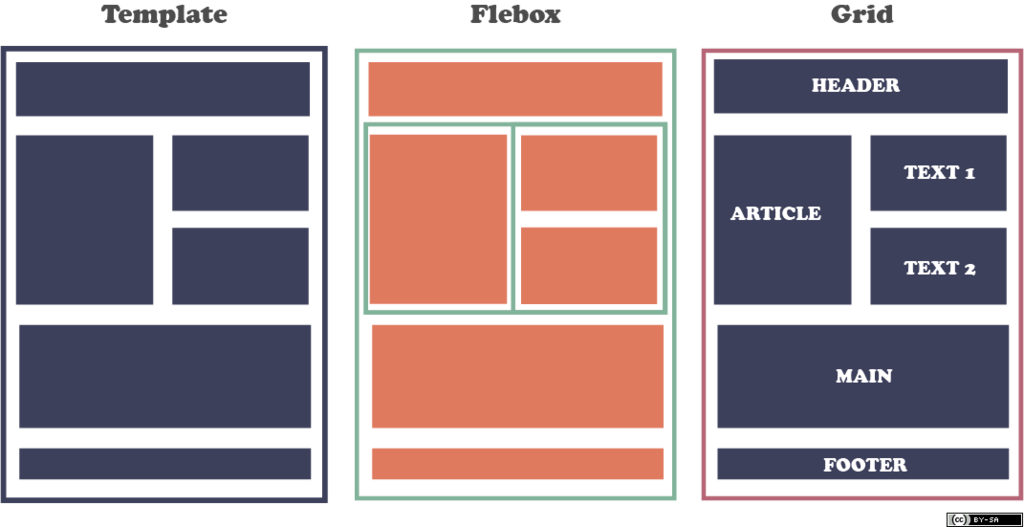
justify-content controls alignment along the main axis (horizontal in this case), while align-items handles the cross axis (vertical). By combining Grid for the macro-layout and Flexbox for the micro-layout, you get the best of both worlds: a strong, clear structure with flexible components inside.
Truly Responsive Design
For years, responsive design meant using media queries to change layouts based on the viewport's width. This works, but it’s a blunt instrument. What if a component needs to change not because the browser is a certain size, but because its parent container is?
This is the problem that solve. They allow a component to adapt its own styles based on the dimensions of its container. A sidebar component could show as a detailed card when it has plenty of space, but collapse into a compact icon-based view when placed in a narrow column, all without caring about the overall viewport size.
/* Make a container eligible for queries */
.post-container {
  container-type: inline-size;
  container-name: blog-post;
}

/* Style the component based on its container's width */
.card {
  /* Default styles for narrow containers */
}

@container blog-post (min-width: 600px) {
  .card {
    /* New styles when container is wider */
    display: flex;
  }
}
Finally, we have new viewport units that help deal with the mobile browser interfaces that appear and disappear. 100vh (viewport height) can be problematic when a browser's address bar shrinks on scroll.
svh(Small Viewport Height): The height assuming the browser interface is showing.lvh(Large Viewport Height): The height assuming the browser interface is hidden.dvh(Dynamic Viewport Height): This value changes automatically as the interface appears or disappears.
Using 100dvh is often the safest bet for creating full-height elements on mobile.
Time to check what you've learned.
What is the primary conceptual difference between CSS Flexbox and CSS Grid?
You are building a website's main page structure, which includes a header spanning the full width, a main content area, a sidebar next to it, and a footer at the bottom. Which CSS technology is most suitable for this 'macro' layout?
By mastering both Grid and Flexbox, you can create virtually any layout with clean, maintainable code. You let Grid handle the structure and Flexbox manage the alignment within that structure.