Measures of Position Explained
Introduction to Measures of Position
Where Do You Stand?
Imagine you take a test and score an 85. Is that good? It's hard to say without more information. If the average score was 60, then 85 is great. But if the average was 95, your score looks different.
This is where measures of position come in. They tell you where a particular data point stands in relation to all the other data points. Instead of just looking at a single number in isolation, we get the full story.
Measures of position help us understand the context of our data by comparing a single value to the rest of the set.
Percentiles
The most common way to describe position is with percentiles. A percentile score tells you the percentage of data points that are less than or equal to a specific value.
If your test score of 85 is in the 90th percentile, it means you scored as well as or better than 90% of the people who took the test. Suddenly, your score has a lot more meaning. Only 10% of test-takers scored higher than you did.
Percentile
noun
A measure indicating the value below which a given percentage of observations in a group of observations falls.
Percentiles are used everywhere. Pediatricians use them to track children's growth, comparing their height and weight to other kids their age. Standardized tests like the SAT report scores as percentiles to help colleges see how applicants stack up against each other.
Quartiles
Quartiles are a specific type of percentile that divide a dataset into four equal parts. Think of them as major milestones in your data.
There are three quartiles:
- First Quartile (Q1): This is the 25th percentile. 25% of the data falls below this point.
- Second Quartile (Q2): This is the 50th percentile. 50% of the data falls below this point. You already know this by another name: the median.
- Third Quartile (Q3): This is the 75th percentile. 75% of the data falls below this point.
Together, these three points split the data into four quarters, each containing 25% of the data points. They give a quick and easy summary of the entire distribution.
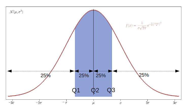
Quartiles are particularly useful for understanding the spread and center of your data. The distance between the first and third quartiles, known as the interquartile range (IQR), tells you where the middle 50% of your data lies. This is a common way to describe the variability in a dataset.
Quantiles are a great way of summarizing numerical data since they can be used to measure center and spread, as well as to get a sense of where a data point stands in relation to the rest of the data set.
Ready to check your understanding?
What is the primary purpose of a measure of position, like a percentile?
If a baby's weight is in the 60th percentile for their age, what does this indicate?
Understanding measures of position like percentiles and quartiles is a fundamental skill in statistics that helps you look beyond the surface of a number and see its true significance.