Mastering Visual Communication and Design Logic
Advanced Grid Systems
Structuring Complex Information
You already know that grids bring order to chaos. They align elements and create a sense of cohesion. But when you move from a simple flyer to a data-heavy website or a multi-page magazine, a basic column grid won't cut it. You need more sophisticated systems to manage complexity and guide the reader's eye effectively.
Enter the modular grid This is a grid that has not only vertical columns but also horizontal rows. The intersection of these creates small rectangular units called modules. By grouping these modules, you can create flexible, organized spaces for text, images, and other elements. Think of it like building with LEGO bricks; you have standard units that can be combined in countless ways to build a complex but unified structure. This approach is perfect for websites, newspapers, and brochures where content blocks vary in size and importance.
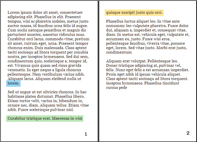
For text-heavy layouts like books and magazines, vertical alignment is just as crucial as horizontal alignment. This is where the baseline grid comes in. It’s a dense series of horizontal lines, like the lines on notebook paper, that governs the placement of all text. The main body text
sits on these lines, ensuring that text in adjacent columns perfectly aligns. This creates a subtle but powerful sense of order and harmony, making the page easier to read. It establishes a consistent that guides the eye smoothly down the page.
Not all content fits neatly into uniform boxes. Sometimes, the information itself dictates the structure. A hierarchical grid prioritizes content over a rigid columnar structure. It uses alignment and proximity to create zones of importance. For instance, a webpage might have a wide area for the main article, a narrower column for related links, and a distinct header area. The grid still exists to align these zones, but the divisions are based on the hierarchy of information, not mathematical equality.
Proportions and Impact
Why do some layouts just feel right? Often, the answer lies in mathematics. Classical proportions, like the Golden Ratio (approximately 1:1.618), have been used for centuries in art and architecture to create aesthetically pleasing compositions. You can apply these same principles to your grids. For example, you could design a two-column layout where the main content column is 1.618 times wider than the sidebar. This creates a natural, balanced relationship between the two sections.
Once you understand the rules of the grid, you can learn how to break them. Breaking the grid is a deliberate choice to make an element stand out. By letting a photo bleed across a gutter, extending a headline beyond its column, or placing a graphic at an unusual angle, you disrupt the established pattern. This creates tension and draws immediate attention to that element. It's a powerful tool for creating emphasis and a dynamic feel, but it must be used sparingly. If everything breaks the grid, then nothing stands out, and you're left with chaos instead of order.
While some designers actively eschew grids in favour of a more intuitive, freeform layout, the most successful do so having worked with grids for years – they understand the rules before they break them.
Let's review the core concepts of advanced grid systems.
Now, test your understanding of how to apply these systems.
You are designing a data-heavy website with many different types of content blocks (images, articles, ads, navigation). Which grid system would be most effective for organizing these varied elements into a cohesive and flexible layout?
What is the primary purpose of a baseline grid in a text-heavy layout like a magazine?
Mastering these grids transforms you from someone who simply arranges elements on a page to a true information architect, capable of building clear, beautiful, and effective designs.