Mastering Typography Essentials
Introduction to Typography
The Art of Arranging Words
Typography is the art of arranging letters and text to make it legible, readable, and appealing. It’s a quiet force in our daily lives, shaping how we consume information, from the books we read to the apps we use. It’s not just about choosing a font; it’s about how that font is used to guide the reader’s eye and convey a specific tone or feeling.
Good typography is invisible. It works so well that you don’t even notice it. Bad typography, on the other hand, is distracting. It can make a message confusing or difficult to read. Think of it as the 'voice' of the written word. A bold, heavy font might 'shout,' while a light, airy script might 'whisper'.
A Brief History of Type
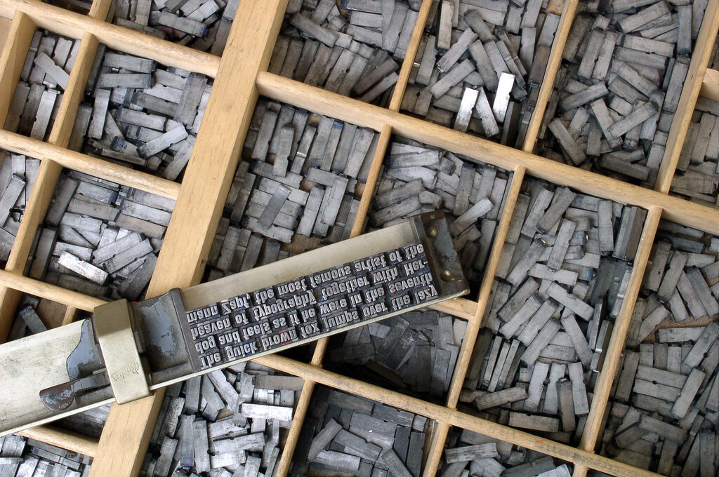
Before typography, every book was written by hand, a slow and painstaking process. This changed in the 15th century with Johannes Gutenberg's invention of the printing press and movable type. For the first time, letters could be cast in metal, arranged to form words, and printed onto page after page.
These early typefaces were designed to mimic the popular handwriting styles of the time, like Blackletter script. As printing spread, new styles emerged, evolving from the ornate letters of the past to the clean, functional digital fonts we use today. This evolution reflects changes in technology, culture, and our very relationship with the written word.
Meet the Families
Just like people, typefaces belong to families. Understanding the main categories helps you choose the right font for the job. The two most common families are Serif and Sans-Serif.
Serif
noun
A small decorative line added to the beginning or end of a letter's stroke.
Serif typefaces have small feet or strokes attached to the ends of the letters. These serifs help guide the eye along the lines of text, which is why they're a popular choice for printed books and magazines. They often feel traditional, classic, and trustworthy. Common examples include Times New Roman, Garamond, and Georgia.
Sans-Serif fonts are those without serifs. The word 'sans' is French for 'without'. These typefaces have clean, straight lines and a modern, minimalist feel. They are widely used for digital screens, headlines, and signage. Helvetica, Arial, and Futura are classic examples of sans-serif fonts.
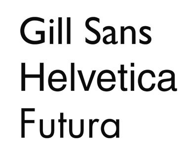
Beyond these two giants, there are other categories like Script fonts, which mimic cursive handwriting, and Display fonts, which are bold and decorative, designed to grab attention in headings and logos.
The Anatomy of a Letter
To truly understand typography, it helps to know the basic parts that make up a letterform. Just like a human body, letters have their own anatomy. Knowing these terms allows you to talk about type with more precision.
Here are a few key terms to know:
- Baseline: The invisible line upon which a line of text rests.
- X-height: The height of the main body of a lowercase letter, like 'x' or 'a'.
- Ascender: The part of a lowercase letter that extends above the x-height, like in 'b', 'd', or 'h'.
- Descender: The part that extends below the baseline, like in 'g', 'p', or 'y'.
- Kerning: The process of adjusting the space between individual characters to create a visually pleasing result.
- Leading: (Pronounced 'ledding') The vertical space between lines of text.
Typography is the art of arranging letters and text in a way that makes the copy legible, clear, and visually appealing to the reader.
Understanding these elements gives you the vocabulary to see why some designs work and others don't. It's the first step toward using type with purpose and intention.
What is the primary goal of good typography?
The small decorative feet or strokes attached to the ends of letters in fonts like Times New Roman are known as what?
These fundamentals are the building blocks of all typography. By understanding its history, classifications, and anatomy, you can begin to see the world of text in a whole new way.