Mastering Trading Analysis and Strategy
Candlestick Patterns
What Are Candlesticks?
Candlestick charts are a popular way to visualize how the price of an asset, like a stock or cryptocurrency, changes over time. Think of each candlestick as a small summary of the price action within a specific period, whether that's one minute, one hour, or one day.
Each candle has two main parts: the body and the wicks (also called shadows).
The body shows the range between the opening and closing price for the period.
- A green (or white) body means the price closed higher than it opened.
- A red (or black) body means the price closed lower than it opened.
The wicks represent the highest and lowest prices the asset reached during that same period. The top of the upper wick is the high, and the bottom of the lower wick is the low. By looking at a candle's color and shape, we can quickly understand the battle between buyers (bulls) and sellers (bears).
Reading a Single Candle
Some individual candlesticks tell such a strong story that they have their own names and meanings. They act as clues about market sentiment.
Doji
noun
A candlestick pattern that forms when an asset's open and close prices are virtually equal. It is characterized by a very small or non-existent body, resembling a cross or plus sign.
A Doji indicates a tug-of-war where neither buyers nor sellers could gain control. It's a moment of indecision. While the price might have moved up and down significantly (creating long wicks), it ended the period right back where it started.
The key takeaway for a Doji is indecision. It often appears before a potential change in the trend.
Another important single candle is the Hammer.
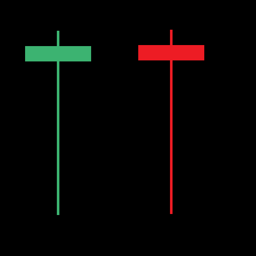
A Hammer has a short body at the top, a long lower wick, and little to no upper wick. This pattern tells a story of sellers trying to push the price down, but failing. Buyers stepped in with force, pushing the price back up to close near its opening price. When a Hammer appears after a period of falling prices (a downtrend), it can signal that a bottom is near and the price might be about to reverse and go up. It's considered a bullish reversal signal.
Patterns with Multiple Candlesticks
The story becomes even clearer when you look at candles in groups. Combining two or more candlesticks can reveal powerful patterns that a single candle might not show on its own.
Engulfing
adjective
A two-candlestick pattern where the body of the second candle completely 'engulfs' or covers the body of the preceding candle.
A Bullish Engulfing pattern occurs after a downtrend. A small red candle is followed by a large green candle whose body completely swallows the previous red candle's body. This shows that buyers have stepped in with overwhelming force, signaling a potential reversal upwards.
A Bearish Engulfing pattern is the opposite. After an uptrend, a small green candle is followed by a large red candle that engulfs it. This indicates that sellers have taken control and the price may be about to head down.
Another key multi-candle pattern is the Morning Star. This is a three-candle pattern that signals a potential bottom.
The Morning Star consists of:
- A large red candle (part of a downtrend).
- A small-bodied candle (red or green) that gaps below the first candle.
- A large green candle that closes at least halfway into the body of the first red candle.
This pattern shows a transition from strong selling pressure to indecision (the small middle candle), and then to strong buying pressure. It's named the Morning Star because it signals hope and a new beginning, like the sun rising after a dark night.
Context is Everything
Recognizing a pattern is only half the battle. Its meaning is heavily influenced by where it appears. A Hammer pattern is significant after a long downtrend but means little in the middle of a sideways, choppy market.
Think of these patterns as a language. They don't predict the future with certainty, but they provide valuable clues about the market's psychology. Learning to read them helps you better understand the story that price is telling.
Chart patterns can be used to predict the direction of prices, areas of support or resistance and price breakout and breakdown points.
As you get more familiar with these basic patterns, you'll start to see them appear on price charts, giving you a deeper insight into market dynamics.
What does the 'body' of a candlestick represent?
If a candlestick has a red body, what does this indicate about the price movement during that period?
Understanding these foundational patterns is the first step toward analyzing price charts effectively.