Mastering the Academic Poster Presentation
Understanding Academic Posters
More Than a Paper on a Wall
Academic posters are a staple at conferences and symposiums. They're not just research papers printed in a large format. Think of a poster as a visual summary of your work, designed to spark conversations and share key ideas quickly.
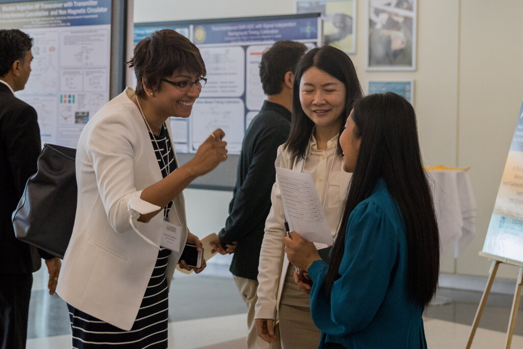
Unlike a formal presentation where you speak to a quiet audience, a poster session is an interactive event. You stand by your poster, and people wander by, stopping to look at what interests them. It’s your chance to explain your research one-on-one, answer questions, and get valuable feedback from peers in your field. The main goal is to engage people, not just present data.
The purpose of a poster is to create discussion.
The Anatomy of a Poster
While designs vary, most academic posters follow a standard structure that tells a clear story. This format helps viewers quickly understand the what, why, and how of your research. It guides them logically from the initial question to your final conclusions.
Here's a quick rundown of each component:
- Title, Authors, and Affiliations: Tells viewers who you are, where you're from, and what your project is about. The title should be catchy and informative.
- Introduction/Background: Sets the stage. Why is this research important? What problem are you trying to solve?
- Methods: Briefly explains what you did. This section should be concise, focusing on the approach rather than minute details.
- Results: This is the heart of the poster. It showcases your key findings, often using graphs or charts.
- Conclusions: Summarizes the main takeaways. What do your results mean, and what are the next steps?
- References/Acknowledgments: Gives credit to sources and people who helped you.
Clarity and Conciseness are Key
A poster session is a busy place. Attendees might only spend a minute or two at your poster. Because of this, you can't include every detail from your research paper. The goal is to be clear, concise, and compelling.
Your poster should pass the "glance test." Someone walking by should be able to understand the main point of your research in about 30 seconds. This means using short sentences, bullet points, and avoiding dense blocks of text.
Think of your poster as a trailer for your research paper, not the full movie. It should make people want to learn more.
Resist the urge to shrink down your entire manuscript and paste it onto the poster. Less is almost always more. Focus on the one or two most exciting findings and build your story around them.
An optimal poster has 400 to 600 words, enough information to be detailed but leaving room for discussion, so pare down as much as possible.
Know Your Audience
Who are you trying to reach? The answer changes how you create your poster. If you're at a highly specialized conference, you can probably use technical jargon because your audience will understand it. But if you're at a broader event, you'll need to simplify your language and provide more background context.
Before you start, think about what your audience already knows and what they will find most interesting about your work. Tailoring your content ensures your message connects and your poster gets the attention it deserves.
The first step in designing an effective poster is understanding your audience.
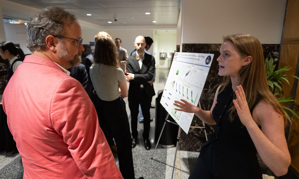
Understanding these fundamentals—purpose, structure, conciseness, and audience awareness—is the first step toward creating a poster that effectively communicates your research.
What is the primary purpose of an academic poster session?
An effective poster should pass the "glance test," meaning a viewer should be able to understand its main point in about 30 seconds.