Mastering Tailwind CSS
Introduction to Tailwind CSS
What is Tailwind CSS?
Tailwind CSS is a different kind of CSS framework. Instead of giving you pre-designed components like buttons or navigation bars, it provides a set of low-level utility classes. Think of it like a big box of Lego bricks. While a framework like Bootstrap gives you a pre-built Lego castle, Tailwind gives you every individual brick you could possibly need, allowing you to build any castle—or anything else—you can imagine.
Tailwind CSS is a utility-first CSS framework that simplifies web development by providing a set of pre-designed utility classes.
This "utility-first" approach means you build custom designs by composing these small, single-purpose classes directly in your HTML. Each class does one specific thing. For example, text-center centers text, and bg-red-500 sets a specific red background color. You combine these building blocks to create your user interface without ever writing a separate CSS file.
<button class="bg-blue-500 text-white font-bold py-2 px-4 rounded">
  Click Me
</button>
Look at the button example above. We can see exactly how it's styled just by reading the class names:
bg-blue-500: Sets a medium blue background color.text-white: Makes the font color white.font-bold: Makes the text bold.py-2: Adds padding on the y-axis (top and bottom).px-4: Adds padding on the x-axis (left and right).rounded: Applies rounded corners.
Everything is right there in the markup. There's no need to hunt down a stylesheet to figure out why the button looks the way it does.
Why Not Just Use Bootstrap?
Traditional frameworks like Bootstrap or Foundation are component-based. They provide classes like .btn, .card, or .navbar. This is great for getting started quickly, and all Bootstrap sites have a familiar, consistent look.
The challenge arises when you want to customize those components. If you need a button that looks slightly different from the default .btn, you often have to write your own CSS to override the framework's styles. This can lead to a messy cycle of fighting the framework, adding more and more custom CSS just to achieve a unique design.
Tailwind avoids this problem entirely. Since you're building everything from scratch with utilities, every design is inherently custom. You're never fighting against pre-existing styles.
The Benefits of Utilities
Working with utilities offers a few key advantages. First, it's incredibly fast. You can style elements directly in your HTML without constantly switching context between your markup and your stylesheets. This keeps you in the flow of development.
Second, it promotes consistency. Because you're using a predefined design system for spacing, colors, and typography, your UI becomes more consistent and predictable. You're not just picking random hex codes or pixel values; you're using tokens from the Tailwind configuration, like p-4 or text-lg.
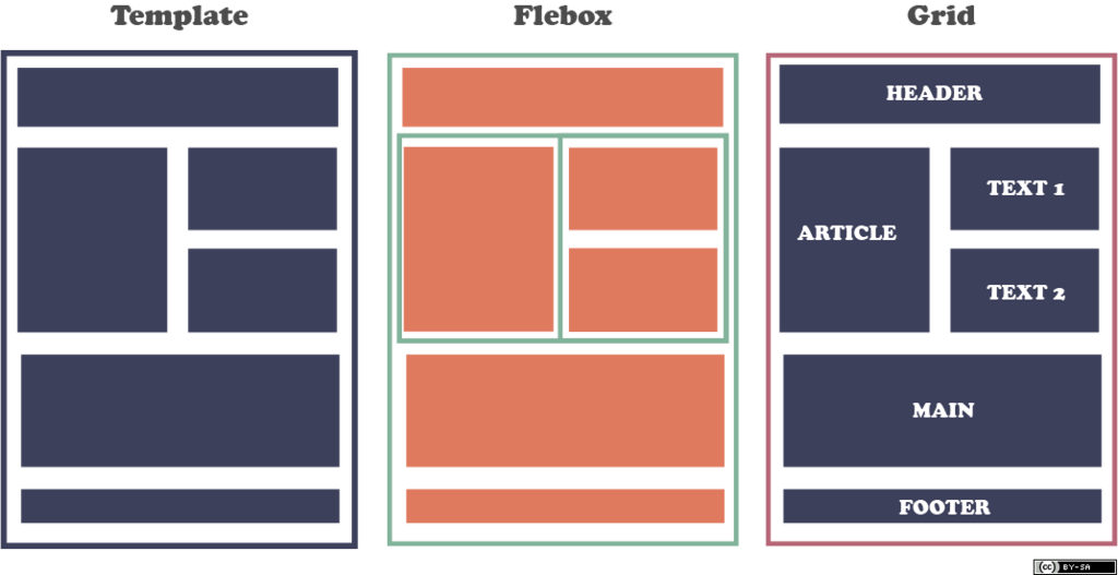
Finally, Tailwind makes responsive design straightforward. You can apply utilities conditionally at different screen sizes. For example, you might want a two-column layout on a desktop but a single-column layout on a phone. In Tailwind, that's as simple as adding a prefix like md: to your utility classes.
<div class="flex flex-col md:flex-row">
  <!-- This will be a column on small screens and a row on medium screens and up -->
  <div class="w-full md:w-1/2">Column 1</div>
  <div class="w-full md:w-1/2">Column 2</div>
</div>
In this example, flex-col stacks the items vertically by default. But the md:flex-row class tells the browser to switch to a horizontal row layout on medium-sized screens and larger. It's a clean and readable way to build complex, responsive interfaces.
Let's review the main ideas we've covered.
What is the core philosophy behind Tailwind CSS?
How does Tailwind's "utility-first" approach differ from the "component-based" approach of frameworks like Bootstrap?
Tailwind offers a powerful and efficient way to build modern user interfaces. By providing a comprehensive set of utility classes, it lets you create custom designs without the constraints of traditional component-based frameworks.